I won't waste too much virtual ink on this review because it's very likely you won't be able to get your hands on this device.  But in the event you ever come across someone selling an Axiotron Studio Pen, my advice is simple: buy it! 

Axiotron was the company that first brought the Modbook to market in 2007. Modbooks are Apple MacBooks modified with Wacom touch screens. They're wonderful devices but very expensive.

Axiotron closed up shop shortly after the release of Apple's iPad. One of its founders Andreas Haas revived the concept and now markets the devices as Modbook, Inc. Unfortunately, the new Modbooks use a very basic tablet pc stylus I reviewed here.

The original Axiotron Studio Pen was much closer to the high end pens Wacom produces for its Cintiqs.

Plain Jane wrapping is nothing to write home about, but I include it here to show the model number of the pen I am writing about. Hopefully it will aid in your future online treasure hunts.

The Studio Pen is signficantly longer (6.2 inches) than other tablet pc pens. The Modbook Pro Digitizer Pen is 5.6 inches, the Motion Computing pen is 5.8 inches and the capped Wacom Bamboo Sylus Feel is 5.95 inches.

The Studio Pen is also flared, so it's approximately .10 inch wider than all the other pens I've tested at its thickest point. It has a dual button rocker with a large, comfortable rubber grip that's at least .25 inch longer than the grip on the Motion Computing pen.  And last but not least, the Studio Pen features nice big eraser tip.

The Axiotron Studio Pen (center) is the largest tablet pc stylus I've tested. Its replacement, the white Modbook tablet pc pen is extremely generic and too light and small for my tastes. The closest pen still in production is the Motion Computing stylus (second from bottom), but its grip and single button are much smaller. The Wacom Bamboo Stylus Feel Carbon is pictured at the top and the standard Surface Pro pen is at the bottom.

I found this pen used, so I'm not sure if the nib assortment was standard, but my pen came with a large array of hard, soft and flex nibs and even a replacement button and grip.

The Studio Pen package I bought used included a large assortment of replacment nibs, two extraction rings, a replacement button and a replacement grip. 

The pen is slightly lighter than the Wacom Feel, but its heft feels almost perfect to me. 

I can't find a reason to complain about the Axiotron. I'm just happy that I get to use it on the Surface Pro and my other Windows 8 tablets. Let's hope Wacom or Modbook see fit to offer something similar in the near future.

UPDATE: Reader Pat pointed out in the comments section below that the Axiotron is slightly less accurate than the Wacom Bamboo Stylus. I hadn't noticed this to be the case until I ran a side-by-side test. The slight offset of the cursor to the nib isn't terribly distracting and I quickly forgot about it as I began to draw. The only time where the accuracy becomes an issue is in targeting very fine points in the UI. As I mentioned in my response below, hitting the ultra-narrow scroll bars in Manga Studio is difficult with any pen, but nearly impossible with Axiotron.

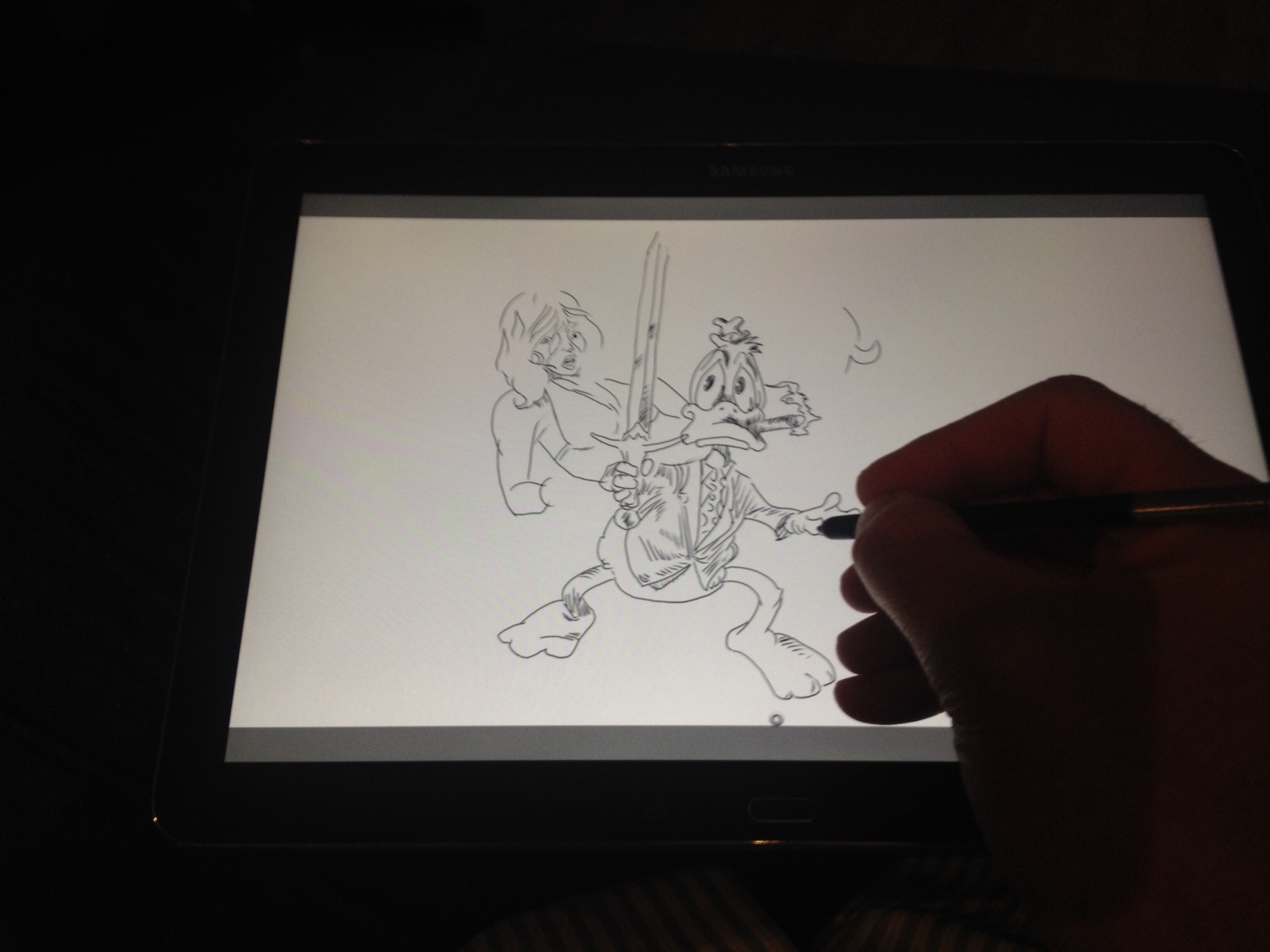
I'm always on the lookout for talented artists' opinions about the Surface Pro and its pluses and minuses.

After using it for over a year and comparing it to many other tablet pc's and pen displays, I'm happy to say that Microsoft's expensive toy still holds up very well compared to the competition. But reading how other artists are coming along and understanding their concerns is very instructive for me as I look to review future products.

I've also come to appreciate how personal the drawing experience is and recognize that each artist prioritizes a different set of features. Hopefully this selection of reviews will be helpful if you're still sitting on the fence.

Image by Ben Towle, inked on the Surface Pro 2 in Manga Studio.

First up is a review published today by Ben Towle (@ben_towle) a three time Eisner-nominated cartoonist whose current comics project is the webcomic Oyster War.

Find Ben's review here: http://www.benzilla.com/?p=5021


Example panels from Infectious web comic, by Eric Merced

Eric Merced (@eric_merced) is a professional Illustrator who has worked for companies like Zondervan Publishing, Upper Deck, Marvel, Archie’s, IDW and DC Entertainment. He purchased his Surface Pro 2 last month. http://www.ericmerced.com/surfacepro2-review/index.html

A common dilemma facing potential buyers is whether to purchase a relatively expensive Wacom Cintiq device or "settle" for the Surface Pro. Below are two write-ups by artists who came to very different conclusions.

Illustrations by Jonathan Hill, side by side on the Surface Pro 2 and the Wacom Cintiq Companion.

Illustrations by Jonathan Hill, side by side on the Surface Pro 2 and the Wacom Cintiq Companion.

Jonathan Hill teaches comics and illustration classes at the Oregon College of Art and Craft and is a Writer in Residency through Literary Arts' Writers in the Schools program. His first graphic novel, Americus, which he illustrated and was written by MK Reed, was published by First Second Books. Late last year, he explained why he decided on the Surface Pro 2 after testing it alongside the Wacom Cintiq Companion. http://blog.oneofthejohns.com/2013/11/07/surface-pro-2-vs-cintiq-companion/

Last Minute Shopping by Scott R. Kurtz

Scott Kurtz is an Eisner and Harvey award-winning cartoonist who helped pioneer webcomics with his daily feature, PvP which debuted in May of 1998. Since then Scott has co-authored a book on making webcomics, co-created and produced several animated web-series and launched a second ongoing webcomic, Table Titans. His most recent blog post details why he chose a Wacom Cintiq 13HD over the Surface Pro: http://www.pvponline.com/

Whether you agree or disagree with their conclusions, you'll definitely find food for thought.

Posted
AuthorRick Rodriguez

This brief review may seem a little out of place for a site dedicated to the Surface Pro and other Windows tablets and convertibles. But if you've read enough of these posts, you'll know that I'm fairly tech agnostic. Like many of you, I'm willing to look under any rock to find the ideal device to satisfy my creative urges. 

When the iPad was first introduced in 2010, I was primed for just such a content consumption device. But the touch interface and the many pens and art apps that were eventually released for the iPad hinted at a greater opportunity: the possibility of producing real work on a tablet. 

The Surface Pro and other Windows 8 devices I write about here have largely addressed the working side of the equation. But that productivity has come at a price: added thickness, weight, heat and shorter battery life. And truth be told, Windows 8 has yet to deliver the diversity of entertainment apps and the couch surfing elegance of iOS. 

The Samsung Galaxy Note Pro 12.2 and its tiny S-Pen. It includes an extractor and five replacement nibs.

At first glance, the Samsung Galaxy Note Pro 12.2 appears to be the tablet I always dreamed possible: roomy 12.2 inch screen, 1.45 mm thinner than the iPad 3 and only 100 grams or .21 lbs heavier. And to top it off, an ultra high resolution display (2560 x 1600) with a Wacom active digitizer. 

Clearly, the Samsung Galaxy Note Pro 12.2 is designed for the power tablet user and at $749 for the 32 GB model I've been testing, it's not cheap. But compared to the pricing of the 32 GB iPad, a $150 premium seems reasonable for the additional screen size and Wacom tech. 

Battery life is outstanding (at least 10 hours) and the fanless tablet is still very cool to the touch. The faux stitched leather back has been ridiculed by some, but I personally think it feels great in my hands. I saw one review criticize its weight and just had to laugh. If this is heavy, what does the reviewer think of the Surface Pro? 

I'll let other tech blogs quibble about Android's suitability for business use and the merits or weaknesses of Samsung's heavy handed UI choices.  I personally don't care for any flavor of Android I've ever tested, including plain vanilla. Customization is fine, but Android options are out of control. I find the whole experience confusing and redundant. But frankly, that's all very secondary.  

I have two simple ambitions for my ideal tablet: entertainment consumption and digital art creation. No faux office apps for this guy! 

I'm a big digital magazine and comic reader and the reason I've always lusted after a bigger screen tablet is to avoid having to read reduced pages.  

For example, an issue of 3D World magazine is printed at 8.7 x 11.8 inches. To read that on an iPad, the page has to be reduced by 34%. On a Surface Pro, the page width must be reduced by 40%! On the Galaxy Note Pro, the page width only needs to be shrunk 25%. (Page height will fit with only 13% reduction on the SGNP; I'm still pining for a tablet with the aspect ratio of paper rather than 16:9 video). A 9% size increase may not seem like a lot, but when you're looking at fine magazine print it makes a big difference in readability. 

Comixology's Comics app running side by side on the Galaxy Note Pro 12.2 vs. the Surface Pro 2. Though only 15% larger, size matters.

It's difficult to justify the $750 price tag for only e-reading, but until Amazon can come up with a larger sized, bargain priced Kindle Fire HDX, the Note Pro 12.2 is the best option magazine and comics buyers. (If you're a Marvel Unlimited subscriber, be aware that the Android app doesn't scale single pages correctly on the Note Pro's high resolution screen.) 

On the digital art creation side, the only widely known app available for Android is Autodesk's Sketchbook Pro.  Coming from the Windows desktop version, however, this edition feels slightly undercooked. Basic settings such as dpi are missing and file handling is a bit of a mystery. For example to load a file, you must first select Gallery which will display previously saved SBP projects. Over on the right side of the Gallery page, you click on a dropdown to select New from image. Then you click on the source directory and finally navigate to your picture. 

Forced to draw with the S-Pen stylus in Sketchbook Pro, I really missed Manga Studio's brush stabilization and the control offered by the replacement pens available for Windows tablets.

Forced to draw with the S-Pen stylus in Sketchbook Pro, I really missed Manga Studio's brush stabilization and the control offered by the replacement pens available for Windows tablets.

Drawing with the S-Pen is very smooth and responsive, but overall I felt a lack of control perhaps due to the tiny size of the stylus. Wacom compatible tablet pc pens will work on the Note Pro, but the pointer doesn't align perfectly with the pen tip. Every replacement pen I tested had the same issue: drawing takes place slightly below the nib, making it next to impossible to draw precisely. 

If you don't mind Sketchbook Pro for Android's quirks, and you have small hands or are accustomed to the S-Pen from other Samsung devices, this tablet is great for sketching on the go. Unfortunately, if you've been spoiled by Windows desktop apps like Photoshop or Manga Studio and/or prefer a heftier stylus, the Galaxy Note Pro 12.2 won't quite cut it.

UPDATE: Make sure to read the comments section for a great list of alternative paint apps to try as well as some S-Pen calibration tips. SurfaceProArtist readers are awesome! 

I can't recommend this device for serious artists, but for light doodling and entertainment consumption, it's the best tablet available and I would love to see Samsung take another crack at the Windows platform. 


ADVERTISEMENT

Purchasing from these links directly supports the maintenance of this site.


Posted
AuthorRick Rodriguez
Categoriesreviews
27 CommentsPost a comment

First, a rant:

I’m not the target consumer for the Asus Vivotab Note 8.

It’s important to get that out of the way up front because as I sit to write this post, my ambivalence about this product has almost nothing to do with its design or implementation. The AVTN8 is a very nice, reasonably-priced entrant into the Windows 8 tablet arena. And since it’s one of the few such devices to include a digitizer, let alone a Wacom digitizer, it clearly demands to be covered in this space.

My misgivings are all about the real world use case for this product. Judging by the enthusiasm around the AVTN8’s announcement, the obvious popularity of the Dell Venue 8 and the anticipation for the upcoming Lenovo Thinkpad 8, Windows artists are clearly clamoring for a small drawing tablet.

But my question is why?

Setting aside portability, I'm afraid that too many of you are simply looking at price and failing to consider the corners that had to be cut to achieve its ~$300 price point. Moreover, I'm concerned some have ignored the deeply discounted original Surface Pro while waiting for this spring's round of 8-inchers.

My message is simple: even at the current US price of $679, the Surface Pro 4/128 is a much better value for artists than the $329 Asus VivoTab Note 8, which has no ports, much lower resolution, a slower processor, half the RAM and one quarter the storage.

Is the AVTN8 worth buying in addition to a Surface Pro or other Windows tablet? Perhaps, but even then I struggle to see how often you will actually use it. Many of you have mentioned that you really enjoy Samsung's line of Android phablets and are accustomed to working on their smallish screens with an S-pen. But since the AVTN8 has no phone capability, will you carry this around in addition to a phone? If you're going to toss it in a backpack or briefcase, wouldn't a 10-inch tablet fit just as well?

By comparison to Android or iOS devices, the biggest selling point of the AVTN8--its ability to run full Windows 8.1--is also its biggest disadvantage. Everything I've thrown at it so far seems to run ok on the tablet (it even ships with Office Home & Student 2013). But how long do you really want to look at desktop interfaces on an 8-inch 1280 x 800 display?

This entire category of devices is only a glaring reminder of how immature the Windows Store environment continues to be. Where is the Modern, touch-friendly version of Office, Microsoft? Why haven't popular iOS paint apps been ported to Windows yet? Why aren't Sketchbook Pro and ArtRage sold through the Windows Store?

I'll stop ranting now, because I know I risk sounding like Paul Thurrott. If you've got the spare cash lying around and aren't going to try to use the AVTN8 for critical artistic work, go for it. But if you feel like you can't afford the Surface Pro but you really need a tablet to pursue your creative endeavors, please think long and hard before taking this plunge.

Now, on to the review:

The $299 Asus Vivotab Note 8 (M80TA) was first announced at CES 2014 with a March release date. It showed up in the Microsoft Stores unexpectedly on Sunday, selling for $30 more. Yesterday, it was pulled from the Microsoft online site and isn't available for sale anywhere else that I can find.

It's unclear whether this now-you-see-it, now-you-don't release was a mistake, but as of now we can only assume that the product will go back on sale soon. A 64 GB version is also due in March, although a price has not been announced.

The sudden arrival Sunday of the Asus Vivotab Note 8 at Microsoft Stores in the U.S. took everyone by surprise. I picked up this 32GB version for $329.

Given its budget pricing, packaging of the AVTN8 is very spartan. The included quick start guide contains only two instructions: press power to turn the tablet on and charge it for 8 hours prior to initial use. That's it. The Asus US site doesn't list or contain any additional technical information for the product either except for a press release issued for CES. Fortunately, the AVTN8 has only three buttons and an SD card slot, along with a micro USB port and headphone jack.

The plastic bezel along the sides of the screen add a somewhat cheap feeling to the product. The volume (left) and power buttons have no discernible markings. To power the device on, you need to hold it down for five seconds.

The plastic bezel along the sides of the screen add a somewhat cheap feeling to the product. The volume (left) and power buttons have no discernible markings. To power the device on, you need to hold it down for five seconds.

Unlike other Windows tablets, the physical Home button is along the opposite side (top left when the Asus logo is at the bottom in portrait mode). The SD slot comes loaded with an 8 GB card that contains a recovery partition. This is a very nice add…

Unlike other Windows tablets, the physical Home button is along the opposite side (top left when the Asus logo is at the bottom in portrait mode). The SD slot comes loaded with an 8 GB card that contains a recovery partition. This is a very nice addition in a 32 GB device.

Unlike the Surface Pro, the Asus' default orientation is portrait mode, with the logo at the bottom of the screen. That logo isn't a home button like on the Surfaces or iPad and it took me a day to figure out that the button along the upper left side is the physical home button. Power is on the top right side and beneath it is a volume rocker.

The stylus slot is located in the lower right back and the pen fits so snugly you can easily miss it. If you keep your finger nails clipped short, it can be extremely difficult to pry the pen out of the silo.

A big calling card for many of you is the dedicated stylus slot. It makes losing a pen less likely for sure, but forces the stylus to be little more than a pointing stick.

A big calling card for many of you is the dedicated stylus slot. It makes losing a pen less likely for sure, but forces the stylus to be little more than a pointing stick.

The stylus fits so snugly into the Vivotab Note 8's back that you may break a fingernail extracting it. 

The stylus fits so snugly into the Vivotab Note 8's back that you may break a fingernail extracting it. 

Powering up the AVTN8 requires holding down the power button for at least five seconds.

When I test Windows 8 devices, I usually will set them up as new desktops, but this time around I chose to sync my Surface Pro 2. That eliminates the need to redo mail, contact, and social network settings. And the layout of the Start screen is also preserved, although individual apps still need to be reinstalled.

I neglected to write down the exact space available upon that first boot, but there were a little over 16 GB free on the 32 GB C:\ drive. Asus mercifully includes an 8 GB SD card mounted as D:\ which includes a 3.26 GB recovery file.

The IPS display is very nice; as seen in the screenshot below, color reproduction is nearly identical to the Surface Pro 2. I've seen some users complain that type is a little blurred, but it perfectly acceptable to me. At the default scaling, desktop fonts are too small, so I scaled up the UI to 125%. You can go higher, but you will sacrifice a lot of screen space as a result.

Side by side (head to toe?) with the Surface Pro 2.

Side by side (head to toe?) with the Surface Pro 2.

Pen driver, calibration woes

As the first Windows 8 device that defaults to portrait mode, there are clearly bugs that need to be worked out with pen drivers. The device can only be calibrated in portrait mode. Attempting to run the calibration tool in landscape mode will only provide registration points for the top left half of the screen.

As we've discovered over the last few months, Wacom digitizer sensitivity varies widely . On my AVTN8, the entire right side requires more pressure than the rest of the screen. This makes hitting the top right calibration points next to impossible with the standard stylus. By contrast, I had no problem touching the targets with the Surface Pro pen.

Once calibrated, neither pen could access within a few pixels of the right screen edge, so I reset my custom calibration data and am running my AVTN8 with the default calibration. 

The tablet also has issues with the Wacom Feel IT drivers. Installing these results in input axes being reversed. In other words, when you move your pen left or right (along x), the pointer will move up or down (along y). I tried with the current set of drivers (October, 2013) as well as July. Wacom has reportedly told users that it is aware of the issue and working on a fix.

This means that Photoshop users will have to use that software without pressure until the drivers are updated or Adobe enables a Tablet PC mode.

As you're no doubt tired of reading, I'm no fan of Adobe's cluttered UIs on tablets, so I didn't bother loading any CC software onto the AVTN8. Instead, I loaded the tried and true Clip Studio Paint (Manga Studio) and Sketchbook Pro. Both run surprisingly well.

Even with toolbars and menus minimized, available canvas real estate can feel cramped. This is okay when working with single figures as shown in the examples below but it will take a lot of panning and zooming in and out to work on anything more complicated.

Though it's cramped, the tablet runs Clip Studio Paint (aka Manga Studio) and Sketchbook Pro very well. Of the various pens and nibs I've tried, the lowly Surface Pro pen seems to offer the most consistent results.

Though it's cramped, the tablet runs Clip Studio Paint (aka Manga Studio) and Sketchbook Pro very well. Of the various pens and nibs I've tried, the lowly Surface Pro pen seems to offer the most consistent results.

Five minute @Sketch_Dailies #Sherlock. Working at 800x1280, 600 dpi; finding it difficult to get fine control.

Five minute @Sketch_Dailies #Sherlock. Working at 800x1280, 600 dpi; finding it difficult to get fine control.

Screen coating: smudge magnet, pen impediment?

The AVTN8 display is the most difficult-to-clean tablet that I've ever used. I was shocked to see that after my first hour or so of setting up the device that the screen was so smudged it looked like I had been eating a greasy burger. Wiping it down took many passes and I had to try a variety of cleaning cloths to get it to be smudge free.

Against the standard stylus tip, the surface feels gritty and rough. In some areas, particularly along the edges, it's next to impossible to register a mark. Other pen and nib combinations don't require as much pressure nor do they feel as rough. However, softer nibs like on the Wacom Feel drag uncomfortably on the coating.

You'll notice in the photo below that the lines drawn with the Feel and Flex nibs are more curved, particularly at the ends of the strokes as I lighten pressure. Notice how the ATVN8 stylus strokes are much lighter because that pen requires much greater pressure.

The hard nibs on a Wacom Tablet PC pen and the Surface Pro pen yield much more consistent results. Notice how much closer and regular the lines are, especially with the Surface Pro stylus. Unfortunately, this means living with a bit less screen friction than I would like (the feedback feels a bit like skating on ice).

One thing I've noticed after three days of drawing and cleaning is that the standard stylus is feeling less rough. It's possible that the screen coating will dissipate over time and it will be easier to clean. That may also mean that it will be possible to transition back to softer nibs after repeated use. Only time will tell.

Working at 600 dpi resolution to test the different pens and nibs. Each crosshatch was drawn at pixel size. The picture above is zoomed out to show each pen I tested. The Wacom TabletPC pen with plastic nib and the Surface Pro pen gave the most cons…

Working at 600 dpi resolution to test the different pens and nibs. Each crosshatch was drawn at pixel size. The picture above is zoomed out to show each pen I tested. The Wacom TabletPC pen with plastic nib and the Surface Pro pen gave the most consistent results. Notice how light the strokes are with the standard stylus (middle). The soft nib of the Feel stylus and the Flex nib on the Fujitsu pen tend to drag on the screen's coating, resulting in all the fish tails at the end of strokes.

The pens I tested in the example above. The Asus stylus is reminiscent of a large plastic olive pick. Surprisingly, I found the Surface Pro pen is the best suited for drawing on the Note 8's display coating.

The pens I tested in the example above. The Asus stylus is reminiscent of a large plastic olive pick. Surprisingly, I found the Surface Pro pen is the best suited for drawing on the Note 8's display coating.

Now that I've installed Clip Studio Paint, Sketchbook Pro, ArtRage 4, Sketchable, Fresh Paint and Office, available storage on C:\ is down to 12.5 GB. I'd advise replacing the recovery card with a 32 or 64 GB SD card and dedicated for Documents. Also make sure to set up a SkyDrive (or OneDrive) account. Keep an eye on Windows Store apps which can only be installed to the C:\ drive. In my experience, Windows will always start to act up once available space on C:\ dips below 10%.

Conclusion

As I telegraphed in my rant up front, I can't recommend the Asus Vivotab Note 8 for serious work due to its limited RAM and storage, small screen and driver issues.

However, if you temper your expectations up front and want it for light sketching and ideating on the go, you could do far worse. The AVTN8 is far better for sketching than any capacitive tablet. And with a driver update or better Windows Store apps, the tablet could get even better in the future.

Just please, please, please know what you want and what you're getting into: sometimes you do only get what you pay for.

Posted
AuthorRick Rodriguez
39 CommentsPost a comment

UPDATE February 1: MobileTechReview has published a companion to the video below focusing specifically on the Flip and pen applications.

ORIGINAL POST

Despite some of their limitations (weight, fan noise, N-Trig), I'm a big fan of the Sony Flip series and think the 15A in particular is a very good value ($1299 with active pen).

In case you my previous write-ups haven't convinced you, my favorite video reviewer Lisa Gade of MobileTechReview has just posted an excellent and lengthy look at the convertible. Enjoy!

Lisa Gade reviews the Sony Vaio Flip 15, a 15.5" Windows 8 convertible Ultrabook. This is the largest Flip model and it's a thin and light mainstream laptop that works well as a main PC.


Posted
AuthorRick Rodriguez

Before I was hoarding Windows 8 tablets and convertibles, I was an insatiable iOS art app collector: always on the lookout for the application that would unlock the iPad's creative possibilities.

I know this is a silly pursuit because truly talented artists have been able to produce masterpieces on their iPads from day one. But those of us who never mastered finger painting like to convince ourselves that we would be better artists "if only" the hardware and software we used had feature x or y.  And though I'd never used a Cintiq, I also knew that there had to be a better tablet drawing experience than the fat Q-tip feel of most of the iPad's early pens.

If you were paying attention to this space back in 2011, you may also remember reading about Microsoft's Courier project, which was a wholly unique take on the tablet form factor that was unceremoniously killed before getting to market. When some of the creatives behind the Courier resurfaced in early 2012 as iOS developer Fifty Three,  their first product Paper for the iPad was accompanied by gushing press reviews. Seriously, just take a moment to contemplate the following quote from The Verge:

...the humanistic sensibilities that made the Courier so attractive are very much present in this app, unbound from the chains at Microsoft.

Ugh. Anyhow, I purchased Paper and found it to offer one of the more pleasant brush engines available on the iPad, though it was hindered by a strange sketchbook metaphor. Overall the app felt better suited to notetaking or doodling than serious drawing and I quickly set it aside (along with the iPad and a dozen or so other iOS art tools when the Surface Pro was finally released). 

In Fifty Three's Paper for iPad, projects are organized as sketchbooks that each begin with ten blank pages.

The brush engine in Paper is one of the finest on the iPad, though it is limited by the lack of pressure sensitivity. The app is free, but each tool is a separate in-app purchase, so the final price is actually about $17. 

The brush engine in Paper is one of the finest on the iPad, though it is limited by the lack of pressure sensitivity. The app is free, but each tool is a separate in-app purchase, so the final price is actually about $17. 

When I was contacted by co-developer Ryan Harris of Silicon Benders to tell me about his recently released Windows 8 app Sketchable, I had to do a double take.

Sketchable is a virtual clone of Paper. The programs are so similar I had to ask Harris whether he or his developer brother were former employees of Fifty Three or Microsoft. (They aren't.) The brothers Harris are based in Northern Florida and enlisted the aid of industry veteran John Deery (co-founder of Painter) and artist Don Seegmiller during their 18-month development process.

Just like Paper, Sketchable uses a sketchbook metaphor. Each sketchbook defaults to ten pages, but you can easily add or delete pages as necessary. And also just like Paper, Sketchable is a free app, but each tool requires a separate in-app purchase. Although this model isn't ideal, it's hard to quibble since the all-in cost is only $11.99.

Where Sketchable stands out vs. Paper is beneath its simplistic surface. Nearly every feature is customizable. There are 13 standard sketchbook cover options (though curiously I wasn't able to add my own with the camera icon). Each tool (eraser, brush, airbrush, pencil, marker, pen, inking nib and chalk) comes with four presets which can be overwritten and expanded to eight. Double tapping on any tool brings up a long menu of options for stroke background, shape, diameter, roundness, feather, angle, spacing, scatter, stroke opacity, concentration, accumulation and more. There are also 18 standard paper textures, each with its own set of customization options.

Sketchable is clearly a pretty amazing application. But many potential users may be turned off by its similarity to Paper. My advice to the developers would be to branch out in a new direction stylistically so they won't be mistaken for mere copycats. All this effort shouldn't risk being dismissed at first glance.   

A version for Windows RT was just released, making Sketchable one of the few "serious" art apps available for the Surface RT and Surface 2. However, in my experience, the coarse digitizer on the Surface RT made it very difficult to produce desirable results with any of the capacitive stylii I own, including the higher end Adonit Jot Pro or Wacom Bamboo. Most of my strokes had some degree of jitter and the RT often missed strokes. Users of the Surface 2 will have to tell me whether that device's digitizer fares any better.

The program runs extremely well on both the Surface Pro 1 and 2. It's great to see a pressure sensitive Windows Store app and I hope other developers follow suit. I didn't have a chance to test Sketchable on either of my N-Trig convertibles yet, but I assume they'll work correctly. I'll update this post if I find out otherwise.

Although I wish more of the power features were exposed in charms, the program is still extremely touch/tablet friendly and should definitely be considered by any Windows tablet user.

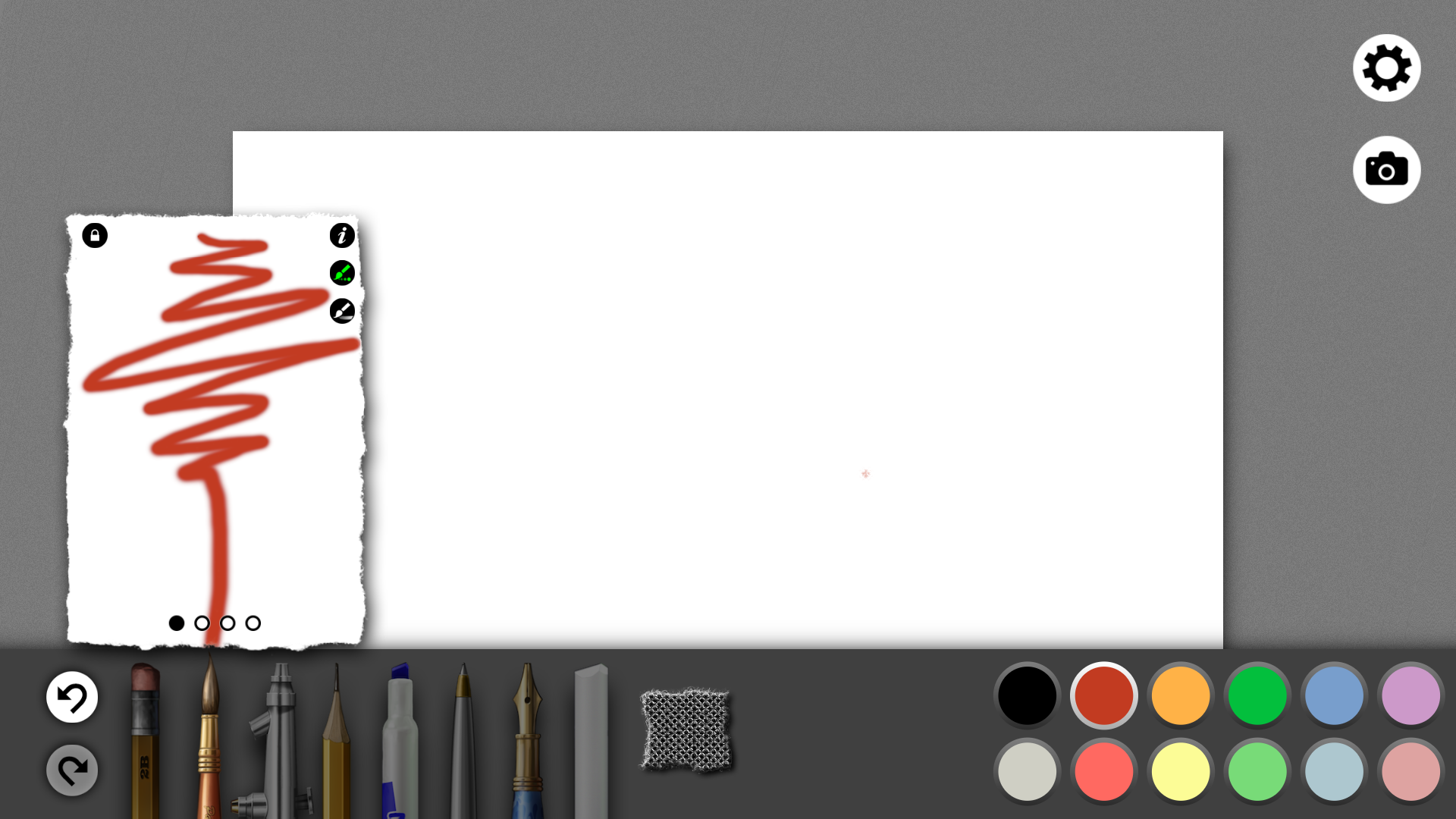
Each Sketchable project begins as a 10-page sketchbook. The are 18 default cover options currently available. The camera icon on my version is ghosted, but I assume the ability to customize covers is in the works.

Each Sketchable project begins as a 10-page sketchbook. The are 18 default cover options currently available. The camera icon on my version is ghosted, but I assume the ability to customize covers is in the works.

Once inside a sketchbook, the UI is very simple. Settings and camera/picture load options are on the top right and tools, paper texture and color palette is on the bottom. The free version ships with only the eraser and brush. All other tools (inclu…

Once inside a sketchbook, the UI is very simple. Settings and camera/picture load options are on the top right and tools, paper texture and color palette is on the bottom. The free version ships with only the eraser and brush. All other tools (including the color picker!) are sold seperately in-app. Total cost is $11.99

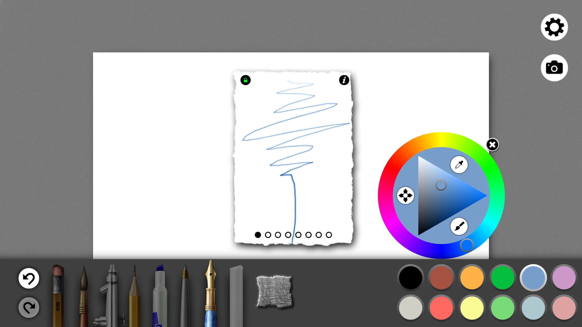
Double tapping on a tool brings up one of the presets. Most tools come with four presets but these can be modified or expanded by the user. Selecting the brush icons allows you to change the stroke interactively. The lock prevents further changes to…

Double tapping on a tool brings up one of the presets. Most tools come with four presets but these can be modified or expanded by the user. Selecting the brush icons allows you to change the stroke interactively. The lock prevents further changes to the preset.

The info button brings up a long list of customization options. Shown above are just a few of the settings for the brush Diameter. Unfortunately because they're shown in this windowed format, going through all the settings requires a lot of scrollin…

The info button brings up a long list of customization options. Shown above are just a few of the settings for the brush Diameter. Unfortunately because they're shown in this windowed format, going through all the settings requires a lot of scrolling. I also didn't like the value sliders. It's very difficult to dial in a precise number. Hopefully in future revisions, the developers can move some of these settings to Charms.

There are 18 standard paper textures, each with its own set of customization options.

There are 18 standard paper textures, each with its own set of customization options.

Screenshot (35).png

Even the color picker is sold separately.

It’s taken me a while to get down to writing this review of the Lenovo Thinkpad Yoga because I know a lot of you are hoping that this convertible laptop addresses all the shortcomings of the Surface Pro while answering all of your artistic mobility dreams.

So, to cut to the chase: the Thinkpad Yoga is a very capable device for creative users, but it isn’t perfect.

Instead of offering a lot of technical details, I’m going to focus on the Thinkpad Yoga drawing experience and how it compares to the Surface Pro and other Windows tablets I’ve acquired over the past year.

The Display

The 1.9-inch diagonal size advantage that the TPY offers over the Surface Pro makes a significant difference. Even at its default scale, crowded desktop apps like Photoshop CC are easier to use on the 12.5-inch display. And if you run the UI scaling hack we posted here, Photoshop is even easier to use.

However, if you’re not a Photoshop user, the additional real estate may not be worth the decrease in portability vs. the Surface Pro.

If you don’t like reflective displays or want to occasionally work outdoors or in brightly lit environments, you’ll appreciate the Thinkpad Yoga’s matte screen finish, which diffuses reflections.  But the coating also makes colors less vibrant to my eye and type appears somewhat fuzzy or muddy. I tried to capture the difference on camera, but my iPhone 4S is not up to the task. According to one reader, the Thinkpad is only able to display 75% of the sRGB color space. I don't know much about the subject, but it does appear that colors are muted compared to the glossy displays of the Surface Pro and Sony VAIO Flip 15A.

In the following screenshots I attempted to demonstrate the color, brightness and reflectivity differences in different lighting conditions. All shots were taken with the devices at maximum brightness.

The matte coating on the Lenovo screen diffuses reflections vs. the sharp reflections on the Surface Pro 2 display.

Laying flat in tablet mode, the reflections on the Surface Pro's bezel are even more distracting than on the screen itself.

The Digitizer

The drawing experience on the Thinkpad Yoga is comparable to any other Wacom-equipped tablet pc. Like many of you who’ve had troubles with Wacom tech on the Surface Pro and other tablets, I’ve encountered several annoyances along the way that I’m forced to work around.

I’ve been unable to get either the touch or pen calibration set up 100% perfectly despite running both the standard and Wacom calibration tools dozens of times. Installing Wacom’s feel drivers deletes the standard calibration settings, but I was able to confirm that the problem I describe below isn’t introduced by the Wacom drivers.

The problem I’ve encountered is that pen alignment and touch don’t match. If I tune the calibration for pen accuracy, the screen won’t respond to taps along the bottom edge of the display so I can’t unhide the desktop taskbar.

I’ve ended up compensating for this by purposely tapping just below the bottom points in the Wacom calibration tool. Now taps on the bottom edge are recognized but there is a one or two pixel drift in cursor accuracy as I move the pen up the screen.

If Wacom ever gets around to releasing a calibration tool with more than four points, it should be easier to limit that drift to the very bottom of the screen.

Based on reading the community’s experience with the Surface Pro, it’s clear that digitizer accuracy varies from machine to machine, so please don’t assume that all Thinkpad Yogas will display this same behavior.

The Stylus

Not much to say here. It’s a tiny pointer that will do in a pinch, but will otherwise stay in its silo forever.

The screen’s matte coating interacts with your pen’s nib very differently than the Surface Pro’s glass. The soft felt nibs I prefer on the SP offer a little too much resistance and feel slightly waxy. Hard plastic nibs don’t feel quite as slippery as they do on glass.

Thanks to the TabletPCReview forum reader who first suggested I try the Fujitsu stylus, I also purchased a set of flex nibs to try. These are black with a white rubberized tip and to paraphrase Goldilocks feel “just right” when sliding along the Thinkpad Yoga’s screen.

All the Surface Pro compatible pens I’ve tested work equally well on the TPY, although they also may require recalibration for best results. This shouldn’t be a problem for most of you who may have one or two at your disposal. I’m sure I’m unique in having 10(!) pens to choose from.

The weakest aspects of the Thinkpad Yoga are its clickable touchpad and the stylus which makes a very poor drawing instrument compared to full size pens.

The Form Factor

I expected not to like the feel of the keyboard behind the screen while in tablet mode. And, while it’s not ideal, I find it’s not as distracting in practice as I thought it might be.

I think this is because the size and weight of the Thinkpad Yoga forces you to either cradle it on your forearm or rest it on your lap. It would be very taxing to hold the convertible for long with the keyboard resting on your hand. My average sized hand covers the entire back of the Surface Pro, but it only extends to about two thirds of the Thinkpad.

The clickable touchpad doesn’t lock when in tablet mode, but I find that’s only distracting when I try to draw in portrait orientation. Then either my fingers or palm are certain to come in contact with it, causing the occasional errant click. The system doesn’t recognize the click, so it’s not really a problem, but it just feels wrong.

Though not as distracting as I'd feared, the keys can still be depressed slightly while in tablet mode. As seen here in portrait orientation, your fingers or palm are more likely to accidentally press the clickable touchpad which doesn't lock in place.

While in tablet mode, you’ll also need a bluetooth keyboard around, at least until someone develops a Thinkpad Yoga-specific ArtDock. With the Acer and Sony convertibles I’ve used, you can always lift up the screen to access the keyboard in a pinch, but the Yoga design makes it all or nothing.

The biggest design flaw of Thinkpad Yoga is the location of its fan vents.

The vents are located at the back of the keyboard, which theoretically blows the hot air away from you while in laptop mode. In practice, this is not always the case. For instance if you’re in bed and like to prop the keyboard up on your knees, the fans will blow right into your legs. Or worse, ventilation will be obstructed by your bed covers.

In tablet mode, the vents blow into you unless you rotate the tablet upside down: with the home button up and the camera lens down.

And the vents can get hot. Not scalding like the bottom of my 2008 MacBook Pro, but uncomfortably warm.

Pictured side by side with the Surface Pro. The Thinkpad Yoga is too large to hold in one hand. In this orientation, the fans point downward and will blow hot air into your body as you hold it.

Despite moving a lot of hot air, the fans are very quiet and seldom noticeable. When compared to the Surface Pro, however, the fans are definitely louder. To stress the CPUs, disks and graphics hardware, I ran Passmark’s Performance Test 8 and while the Yoga’s fans were audible throughout half the tests, the Surface Pro 2 remained silent.

Fit & Finish

Like most Lenovo products, the Thinkpad Yoga won’t win any design awards. It’s a utilitarian device that feels solid and built for durability.

It avoids some of the sharp edges of the Surface Pro and the magnesium alloy finish resists fingerprints and smudges.

The keyboard feels great and is certainly one of the most popular features for road warriors. I really don’t like the clickable touchpad which feels cheap and flimsy. I don’t know what Lenovo’s reliability record is for this touchpad design, but I worry that it will be the first thing to go.

The keyboard also features the signature red Lenovo TrackPoint touching stick which is fairly redundant on a touch screen, but can be mapped as a middle mouse button. I haven’t tried this but that is a nice feature if you need it.

As I mentioned in my unboxing, my Thinkpad Yoga has a small defect in the upper right corner of the screen. There is a bit of tape or something sticking out between the display and the matte coating. It’s no big deal and I’m not going to risk cutting it off, but a $1735 retail device shouldn’t have such an obvious manufacturing flaw.

In laptop mode, the screen is quite springy. The slightest tap will start it wobbling.

The power button on the right side of the keyboard is very small and hard to find without looking.

Performance & Battery Life

 Several of you requested that I run extensive benchmarks and software tests on the Thinkpad Yoga, but I’ve been unable to do so. There are a lot of hardware dedicated sites that do that sort of thing all the time and you’re likely to find more reliable results there anyway.

Using the aforementioned Passmark benchmarks, the Thinkpad Yoga scored 1944 vs. the Surface Pro 2’s 1975. Clearly the Core i7 in the TPY doesn’t make a huge amount of difference in the overall rating.

In practice I found the Yoga to be equal to the Surface Pro 2 in all respects, except for occasional stutters while using Clip Studio Paint 1.27. I’m not certain what to attribute those hiccups to; there may have been background activity going on that I was unaware of, but these delays only lasted a second or so. I did have one freeze that cost me an hour’s worth of work on CSP that may have been caused by a loss of network connectivity.

Some users have complained of weak wi-fi signal, but I can’t confirm that. Running a couple of speedtests side by side didn’t show any difference between the two systems.

I haven’t run the Thinkpad Yoga all the way down to zero battery, but it took about five hours to go from 100% to 10% remaining, all while working in Clip Studio Paint.

Conclusion

So is the Lenovo Thinkpad Yoga perfect? Far from it. Is it better than the Surface Pro 2? Not really, given the price difference.

But if your top priority is screen size in a Wacom penabled device, the Thinkpad Yoga is your best option for the moment. We’ll see what manufacturers have up their sleeves in a few weeks at CES 2014.


Posted
AuthorRick Rodriguez
16 CommentsPost a comment