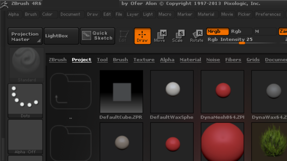
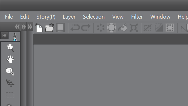
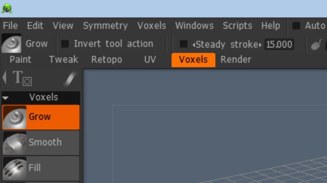
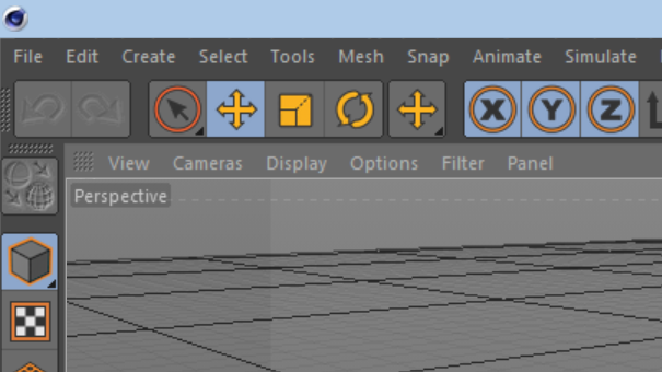
After running this blog for a few months and installing and trying out nearly every graphics app available in Windows, I sometimes feel like I've been trapped in the Surface Pro's "Bermuda Triangle."
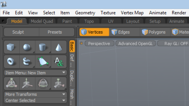
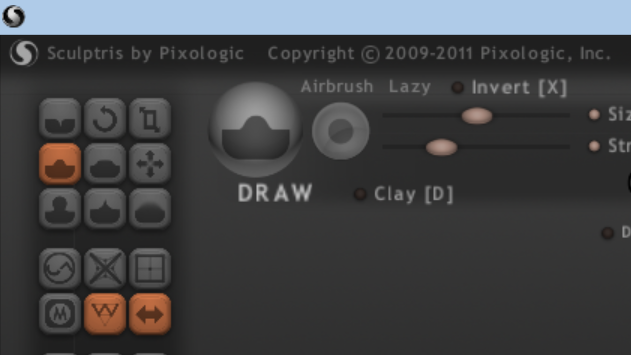
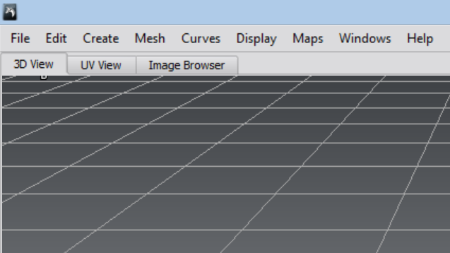
What's that, you ask? It's that dreaded upper left corner where UI designers seem to love to pack more targets per square pixel than anywhere else on the screen.
This Triangle has existed as long as I remember running paint programs (Deluxe Paint 1.0 on the Amiga 1000). But even though my monitor was only 13-inches in diameter, the Amiga's low resolution 320 x 200 display made it easy to distinguish between the file menu and the first icon in the toolbox.
Over the years, as screen resolution increased, monitors grew too, so precisely pointing to a teeny tiny icon on the screen became second nature.
But now the Surface Pro has me working on the smallest screen I've ever used and the machine's otherwise excellent 1920 x 1080 resolution renders some toolbox icons less than 1/10th of an inch tall. And that wouldn't be so terrible, if they were not also stacked immediately on top of one another. The problem is compounded in the Triangle, with these icons butting up against the menu bar and any other toolbars and items the programmers choose to display there.
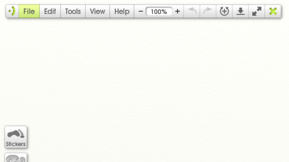
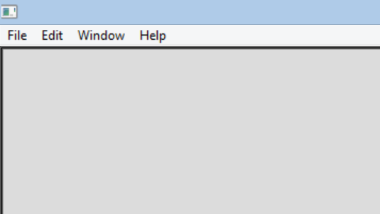
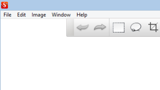
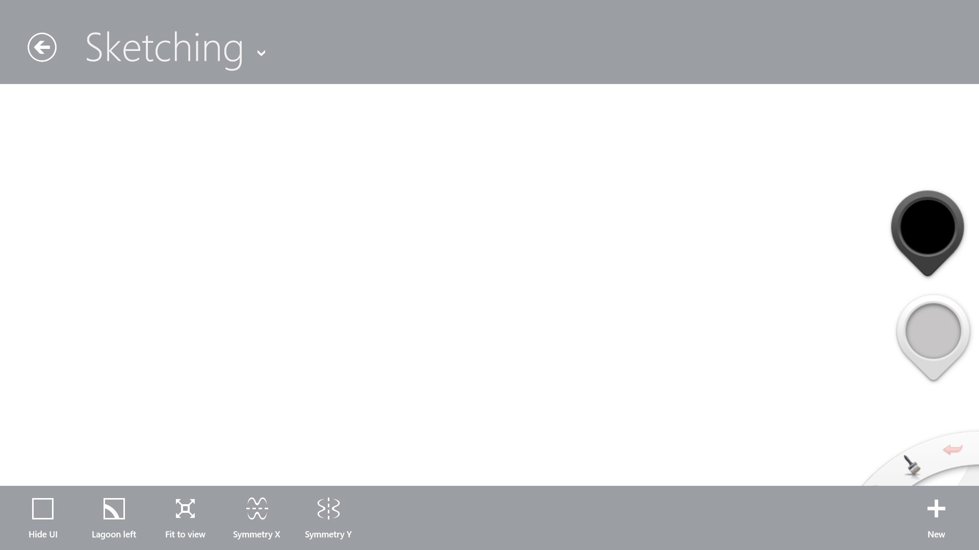
Depicting this problem accurately is difficult to do on a website that is likely being viewed on a larger screen monitor, but the following screen pics should at least highlight how much designers are trying to pack into a tiny amount of screen real estate. I also highlight a couple of apps that allow this area to breathe and (hopefully) point to the future as more companies adapt their programs for the "post-PC" era.
Please share your experiences and thoughts in the comments section below!


