Surface Dial: must-have peripheral or novelty act?
Although I have a Surface Dial due to arrive soon, bundled with my new Surface Studio, I decided to buy a standalone peripheral when it went on sale recently.
The $99 Surface Dial was the surprise star of the Surface Studio unveiling (take a look at any of dozens of reaction videos available on YouTube) and I was eager to see how functional it was on existing PCs.
An upcoming firmware update to the Surface Pro 4 and Surface Book will enable on-screen use on those devices, but the Dial already works in desktop mode with any Windows 10 PC with Bluetooth. To confirm this, I also tested with a Huawei MateBook.
Although the on-screen usage in novel, I think most users will opt to use it next to their tablets, because the Dial’s size makes it impractical to keep on the display for long, taking up too much real estate. The Dial also has the annoying habit of sliding down the screen even on the mild incline of the Surface Pro.
Roughly the size of a paperweight, the Dial reminds me of a tuner knob on a radio or stereo console.
You won’t feel any physical clicks as you rotate the Dial, but you will get haptic feedback as you “tune” from one command to another. Pushing down on the Dial to select a command also provides a haptic response.
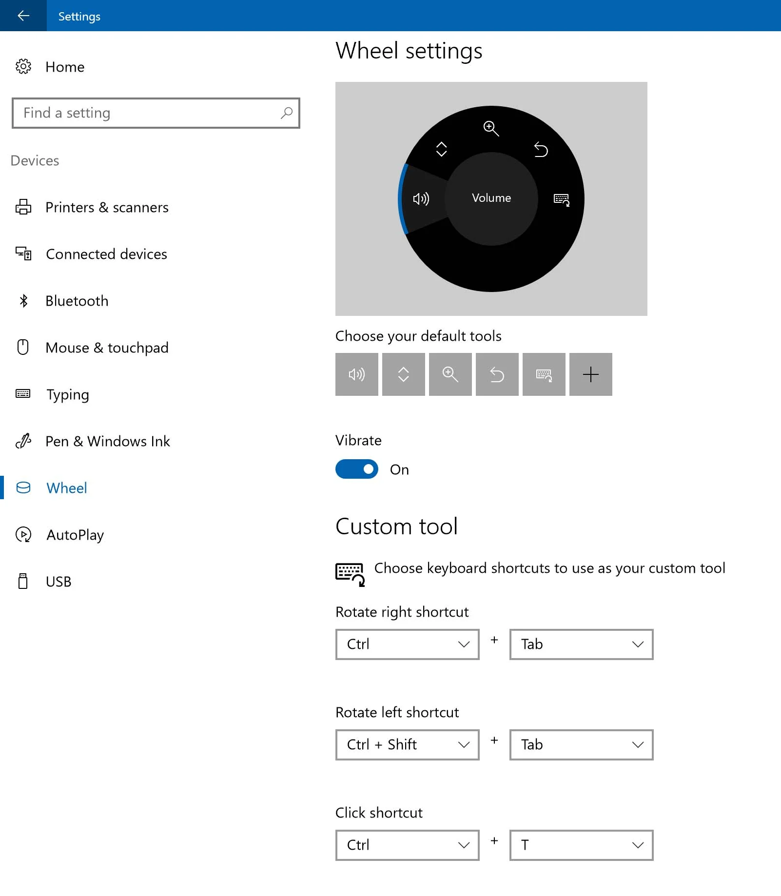
The Dial offers five standard commands that are available system-wide and a customizable command for keyboard shortcuts. These OS level options can be changed (as shown above) in Windows Settings> Devices> Wheel. (Someone from Microsoft marketing needs to tell the OS coders of the name change).
Even with all commands configured, not all commands will show up at all times, as the operating system will generally offer only those that are available on the given screen. For example, pushing the Dial on the desktop only shows the volume and brightness commands.
When you activate the Dial within an application that supports it, those commands can override all of the settings you set at the OS level. This works well in practice, but it limits the functionality of the Dial as well.
An obvious use of the Dial might be to access on-screen toolbars created with something like Tablet Pro or Toolbar Creator. But with applications being able to override control, such a utility would only work for software that doesn’t yet support the peripheral. Perhaps in future updates, Microsoft could enable a “manual override” option.
There’s something very elegant about the dial command interface and I think it could point the way to much less cluttered UI design (assuming developers are able nest commands several levels deep).
Microsoft lists the following apps as ready for Surface Dial: Sketchable, Mental Canvas, Drawboard PDF, Moho 12, StaffPad and Bluebeam Revu. Additionally, Plumbago, Sketchpad, Word, Excel, Powerpoint, OneNote, Maps and Groove Music all offer some Dial functionality. I tested many of the creative applications and found that the degree of implementation varies widely.
Sketchable's Dial control menus.
The default brush control is brush tip diameter.
Sketchable
The program with the most sophisticated set of Dial controls is Sketchable from Silicon Benders, which offers controls for navigation, HSB and RGB color palettes and brush settings.
I find the palette controls redundant with Sketchable’s native shortcut panel (which looks remarkably similar to the Dial menus). It would be nice to see the two combined or at least have a way to turn off the native shortcut panel while the Dial is in use. Similarly, the navigation controls are just as easily performed with two finger gestures.
It’s in the brush settings that the Silicon Benders team have gone out of their way to add Dial controls. By default, the brush control dials diameter up and down. But by accessing the Sketchable preferences (right), you can choose to “speed dial” 11 additional brush attributes: stroke opacity, tip opacity, tip rotation, tip roundness, flow, feather, penetration, spacing, scattering, bleed and resaturation.
With so many parameters to set, you will find yourself clicking the Dial often to get to the desired function. I’m a bit too left-brained to get the most out of this level of variability. I prefer to lock in a value numerically and rely on it not changing the next time I go to use it. But if you’re a more experimental type, I think the happy accidents that these fluid controls provide may delight you.
As with the shortcut menu, I’d prefer to see more of the Sketchable UI available in Dial form, hiding redundant controls from view, especially brush preset selections that are currently parked along the bottom on the screen.
Mental Canvas Player
The Mental Canvas Player app is a viewer for interactive content created on the as-yet-unreleased Mental Canvas Authoring system.
That software will enable users to create 2D sketches and assemble them within a 3D space. The concept is intriguing and the demo scenes are fascinating, but Dial functionality is quite limited.
Rotate the Dial to move to the creator’s bookmarked views, click to play the animation and click again to pause.
It’s unclear whether the Dial will play a role in the authoring system.
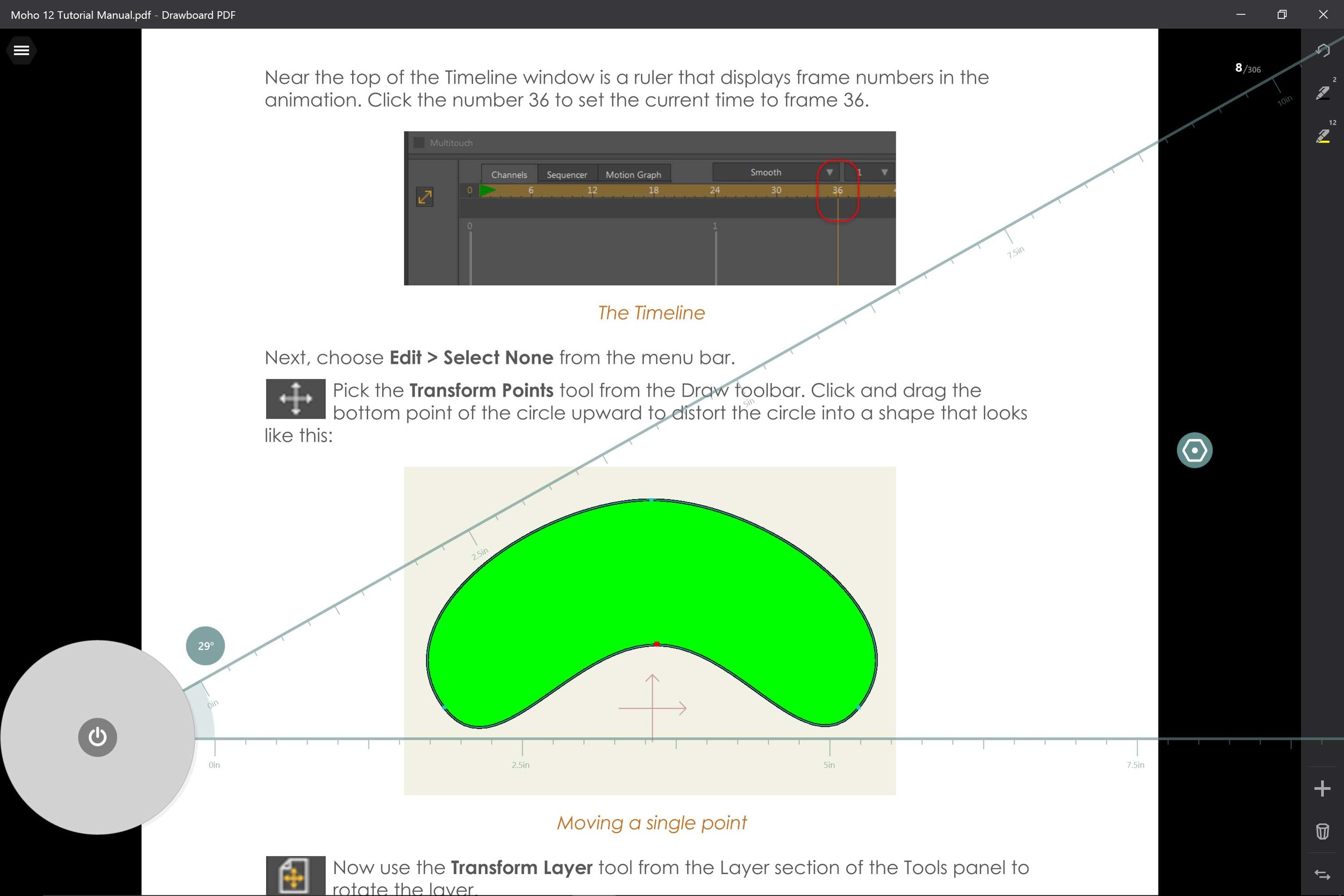
The Drawboard PDF protractor and ruler is very elegant and easy to manipulate with the Dial, although I wasn't able to figure out how to move its origin from the default location.
Drawboard PDF
Drawboard PDF is a PDF viewing and annotation app and its Dial controls are the only ones I encountered that overflow onto a secondary set of menus. If you neglect to dial over to the < or > commands, you’ll miss them.
App specific controls allow you to rotate the PDF, use a protractor tool, add rules and gridlines, and select pen line widths.
As with other protractor tools in Windows 10, the Dial rotates in one degree increments. It would be great to add modifier functions in order to rotate the degrees in finer increments or in 10- or 15-degree chunks.
I also couldn’t divine how to move the protractor origin from the lower left corner of the screen.
Besides offering intuitive timeline controls, the Dial allows you to cycle through Moho 12's bones which can be difficult to select manually.
Moho 12
Moho is the animation program from Smith Micro formerly known as Anime Studio. With its recent update to version 12.2, the software also integrates vital Dial controls.
I first learned to edit video in the old analog days where a knob was used to fast forward and rewind. In the transition to digital editing, mouse control of a timeline made for a very poor substitute when desiring to advance video a frame at a time or rock back and forth over an edit.
Using the Dial to control Moho’s timeline was the first time in my testing where the analog device made absolute sense. There is no new muscle memory to develop: turn the knob right, you go forward, turn to the left you go back. Clicking plays and pauses.
I can’t wait to see video editing applications like Adobe Premiere Pro adopt the Dial interface.
Moho also allows users to cycle through smart bones with the Dial. This is definitely a useful feature as it’s sometimes difficult to pick a bone that might be obscured by another one in the rig.
The other Dial functions zoom and rotate the canvas and set brush stroke width.
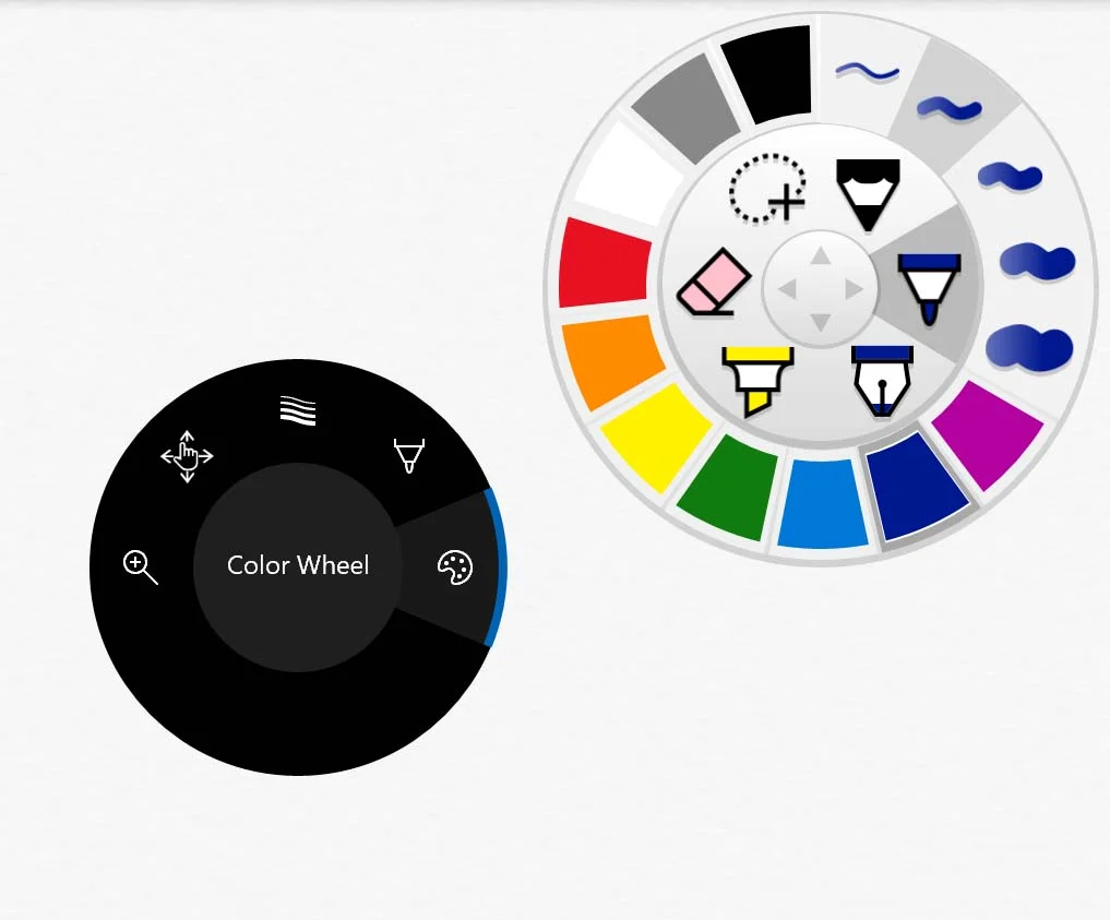
Plumbago's wheel UI is already efficient and the Dial controls are redundant.
Plumbago
Plumbago is the Microsoft Garage sketching and notetaking app. It also features a wheel interface UI that the Dial can control.
Selecting Tool Size, Tool Picker or Color Wheel and then rotating dials through the small number of options in the standard menu. I frankly found the experience totally redundant. It’s much easier to just tap on the item and option you want and move on.
And like in all the programs, panning and zooming is much better with gestures than with Dial control.
The Dial makes it easy to rotate the Sketchpad ruler to exact increments.
Sketchpad
The new drawing utility that was introduced with the Anniversary Update, Sketchpad is accessed via the Ink Workspace.
The Dial allows you to select Pens (something easily accomplished by tapping directly). Selecting Size opens the current pen’s palette and size settings. With the settings panel open, the Dial options change to allow you to either manipulate the size slider or cycle through colors.
If you open the on-screen ruler, the Dial allows you to rotate it in one degree increments.
With Undo selected on the Dial, you can move through your drawing history. Unfortunately, strokes pop on and off. It would be great if strokes could be traced on and off.
OneNote
Only the standard OS Dial controls are available on the desktop version of OneNote, but they all work well.
The OneNote app includes a Playback function. You can either rock back and forth with your Dial or click to play and pause. This is a fun feature, but strokes pop on and off instead of tracing themselves. The latter would be much more instructive for drawing playback or emphatic text.
Conclusions
The Surface Dial is an interesting new addition to the desktop and points the way to more streamlined and intuitive user interfaces moving forward.
However, with the exception of timeline control, none of its current functions are “must haves” and many feel like novelties.
Artists who are either more coordinated or who like to experiment with line widths and brush settings as they draw may disagree, but I’d advise waiting a few months to see how other developers implement the Dial before spending $100.


