The Brad Colbow video review I embedded yesterday freaked me out. Brad's video depicts tremendous, unacceptable lag in Photoshop and worse, he identified a stroke tapering behavior that is impossible not to notice. Could I really have blown my m3 Surface Pro 4 evaluation so badly?

So I overcame my usual aversion to recording my scribbling tests and here's the verdict: guilty. The lag and tapering are definitely there, not only in Photoshop but in Clip Studio Paint as well.

The good news is that I think I can argue for a pardon, because as I demonstrate below, the problems manifest themselves in a drawing style that is foreign to me.

You have to use a lot of pressure to see the tapers. As you'll see in the videos below, I sketch very lightly and even the 60 pixel brushes that I'm using in both applications show up more like 12 px strokes. While the strokes are still tapered at that size, those tapers seem a lot more natural than they do at full size.

You'll note that as I'm scribbling very quickly, both applications have no trouble keeping up. It's only once I try to achieve maximum pressure that there's a discernible delay for Photoshop especially to complete the stroke.

In the first wobbly video (it's hard to draw while trying to frame the shot with the your free hand!), I adjust the pen pressure in the Surface app. Brad's video captured the problem with stroke tapers here as well. Despite my best efforts, I don't see them except for a couple of strokes in the video thumbnail.

This test of the m3 Surface Pro 4 attempts to show the stroke tapering issue identified by Brad Colbow in his video review. But try as I might I can't reproduce the tapering on most strokes. What's up with that?

The next test is in Clip Studio Paint Pro and demonstrates the speed and fluidity of that program on the m3 Surface Pro 4. Tapers are barely perceptible at the ends of thin strokes. It's only when I try to get 100% pen pressure that I get the little pinch at the end of the stroke.

Stroke tapering and lag are a lot less apparent in Clip Studio Paint than in Photoshop. This is a 3000 x 2000 canvas at 300 dpi. The SP4 has no trouble keeping up with my light, fast strokes. It's only when I press very hard that the stroke tapering becomes very apparent.

Hopefully the video below illustrates why I missed the lag in my written review. You hear an audible click every time I force the pen down with maximum pressure. It's a totally unnatural amount of force for me. It's also unclear how much of the lag is being contributed by Photoshop not being optimized for the new sixth generation M3 processor and its Intel HD Graphics 515 GPU.

Why my initial testing failed to spot the stroke tapering and lag: I tend to draw lightly and when I test, I'm seeing whether tablet can keep up with my light strokes. This is a 3000 x 2000 canvas at 300 dpi. The lag is evident when I press much harder than I normally do.

So from what you see here, is the tapering a deal breaker? It's definitely not ideal and may be something that can be corrected in a future update. I certainly can live with it and compensate for it. Let me know if you could do the same in the comments section below.

As for the Photoshop lag, it's harder to say whether this is a hardware, driver or software issue. The lag is present whether I turn gpu acceleration on or off. Once again, I can work around it. I don't use Photoshop for drawing anyway. But can you?
Posted
AuthorRick Rodriguez
Categoriesnews, reviews
18 CommentsPost a comment

Illustrator Brad Colbow's video reviews are always good for their mix of information, insight and humor. He just posted his review of the m3 Surface Pro 4 and has scenes of it running Photoshop, Illustrator and Clip Studio Paint.

This is the same model that I glowingly reviewed yesterday and his results are radically different than mine. Although he is surprisingly positive on the product, I could never recommend the entry level SP4 if it was as laggy as he demonstrates here. Even stalwart CSP looks like it's having trouble keeping up.

I've asked Brad to share his exact settings so that I can try to reproduce his configuration (and the troubling strokes that he illustrates at about the 6:30 mark). I'll update my review or this post once I determine whether they are reproducible. 

Now that I've had more time with the Surface Pro 4 I've put together a more comprehensive review.

If any of you have seen similar behavior, please let me know in the comments section below.

Posted
AuthorRick Rodriguez
Categoriesreviews
22 CommentsPost a comment

This blog entry was supposed to be my promised Surface Book review. But fate intervened and I received a device that was highly unstable, suffering from frequent lockups and even a few BSODs.

If you follow my Twitter feed, you’ll know that I tried everything I could think of to correct the freezes, but after three days of utter frustration, I decided to return the Surface Book to my local Microsoft Store.

The new Microsoft Surface Pen and replacement nib kit retails in the US for $60. A standalone nib set is available for $10. The pen is compatible with the Surface Pro 3 and other N-Trig DuoSense2 devices. The nibs will not fit in other pens.

The new Microsoft Surface Pen and replacement nib kit retails in the US for $60. A standalone nib set is available for $10. The pen is compatible with the Surface Pro 3 and other N-Trig DuoSense2 devices. The nibs will not fit in other pens.

Ignoring telephone support may have been a mistake because several others who were having similar issues were able to get replacement units after troubleshooting via phone. By the time I decided to try to swap out my machine in person, I was told that the soonest I could expect a replacement was mid-December.

I opted instead to ask for a refund and will sit on the sidelines to see how quickly Microsoft can address the lingering issues with their new flagship product.

There’s much to like about the Surface Book and I’m fairly certain that my review would have been relatively glowing were it not for the hardware issues I encountered. Although all reviews I’ve read have mentioned some niggling problems, no major reviewers have complained about frequent lockups. So I will assume that mine was an isolated, though not entirely unique, case. The "Surface Book is Freezing" thread on Microsoft’s support forums is currently well over 300 posts long. http://answers.microsoft.com/en-us/surface/forum/surfbook-surfperf/surface-book-freezing/9889417d-32ff-46c7-8be5-5ce8b92799b6

So despite my frustration with the Surface Book, I was despondent to let it go. To console myself, I decided to apply a small portion of my refund to a new Surface Pro Type Cover ($130) and Surface Pen ($60).

The new Type Cover is outstanding: a huge step up from the last generation. I’ll have more to say about it during my Surface Pro 4 review.

Although I still have the new Surface Pen that came with the Surface Pro 4, I was eager to try the new nib set bundled with the replacement pen.

On the basis of my in-store testing, I’ve already advised several readers and Surface Pro 3 users to skip an upgrade to the new tablet and opt for a peripheral upgrade instead. Although the new pen won’t give SP3 owners any additional pressure sensitivity, I do believe the new nibs and eraser tip are worth the money if, like me, you like a little more “tooth” or friction from your pen nib.

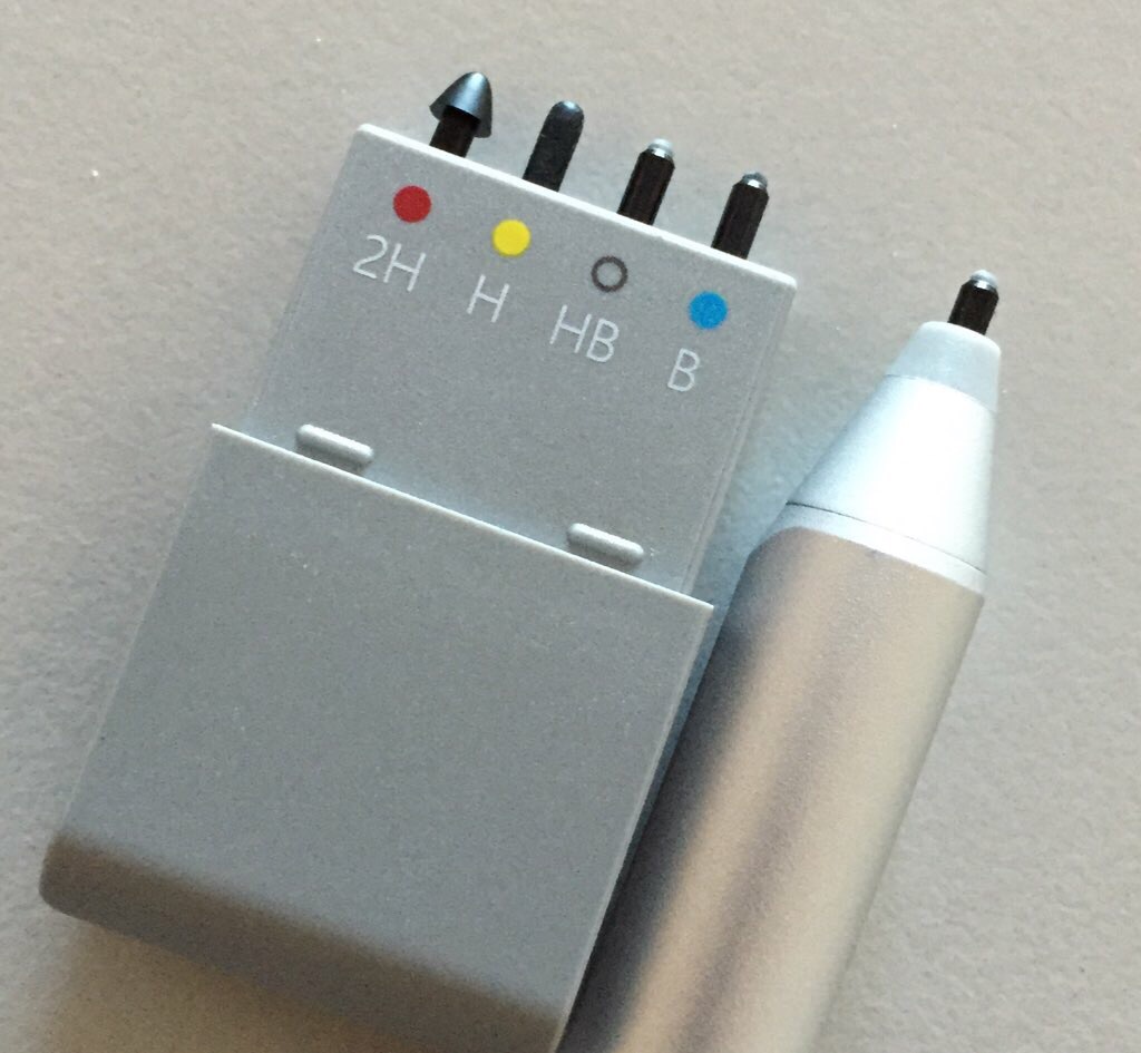
The replacement nib set (right) includes four nibs of varying hardness, from 2H (very hard) to B (very soft). The standard nib in the Surface Pen is HB. The H nib approximates the hardness of the Surface Pro 3 pen. The replacement pen included in the set is also equipped with its own HB nib.

The nib set includes four nibs of varying hardness. The pen is supplied with its own HB nib.

The nib set includes four nibs of varying hardness. The pen is supplied with its own HB nib.

That standard nib is such an improvement over the slippery "plastic on glass" response of the Surface Pro 3 that I believe most users will be very happy with it. However, I found the B to be even better, approximating the toothiness of the Wacom Stylus Feel nibs I still recommend for the Surface Pro 1 and 2 and other Wacom EMR tablet PCs.

The 2H and H nibs are so hard that I don't see ever using them myself. Perhaps artists doing very fine line drawing may appreciate the hardness. I tested the nibs on one device with a Photodon MXH film screen protector and found the H was acceptable on it, but I still preferred the HB. This is all a matter of personal preference of course. You may reach an entirely different conclusion.

When the Surface Pen is used against a new Surface Pro 4 or Surface Book, it provides naturalistic feedback as pressure is applied. You can feel the sensation of the nib moving slightly into the pen body the harder you press.

This isn't the case when you use the new pen on a Surface Pro 3 or other N-Trig DuoSense2 device. Although the nibs feel great, pressing harder doesn't provide feedback. I don't know how Microsoft achieves this trick with their new hardware, but it's very convincing.

Most reviewers have already mentioned the Surface Pen's eraser tip, which really feels like a rubber eraser on both new and older devices. If you like to erase that way, you should really enjoy the sensation.

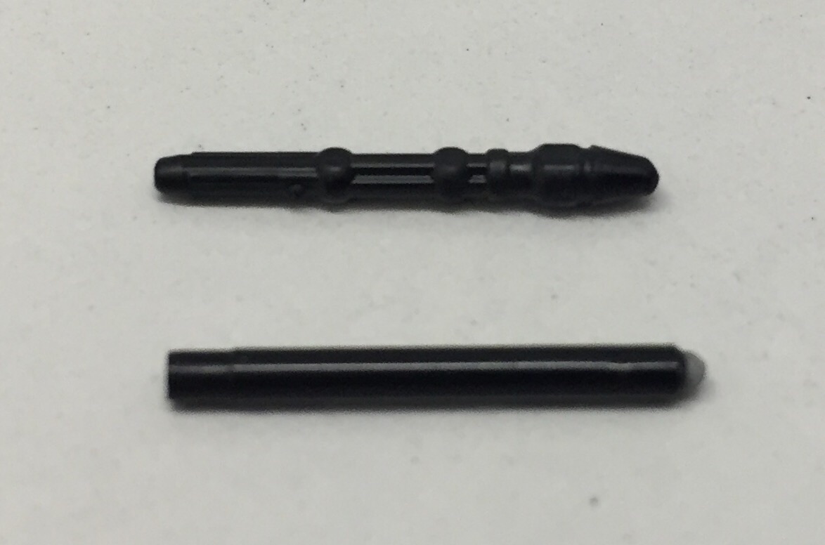
The sculpted Surface Pro 3 pen nib (top) and the new Surface Pen nibs are not interchangeable.

The sculpted Surface Pro 3 pen nib (top) and the new Surface Pen nibs are not interchangeable.

Since the only advantage of the new pen for Surface Pro 3 users is the new nib texture, you may wonder if you can just replace your current pen's nibs with the new generation replacements. Unfortunately, they're very differently sculpted (see above) and the new nib would have to be tapered in order to seat properly into the older pen's body.

Swapping nibs is very straight forward. The nib case itself cleverly doubles as an extractor (see below). Make sure to apply a lot of pressure between your index finger and thumb or the nib will slip. I lost my grip as I was pulling out a nib and lost an HB nib against the gray-black patterned carpeting in my office and it hasn't turned up since.

I hope that Microsoft eventually offers sets of same-hardness nibs. I would hate to pay $10 for a new replacement set when I'm only ever going to use one or two of the nibs.  If any of you reading this prefer the hard nibs to the soft ones, message me and let's create a nib-swapping club!

The bottom of the replacement nib holder doubles as a nib extractor. Apply heavy pressure with finger and thumb or the nibs will slip!

The bottom of the replacement nib holder doubles as a nib extractor. Apply heavy pressure with finger and thumb or the nibs will slip!

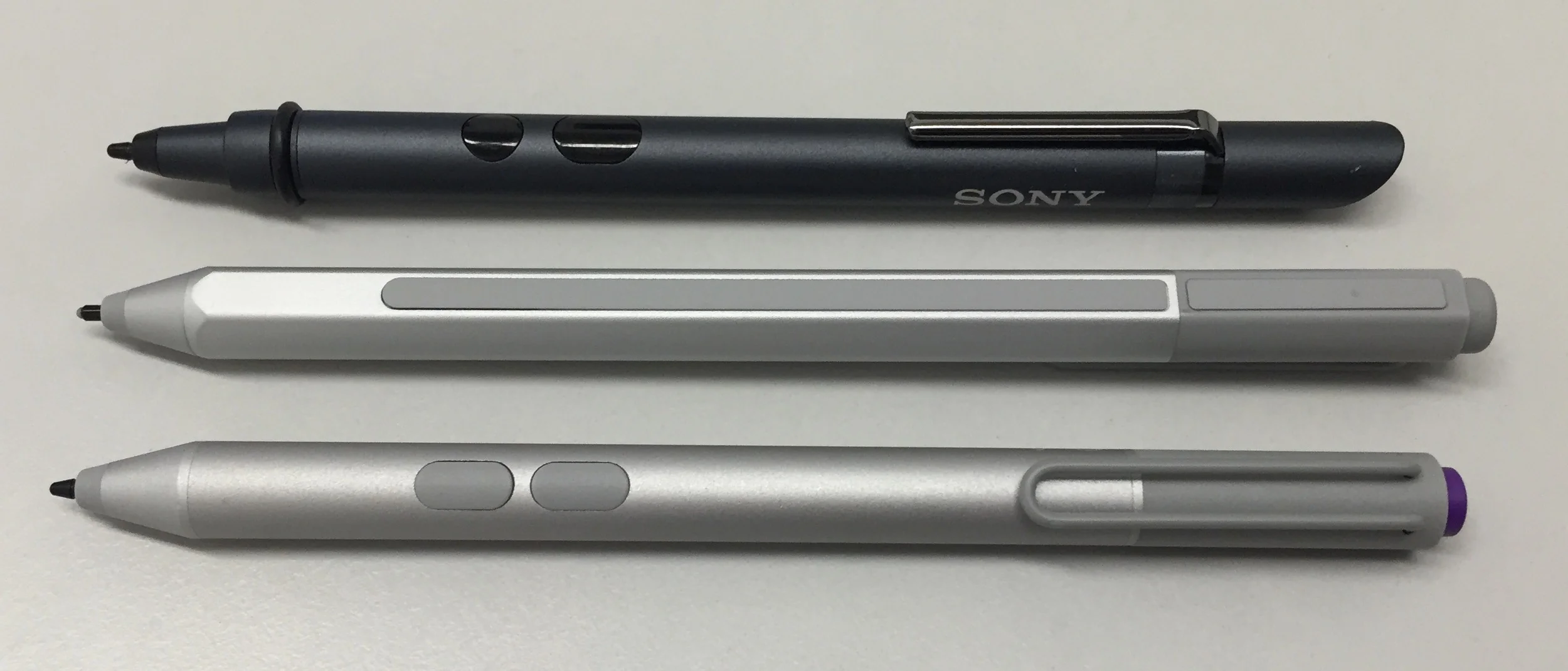
The Surface Pen (middle) is compatible with N-Trig DuoSense2 pens like the Sony Active Pen (top) and the Surface Pro 3 pen (bottom). The new pen has a single side button that is hidden under the tip end of the raised rubber strip located along the p…

The Surface Pen (middle) is compatible with N-Trig DuoSense2 pens like the Sony Active Pen (top) and the Surface Pro 3 pen (bottom). The new pen has a single side button that is hidden under the tip end of the raised rubber strip located along the pen's flat edge.

The new Surface Pen is slightly longer than the Surface Pro 3 pen and it has a flat edge where the single side switch is located. That button is hidden at the tip end of the raised rubber accent strip. As much as I would have liked Microsoft to have kept a second programmable button, the flat edge and rubber strip really make it comfortable to grip the pen and move it with my index finger. Not trying to be cheeky, but the pen really does feel more like a pencil now. 

Unfortunately, the side switch is not programmable; it will only function as a right click.

The eraser tip button has three functions: single-click launches OneNote, double-click triggers a screenshot (a fantastic new feature!) and clicking and holding calls up Cortana.

If any of this functionality is important to you, you'll need to pair your pen via your Bluetooth settings. You won't need to pair the pen in order to just draw with it on your Surface Pro 3 or other N-Trig device.

At the Surface Pen's unveiling, Microsoft indicated that the pen would hold a one year charge. Following that confusing statement, many users who've tested the new pen at a local Microsoft Store or Best Buy have come away convinced that the pen is disposable. That's absolutely not the case. The Surface Pen contains a AAAA battery that should last a year between replacements.

Microsoft has inexplicably changed the the cap design so that the pen is nearly impossible to open unless you know the magic combination. And even doing so, I really worried I was going to break the pen trying to pry off the cap.

As illustrated below, the cap requires an 1/8 of a counter-clockwise turn in order to align a notch in the cap with a contact in the barrel. And it still will require significant force to pull the cap off when it's properly aligned. Putting the cap back on requires carefully aligning the cap notch and  contact.

The bottom line is that this process is so finicky and precise, that I recommend you just bookmark this article now so that you can come back to it in a year's time when you need to replace your pen battery!

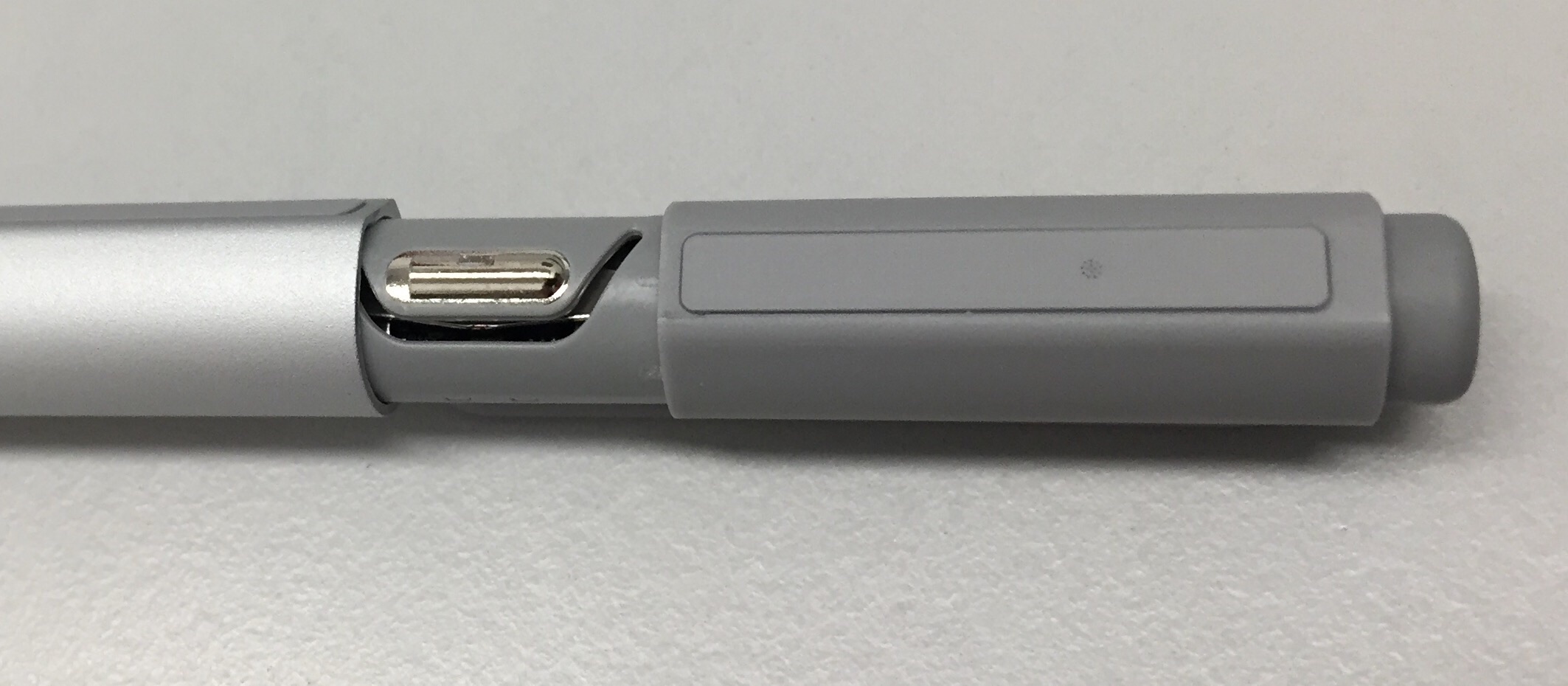
Opening the Surface Pen's battery compartment requires turning the cap about 1/8-counter-clockwise before pulling.

Opening the Surface Pen's battery compartment requires turning the cap about 1/8-counter-clockwise before pulling.

The blurry barrel opening (bottom) contains a notch that must be aligned with the silver contact in the pen cap (right).

The blurry barrel opening (bottom) contains a notch that must be aligned with the silver contact in the pen cap (right).

In addition to testing the pen on the Surface Pro 3, I also tried it out on the VAIO Z Canvas and the Sony VAIO Flip 15A. In both cases, I vastly preferred the quieter soft nibs of the Surface Pen vs. the hard tapping of the VAIO and Sony pens. As I mentioned earlier, screen protectors will interact with your nib texture, so the softness you prefer on glass may be unacceptably draggy on screen protector film.

I really didn't encounter any meaningful difference in drawing results using the new pen and nibs. On the Surface Pro 3, the added friction provided a bit more confidence in my strokes. Conversely, on the VAIO Z Canvas, the added drag introduced a bit more wobble in slow strokes that I ended up rectifying with brush stabilization.

UPDATE: I was asked by a Twitter follower whether the new nibs are susceptible to the same wear as the SP3 nibs. I'm not sure whether later model Surface Pro 3 pens exhibited this issue, but in the early days, the nib would fray around the edges as an outer coating peeled off. The tip wouldn't continue to deteriorate at that rapid rate but that initial impression was very troubling. After about ten days of use, none of my new nibs show any signs of wear.

Ultimately only you will be able to decide whether you like the new nib textures and whether the pen is worth the steep price. But think of it this way: the Surface Pen costs $40 less than an Apple Pencil and the eraser and flat edge are much closer to the feel of a pencil than any pen on the market!

Posted
AuthorRick Rodriguez
Categoriesreviews
38 CommentsPost a comment

To properly judge some devices, you need to place them in the appropriate context.

Before Microsoft unveiled the Surface Pro 4 and Surface Book lines, the VAIO Z Canvas seemed incredibly expensive to me. I was tempted to dismiss the tablet as an ill-timed, overpriced curiosity.

But now that the $2000 Windows tablet ceiling has been shattered, with highest end configurations of the Surface Book going for over $3000, the Z Canvas actually seems--dare I say it?--reasonably priced.

I was also dismissive of the Z Canvas' Haswell (fourth generation) processor until I learned that this quad core Intel Core i7-4770HQ still runs circles around the fastest sixth gen (Skylake) dual core processors shipping inside competing products.

And finally, to compare the Z Canvas head to head with general purpose tablets like the Surface Pro 3 or 4 is probably missing the point, because VAIO is actually targeting users who would otherwise be in the market for specialized devices like a Wacom Cintiq Companion 2.

From a pure power perspective, the VAIO Z Canvas is something of an engineering marvel. The former Sony engineers at the Japanese startup have managed to pack their tablet with a huge amount of performance that also runs coolly and quietly.

And while the Z Canvas still has its design quirks and limitations (like no discrete GPU), it should reign atop the Windows tablet heap for quite some time to come.

Although it's thick compared to other tablets, the VAIO Z Canvas packs a lot beneath the hood.

Although it's thick compared to other tablets, the VAIO Z Canvas packs a lot beneath the hood.

Build quality is excellent. Although the tablet is by no means heavy, it is a solid 2.67 lbs. without the keyboard and .54 inches thick. When attached, the cover adds .75 lbs. and an extra .17 inch.

The left side of the VAIO Z Canvas is chock full of ports.

The left side of the VAIO Z Canvas is chock full of ports.

All the cables connectors will quickly ruin the tablet's clean aesthetics.

All the cables connectors will quickly ruin the tablet's clean aesthetics.

It features a full array of ports along the left side: power, ethernet, HDMI, mini displayPort, SD memory card reader, 2 USB 3.0, and headphone/microphone port.

The Z Canvas can be used in effectively only one orientation and it's unfortunate that power connector is so close to the Ethernet adapter. The two thick connectors are a tight fit in this location and the cables have to be routed under the kickstand to stay out of the way. It would have been ideal to move power to the right side of the tablet.

The Z Canvas has all of its venting along the top, a major improvement over many devices that force hot air into your lap.

On either side of these vents (see above) are two unique hardware buttons: the left button calls up user-configurable on-screen shortcuts while the right button toggles touch on and off.

The right side of the VAIO Z Canvas.

The right side of the VAIO Z Canvas.

The pen clip and pen grip are two simple and useful enhancements.

The pen clip and pen grip are two simple and useful enhancements.

Volume control is on the right side, along with a magnetic slot to hold the pen. But in another smart move, VAIO includes a pen holder which snaps into the slot. There's very little chance of your pen coming loose in your bag if it's clipped into place inside the holder.

Like the Surface Pro, the Z Canvas built-in has a hinge stand, but that's where the similarities end. The tablet is not really designed for "lapability." Instead, the stand will provide a variety of useful drawing angles on a desk.

The back of the VAIO Z Canvas.

The back of the VAIO Z Canvas.

Opening the stand can take some effort. You need to fit your fingers into a slit above the stand edge and apply quite a bit of force to open it. Closing it by hand is also not encouraged. Instead, you should put the stand on a flat surface and push the display into a flat position.  Conversely, when the stand is sitting on a flat surface in even a mostly closed position, it takes almost no effort to tilt the screen to a 90-degree angle.

The VAIO Z Canvas keyboard cover lies completely flat and is always detached while in use.

The VAIO Z Canvas keyboard cover lies completely flat and is always detached while in use.

The Z Canvas keyboard cover is one of tablet's quirkiest design choices. The keyboard is roomy, with good key travel and a large, good-not-great trackpad. But the keyboard lays completely flat and is always detached, so it's not ideally suited for long stretches of typing. I did write this entire review on the Z Canvas, but it was not the most comfortable experience.

When not working at a desk, the ZC is not what anyone would describe as "lap friendly." The large keyboard will lay flat on your lap, but you will need to grip the sharp metal stand between your knees in order to keep the display steady: an awkward, uncomfortable position, to say the least.

Clearly, VAIO intended its Z Canvas for pen users who only occasionally need to tap keyboard shortcuts. I appreciate that the ZC keyboard works wirelessly (not bluetooth) so that it can be stashed out of the way as you work but still function and I have long wished that Surface keyboards would follow suit. However, I think a smaller bluetooth keyboard with a better typing angle (like Microsoft's Wedge Keyboard) is a better approach.

The three-way power switch and power connector

The three-way power switch and power connector

The Z Canvas keyboard has a three-position power switch. The third position disables the trackpad. There is a small power connector in the upper right corner of the keyboard. While it can be charged separately via a micro USB port located along its top edge, whenever the cover is attached to the display, an amber light turns on to indicate that the keyboard is charging.

When it's attached, the keyboard cover is always drawing some power to recharge itself.

When it's attached, the keyboard cover is always drawing some power to recharge itself.

This is a little disconcerting if battery life is at a premium. I haven't been able to verify how long the keyboard charge lasts, but the tablet seems to hold about a six-hour charge with mixed use (high performance mode, web surfing, writing, at various display brightness levels).

One of the biggest selling points of the Z Canvas is its display and it does not disappoint. The 12.3 inch LCD WQXGA+ 2560 x 1704 IPS display boasts a wide gamut display with 95% coverage of the Adobe RGB spectrum. I have no way of verifying this claim, except to say that it looks gorgeous to me.

As I mentioned above, one of the shortcomings of the Z Canvas is its lack of a discrete GPU, but VAIO claims that its 4th generation Intel Iris Pro 5200 offers as much as 3.7 times the performance of the HD4400 processor found in the Surface Pro 3.

I purchased the $2200 "entry" level Z Canvas with 8 GB RAM and 256 GB Storage. The next model up offers 16/512 and a PCI Express x4 SSD upgrade for an additional $300. The top of the line model offers a 1 TB PCI Express x4 SSD for a whopping $3099.

Benchmark results. Click to enlarge.

The benchmarks I ran roundly defeated nearly every mobile device I own to date. (I can't explain the two slightly better scores the Lenovo Thinkpad Yoga 14 got on Fire Strike and Sky Diver). The dramatically better scores in the Geekbench multi-core test are entirely to be expected, given the Z Canvas' two additional cores. I'll include Surface Book comparison results in that review when I publish it sometime in the coming week.

The Z Canvas N-Trig pen is nearly identical to the Sony Active Pen and is compatible with all DuoSense2 devices I've tested. VAIO includes an optional rubber pen grip that I think makes the pen much more comfortable to hold for extended drawing sessions. The two pen side switches can still be accessed through the grip and I find that they are also easier to access this way. The actual pen buttons are almost flush with the pen barrel.

The VAIO Z Canvas pen (middle) is compatible with other DuoSense2 pens like the Surface Pens (3 and 4) and Sony Active Pen.

The VAIO Z Canvas pen (middle) is compatible with other DuoSense2 pens like the Surface Pens (3 and 4) and Sony Active Pen.

The control panel applet contains very limited button settings. You can swap between clearing and right clicking and you can set whether OneNote or the VAIO Clipping tool run when you hover click. There is no eraser tip on the AAAA-battery powered pen.

Button mapping options are limited.

Button mapping options are limited.

Pen pressure settings

Pen pressure settings

Setting tip sensitivity to Normal, Hard or Soft provides three different default pressure curve which you can further modify to your liking. To get the maximum pressure range, I set the tip to Hard. There's an interaction that occurs between this global setting and your favorite paint program that you will need to monitor. If you can set your pressure curve in your favorite software, it might be better to leave your global settings at Normal.

Hard pressure curve

Hard pressure curve

Soft pressure curve

Soft pressure curve

The hardware shortcut menus are accessed by tapping the L button along the top edge of the tablet

The hardware shortcut menus are accessed by tapping the L button along the top edge of the tablet

VAIO and/or Sony clearly worked very closely with N-Trig to get the most out of that tech, which now reaches 1,024 pressure levels. It's unclear whether the improvements in the Z Canvas are the same as those in the Surface Pro 4 and Surface Book, now that Microsoft owns N-Trig. I need to test them side by side when my new Surfaces arrive, but I think the two results are nearly identical.

The biggest drawback of the VAIO pen is its extremely hard nib. If you don't like the feeling of drawing on glass, you probably won't like the Z Canvas experience. I found the loud taps of the pen tip against the glass pretty annoying after a while. A screen protector that helps deaden the sound is almost a requirement. Unfortunately, VAIO doesn't yet offer its factory-installed film in the US and couldn't offer any information on when that option would be available. I tested the VAIO pen on a Surface Pro 3 with a Photodon screen protector and while it doesn't eliminate the tapping, it lowers the volume quite a bit.

The new Surface Pen is also compatible with the Z Canvas and that pen's default nib is much softer and quieter. Once again, I'll need to test more extensively, but dedicating a Surface Pen to the VAIO may be the way to go. (Although the pens are compatible, their nibs are not interchangeable.)

Setting aside my issues with the tip hardness, the pen experience is the best I've ever had on an N-Trig device.

In Clip Studio Paint, with pen stabilization off, there is very little diagonal jitter on slowly drawn lines. Speeding the stroke slightly eliminates it altogether. A stabilization setting of 15 is the most I think I would ever need. By contrast, I would often crank the setting up to 45 on the Surface Pro 3.

Drawing lag is definitely, a software-specific issue. In Clip Studio, on an A4 canvas at 350 dpi, I could draw rapidly with a 500px Colored Pencil brush. In Photoshop CC 2015 on the same size canvas, a 475px textured brush might take half a second to catch up.

Hover lag has been improved, but can still be distracting. If it bothers you too much, I recommend disabling the hardware cursor. In Clip Studio, I change the Cursor preference from Brush Size to Single Pixel Dot.

Software that I find unusable on other tablets is now an option on the Z Canvas thanks to the ability to quickly turn touch on and off with the press of the R button (located on the top edge of the tablet). Sketchbook Pro and ArtRage are among many applications that I never use on other tablets because I'm always leaving stray marks with my knuckle taps.

The L button calls up the hardware shortcuts menu (far left). This overlay is a great artist-friendly feature that eliminates the need for 90% of third-party add-ons like ArtDock, etc.

The second overlay provides quick access to other innovations like fan speed control, color temperature and pen control. The settings shortcut accesses the control panel (below) that allows you to configure your own sets of shortcuts.

The device already includes shortcuts for popular Adobe CC software like Illustrator, Lightroom and Photoshop, as well as Clip Studio Paint, Corel Painter and Autodesk Sketchbook.

All of the preset shortcuts can be customized.


The hardware shortcut keys include configurations for top applications.

The hardware shortcut keys include configurations for top applications.

Limiting the Z Canvas to just drawing is also thinking too small. Based on its benchmark results, the tablet should be ideal for video and 3d applications (except those that use GPU rendering).

If you use one of those applications you'll notice the ZC's fans, because it generally runs absolutely silently. I think I've only managed to get the fans to rev up briefly during the Blender render. And despite its horsepower, the tablet stays pleasantly cool to the touch.

Compared to the Surface Pro 3, the VAIO Z Canvas is much better suited for creative users. Due to its speed, size, advanced features and very quiet operation, the ZC is even worth considering versus the Wacom Cintiq Companion 2. The latter has a slight edge thanks to its additional pressure levels, tilt support and textured screen protector. It is also available for less than the VAIO's steep starting price.

It's a shame that the new Surface releases have stolen so much of the thunder from the VAIO Z Canvas. It truly is an outstanding device that deserves a lot more attention.


Posted
AuthorRick Rodriguez
13 CommentsPost a comment

Because I never saw a big screen I didn't like, I've been anxiously awaiting the arrival of Lenovo's first two Wacom Active ES 2-in-1 convertible laptops, the Thinkpad Yoga 14 and 15. 

Determining whether Windows devices support pen input is rarely easy, but in the case of these new Yogas, it's been downright ridiculous. I first ordered the Thinkpad Yoga 15 in March when it appeared on the Lenovo website. Buried in the specs was a claim of pen support. But I quickly returned it when it arrived with no Wacom digitizer. By the time I submitted my RMA request, Lenovo had updated its site and erased all mention of pen support on the new Thinkpads. Mysteriously though, Lenovo began listing an Active Capacitive Pen for $40 that its specs say is compatible with "all ThinkPad capacitive touch screen enabled devices."

In the three months since my first abortive encounter, I've been visiting the Lenovo site daily waiting for the new convertible to be listed for sale. And I'm not alone, because over on the TabletPCReview forums, the Thinkpad Yoga 15 thread is 65 pages long as I write this! Recently, international posters began reporting having purchased the penabled TPY14, but a 14-inch model has never even been listed in the US.

Thursday night, TabletPCReview regular @soh5 discovered that the Lenovo Thinkpad 14 is now available in the US as a Best Buy exclusive for $999. I followed this link and quickly placed my order and picked it up Friday morning. Although I would have preferred to test a 15-inch model, recent posts lead me to think that the TPY 15 may have been cancelled or is still a long way out.

Unfortunately, Best Buy doesn't offer the Active Capacitive Pen for sale (what a surprise) so I had to order that from Lenovo directly. It will take at least a week to arrive.

Unlike prior Wacom EMR tablet PC pens, it appears that Wacom Active ES pens are OEM specific. My Toshiba Encore 2 Write pen is not recognized on the TPY14, although the convertible laptop definitely lists a digitizer and even includes the Wacom Feel driver pre-installed.

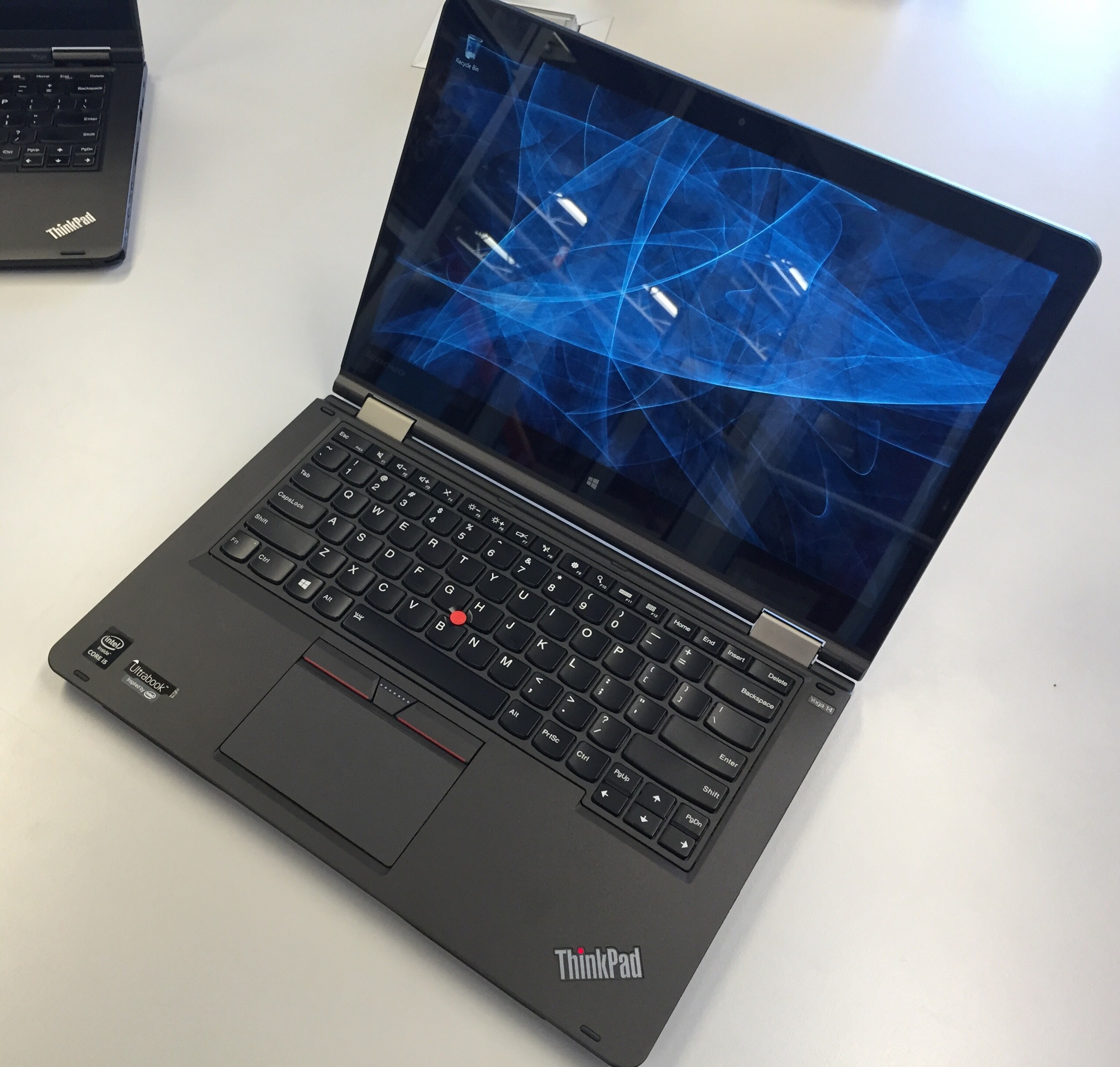
Testing of the pen will have to wait until the pen shows up, but below are some quick first impressions and a size comparison with the first generation Thinkpad Yoga 12.

image.jpg

Despite its relatively low price, the Thinkpad Yoga 14 is a solid, quality business laptop. It features a 2.2 GHz 5th Gen Intel® Core™ i5-5200U processor with a 3MB cache and a Turbo Boost speed up to 2.7GHz, 8GB DDR3L memory, 1 TB hybrid hard drive (5400 rpm) with a 16GB solid state drive as a cache, NVIDIA GeForce GT 940M graphics with 2 GB dedicated video RAM and a 14" LED-backlit high-definition 10-point multitouch display with IPS technology and 1920 x 1080 resolution. 

The TPY14 includes 2 USB 3.0 ports and 1 USB 2.0 port, built-in high-speed wireless LAN (802.11ac), and Bluetooth 4.0.

It weighs 4.18 lbs. and measures just 0.82" thick.

The new Thinkpad Yoga 14 makes an excellent first impression. The display is sharp and bright, unlike the first generation Thinkpad Yoga 12 that has a milky screen protector that makes all images look dull. The keyboard is roomy and the best in class. The touchpad is also vastly improved over the TPY12 which felt slightly wobbly and cheap. The touchpad also features true left and right mouse buttons that  is appreciated. 

image.jpg

Lenovo has eked out another 1.5 diagonal inches out of the display by reducing the side bezels dramatically. You can't really make them any smaller without sacrificing side swiping capability. The TPY14 is just over 13" wide and 9" tall in landscape mode. The first gen TPY 12 approximately 12.25"x 8.5."

image.jpg

It's still a little odd to use the Yoga in tablet mode as the retracted keyboard keys will rest against your hands or knees as you hold it. I much prefer older compatibles like the Sony VAIO Flip and Acer Aspire R7-572 that allowed you to lift the display slightly to access the keyboard. To use the Yoga as a drawing device, you will definitely want to keep a Bluetooth keyboard nearby.

Lenovo packs a lot of crapware into its products lately and many of them are redundant to Microsoft services. I removed the McAfee Internet Security, a cloud storage solution and several other so-called Lenovo DOit applications. My advice to all PC manufacturers: DON'T DOit.

I haven't really put the laptop through its paces yet, but benchmark performance is very good. For some reason PCMark 8 won't run, but the TPY14 3DMark results were far better than either the original Thinkpad Yoga, the Wacom Cintiq Companion 2 or the Surface Pro 3 thanks to the latest gen i5 and the NVidia 940M GPU. I suspect the Ice Storm benchmark is the only one that is reliant on the CPU speed, which might explain the Core i7 TPY12's win in that category, although that doesn't explain the CC2 coming in second.

                         TPY14      CC2         SP3            TPY12(1st Gen)

Fire Strike      1492        649          409             565

Sky Diver        5558        3096       1628           2454    

Cloud Gate     6397        4658       3653          4297

Ice Storm        38725     40038     27450       44865

Battery life also appears to be good, claiming to last 8 hours.     

I have to reserve my final judgement on the Thinkpad Yoga 14 until I've put the Active Capacitive pen through its paces, but at the moment, I think it's a very solid contender if you're looking for a convertible device. Considering that I paid over $1700 for the original Thinkpad Yoga in November, 2013, the $999 TPY 14 is an absolute bargain. Stay tuned!


Posted
AuthorRick Rodriguez
29 CommentsPost a comment

When I was first approached by the folks behind TabletPCMouse a couple of months ago, I was frankly perplexed. The utility developed by Japanese developer Takashi Yamamoto creates a virtual trackpad on your Windows tablet's display (see demo video, right). 

We all know that desktop touch targets can be very small and difficult to hit accurately, especially on complex professional programs. Controlling the screen pointer with the virtual trackpad is indeed easier than attempting to tap with a finger. But whenever I'm in tablet mode, I'm seldom without my pen, so whatever the added accuracy, I find it's much faster to tap the pen tip directly onto the target.

The software also enables users to access a large array of customizable two-, three-, four- and five-fingered gestures which can be very "handy." (Pun intended). 

I thought this latter feature was very useful and I intended to write a note about the utility at that point, but it was a complex enough utility that I felt I couldn't do it justice with the time I had available, so it quickly fell off my radar.

The developers persisted and contacted me again this week to offer a peek at the upcoming version 2.0 beta. My interest was piqued when I learned that this new version offers an ArtDock alternative called "Artist Pad." Development of the free utilities Toolbar Creator and RadialMenu, which I've covered extensively, has slowed in recent months, so it's nice to see a new option on the horizon.

Once installed, TPCM makes it extremely easy to create customized Artist Pads with your favorite keyboard shortcuts. The layouts are saved as .ini files that you can load in and out as often as you like. I created the Photoshop Artist Pad here (see left) after only a few minutes of getting familiar with the utility.

TabletPCMenu is free to download from the Windows App Store, but to unlock all its features, you'll want to pay the $10 premium. At this writing, the software is on sale for $4.99.

What's odd about the tool is that the app doesn't do much without the presence of the desktop add-on. It's this confusion about the way the two programs interact that kept me from writing about it earlier.

In case you'd like to give the utility a try, below is a step by step guide to getting the program up and running. (Apologies if the layout is weird. Squarespace's Layout Engine is giving me fits with this post!)

STEP 1. Download the Tablet PC Mouse Manager App from the Windows Store.

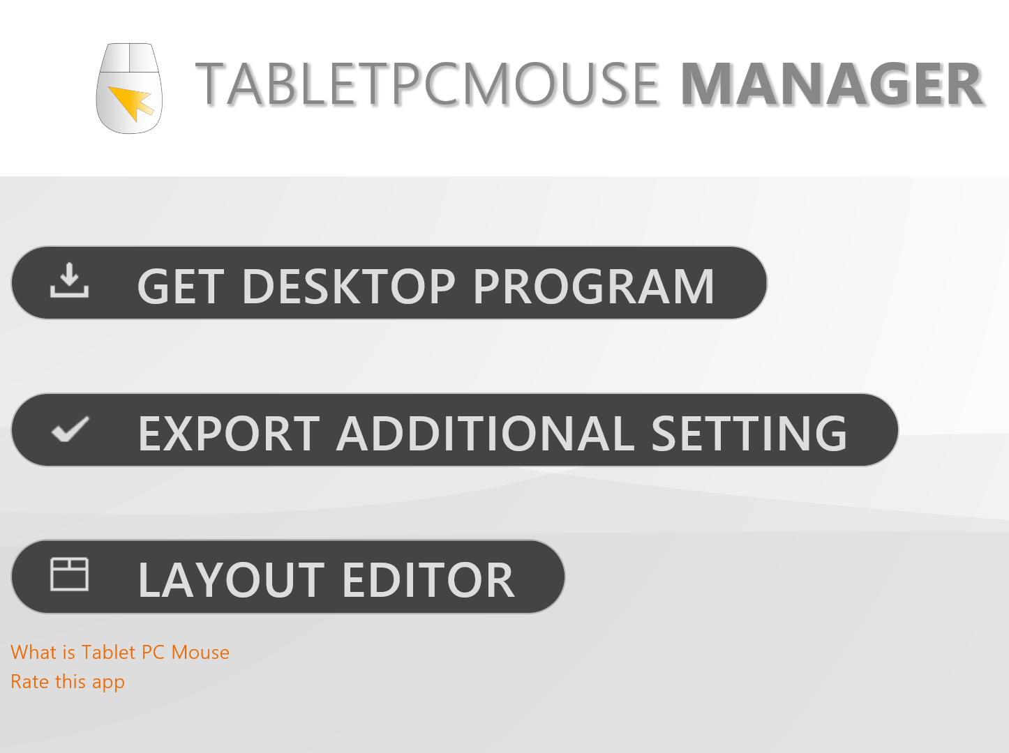
STEP 2. Run the App and select Get Desktop Program

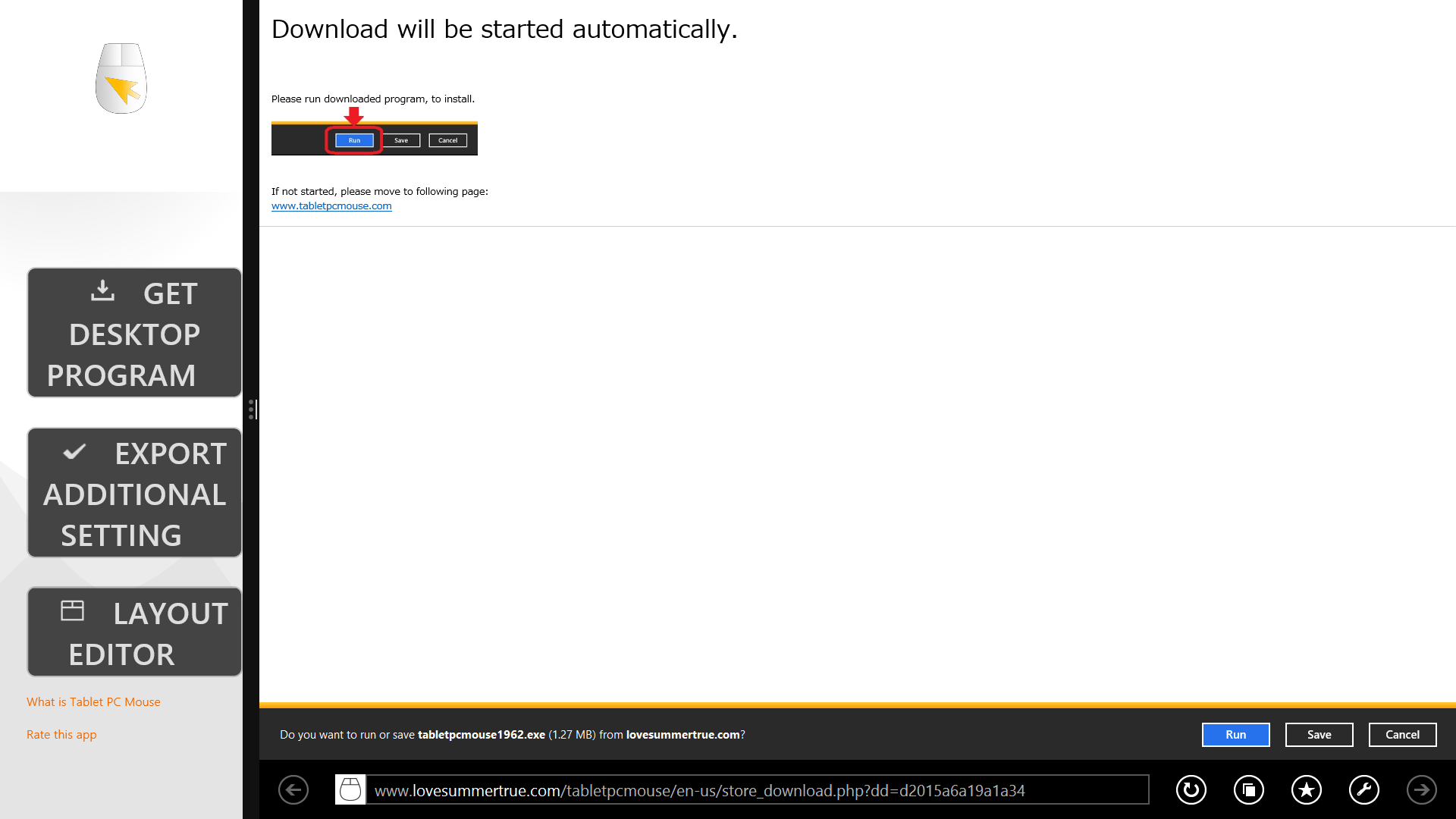
STEP 3. Download the desktop program. At the moment, this downloads the 1.9x version. When you register your email address, you will get the 2.0 beta and eventual update.


The settings (above) also offer customization of the pointer and virtual keyboard, but for the remainder of this post, I'll focus on customizing the ArtistPad.

STEP 4. Install the desktop application.

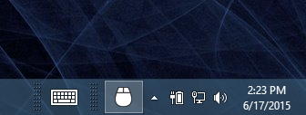
STEP 5. Access the TabletPCMouse settings from the notifications tray.

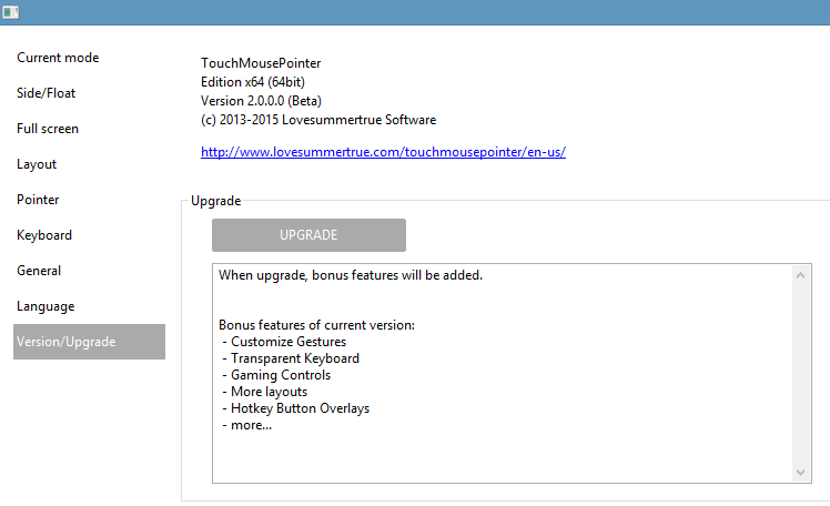
STEP 6. Insert your Bonus Code to unlock commercial features.

Once inside the settings menu, TabletPCMouse offers a wide and potentially confusing array of options (click on any of the images below to see larger versions).

My advice is to take your time with each screen, testing the settings one at a time until you're comfortable with the options.

To access the ArtistPad, tick it in the Current Mode (left).

Side Float and Full Screen settings (below) allow you to set up customized gestures. This is a really great feature that should be part of the OS. The developers state that TabletPCMouse is compatible with Windows 10, so this may end up being a lifesaver if Microsoft removes a gesture from 8.1 that you've grown to love.

In one of the oddest design choices of the utility, selecting the Layout settings (left) only offers the opportunity to edit the layout in the Modern app (below).

By default, the layout screen opens up the Float trackpad (above). I wasn't able to load the Artist Pad from the Layout pulldown, so it took a little trial and error by loading the Artist Pad on the desktop and then selecting "Edit layout with store app" (above left).

Once the Artist Pad is available in the Layout window, save a new .ini file in case you want to go back to the original settings.

Customizing your Artist Pad is very simple: just click on a button (below left), enter its keyboard equivalent and modifier keys and size, position and rename it. In the example below, tapping the Open button will send the Ctrl-O shortcut.

By default, the Artist Dock buttons are 15 units tall, but in order to add many more buttons, I reduced the height to 7. At present, it looks like Artist Pads are limited to two columns.(CORRECTION: The pad can contain more columns, but I haven't figured out how to do so.)

You can drag the buttons around as you like, but they don't snap consistently. Just pay attention to the x and y coordinates to keep your buttons evenly spaced. It would be nice to be able to move multiple buttons at once or add graphical separators to keep the items better organized.

When you have a button you like, just Clone it to add a similar one.

Once your Artist Pad is completed, save the .ini file and load it in the desktop settings. (I told you the bouncing back and forth between apps is weird and a little tedious).

When the Artist Pad is loaded (left), it has a hamburger menu icon in the top left that allows you to quickly load settings or jump to the layout app. The blank area next to the hamburger menu allows you to click and drag the pad around the screen.

You can set the Artist Pad's opacity in the Settings tab and the Minus icon will minimize it.

For a beta product, TabletPCMouse is very robust. It works with both Wacom and N-Trig devices. Be aware that on N-Trig tablets like the Surface Pro 3, the pen's proximity to the screen will disable touch. On Wacom tablets, touch is only disabled at the moment that the tip touches the screen. In any event, this means that the keystroke can't be held down as you use your pen. 

TabletPCMouse mitigates this limitation somewhat by toggling modifier keys like Alt and Shift. For those shortcuts, once they are tapped they will stay depressed until they are tapped again.

This is a very worthwhile utility and the developers are eager to get feedback from the SurfaceProArtist community. The first 20 commenters on this post will receive free licenses in order to provide more feedback and advice on the beta. For more details visit TabletPCMouse.com

Posted
AuthorRick Rodriguez
53 CommentsPost a comment