The Surface Pro 3 went on sale this morning and I dutifully pre-ordered a lower end unit. I was planning to buy the entry level i3 $799 model but the Microsoft Store reports that it won't be available until August 31.

So I bought the next size up, the $999 i5/128 GB. That device ships on June 20.

This purchase feels unusual for me because I usually buy the "sweet spot" model, just under the highest end version available.  But in the case of the Surface Pro 3, I'm just not sure that the premium is warranted for the added storage of the $1299 model or the Core i7 in the $1549 or (gasp) $1949 versions.

To be clear, I think the average consumer is going to love the Surface Pro 3 as it addresses nearly every concern I've had with the first two generations. For that theoretical individual, I'd recommend spending the extra $300 for the i5/256.

I got into New York just in time yesterday to attend the last hour of a tech pundit tweetup hosted by Mary Jo Foley. It was a thrill to meet her and my favorite Windows-centric journalists Paul Thurrott and Ed Bott.

Foley and Thurrott were showing off the Surface Pro 3 review units they were given (loaned?) by Microsoft following the morning press conference.

The new SP3 looks a lot like the Surface 2, with its silver vapor mag finish. It is significantly thinner and lighter than the SP2 and the 3:2 aspect ratio is much better balanced and easier to hold in portrait mode.

The 2160x1440 display is crisp and beautiful. Of course it will make software that doesn't handle UI scaling even harder to use. I wasn't able to see the new Photoshop, but it looks like Adobe software won't be an issue.

I'd expected the odd aspect ratio to be exactly like 8.5x11 paper, but it's a bit taller (equivalent to 8x12?). But it's still much preferable to 16:9 in portrait mode and feels less squashed in landscape.

The new pen is a significant improvement over the standard SP pen. I didn't compare them side by side, but it seemed larger and heftier, though not quite as heavy as the Wacom Bamboo Feel. It has two buttons and the large click tip that functions as a remote control to wake the SP3 directly into OneNote.

It's impossible to accurately evaluate the pen's performance or improvements over other N-Trig devices like the Sony Active Pen with the pre-installed software. OneNote was responsive and silky, Fresh Paint was too but my knuckles left the occasional stray marks. I don't fault N-Trig for that, based on my experience with Clip Studio Paint/Manga Studio, it's very possible for developers to deliver perfect palm rejection with N-Trig devices. I'm very curious to test if Adobe gets it right.

The new kickstand design is very interesting, offering no pre-set angles like the first two models. It seems very stable, though I imagine it will always want to slide to its lowest position if you rest your hand on the screen while drawing. Time will tell on that one.

So why did I end up ordering the lower end device?

Lack of backward compatibility with wintab software means I won't need as much storage to install older applications. Without discrete graphics, I won't be doing much 3d or gaming work. Until Pixologic and Autodesk update their applications, ZBrush and Mudbox are out of the question (both require wintab for pen pressure).

So if nothing else, the Surface Pro 3 will be a fine Manga Studio/Photoshop/comics reading tablet. But the limited pressure and software restrictions mean it's not the ultimate pro tool we were all hoping for/expecting. And it means there is still an opening for another manufacturer (Wacom, Samsung, Apple?) to  develop a device that addresses all the needs of the pickiest creative users.

Up to now, I've had no reservations recommending the Surface Pro to all graphics artists. Yes, 2048 pressure levels and tilt sensitivity are very nice and the screen could be larger, but the SP 1 and 2 offered great performance for the price. Now, the recommendation will have to be prefaced by "It depends..."

Writing this from somewhere above flyover country. The Microsoft announcement concluded a few moments ago. I'll leave it to writers on the ground to fill in the details.

The device sounds amazing. In fact, it's as if Microsoft's Surface team reads this humble blog.

BUT, the next generation Surface Pro 3 will be an NTrig device, not Wacom. So that means 256 levels of pressure vs. 1024 on the original two generations and 2048 on Cintiq Companions.

Perhaps more importantly, this means palm rejection and compatibility with important apps like ZBrush may be lacking.

The collective cries of disappointment emanating from my Twitter feed are deafening.

If you've read my Sony Flip 15A and Acer Aspire R7 reviews, you know I think NTrig is perfectly acceptable for sketching, but I recognize that serious artists are able to squeeze every ounce of pressure out of their stylii and this move relegates the Surface Pro line to the toy aisle.

When I get back to base camp next week, I'll begin a new feature: N-Trig, What Works, What Doesn't so we can all get an idea of the sacrifices we'll need to make in order to use the otherwise perfect Surface Pro 3.

Posted
AuthorRick Rodriguez
Categoriesnews
57 CommentsPost a comment

Big changes on the horizon for Microsoft's Surface line, as both a new Surface Mini and larger Surface Pro are expected to be announced Tuesday, May 20.

Because I love rumor-mongering as much as the next guy, here's some tantalizing new info from Windows Phone Central:

For the Surface Pro 3, which is now confirmed as being a real device, there will be five versions offered with varying pricing and configurations:

  • i3-4GB RAM-64GB - $799
  • i5-4GB RAM-128GB - $999
  • i5-8GB RAM-256GB - $1299
  • i7-8GB RAM-256GB - $1549
  • i7-8GB RAM-512GB - $1949

If this pricing is correct, there is a lot to mull over. First off, we should see prices on existing Surface Pro 2 models should drop by $100 or more.

The $799 i3 model sounds really appealing for sketching and comics reading; but I've never run graphics apps with an i3 so it remains to be seen how well they perform on this processor. This model seems to compete directly with the Samsung Galaxy Note Pro 12.2.

It will be really interesting to see what Microsoft's plans are for its existing Core i5 Surface Pro 2 models. Will anyone want a 10.6 inch version if the price difference is only $100?

The i7 is obviously the model that I want but once again I don't understand the $400 premium for 256GB of additional storage.

Therefore, the "sweet spot" in the high end model is the 8GB/256GB model for $1549, this pricing and configuration is on par with the often discounted Lenovo Thinkpad Yoga.

Think it's finally time for that SurfaceProArtist Spring cleaning sale...

Posted
AuthorRick Rodriguez
Categoriesnews

I'm still confused about Autodesk's pricing for the upcoming Sketchbook Pro. Apparently the 2015 edition is only available to certain Enterprise customers as part of one of the company's many subscription plans.

But a consumer update to Sketchbook Pro 6 is apparently on the way in June and judging, by this video, it looks like a major upgrade with Perspective Guides, 3d lighting and even some animation features.

Check out the all-new SketchBook Pro - coming this summer! Get more info and be the first to know what's coming by checking out our blog and joining the email list: https://www.sketchbook.com

Sketchbook.com also has a blog post featuring more details on the upcoming perspective guides, which include a fisheye mode. Manga Studio users shouldn't feel jealous, artist guru Doug Hills is preparing his own curvilinear rulers for release this week. 

UPDATE 5/12/14: Hills released his ruler set this afternoon. Check them out here: http://doughillsart.myshopify.com/products/manga-studio-5-curvilinear-rulers


Posted
AuthorRick Rodriguez
Categoriesnews
2 CommentsPost a comment

EDITOR'S NOTE: Ron2k_1 of Belize City, Belize posted this very detailed review of the Wacom UP-911E pen over at the TabletPCReview forum and his post inspired me to order it so I could compare it head to head with the discontinued Axiotron Studio Pen (see my review "I have a new favorite tablet pc pen and you can't have it" Don't know why I'm really proud of that bitchy headline).

My pen should arrive within a week or two and I'll post my findings as soon as I can.

In the meantime, I asked Ron's permission to reprint his article and amazingly detailed photos here. The UP-911E is expensive at $90-and-up from third party Japanese sellers on ebay, but I am fond of bigger pens and you may like its size better than the only other two-button pen currently available, the Fujitsu T5000. 

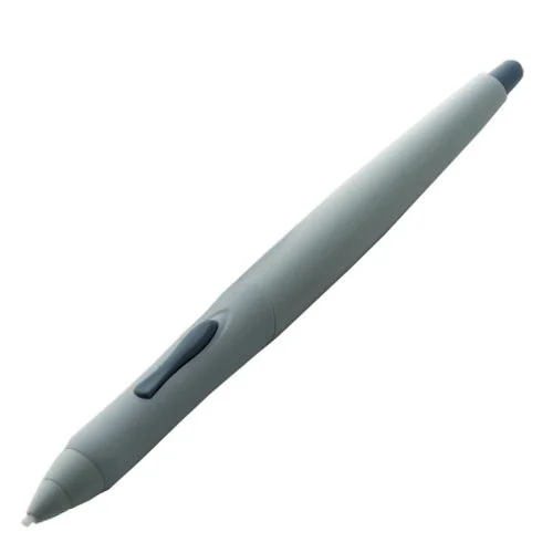
The Wacom UP-911E

The Wacom UP-911E

GUEST POST by Ron2k_1, reprinted by permission from this TabletPCReview forums thread.

So I finally got a chance to go to the post office to clear my UP-911E Pen.

It all started after searching and searching for the ever-elusive Axiotron Studio Pen every digital artist out there venerated. I found the following website for reference and started looking for its closest match: Wacom Asia Pacific | Pen Compatibility

So, if you're still reading, here are my observations.

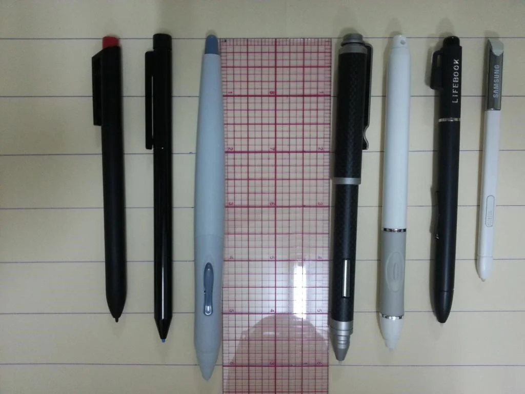
First, my lot of pens for visual reference if anybody else have any of my other pens:

Left to right: UP-911E, Bamboo Feel IT Carbon, Motion Computing, Surface Pro, Fujitsu Lifebook 5010, Lenovo x230t, Galaxy Note 2 pen

Left to right: UP-911E, Bamboo Feel IT Carbon, Motion Computing, Surface Pro, Fujitsu Lifebook 5010, Lenovo x230t, Galaxy Note 2 pen

And here are the specs of the above pens (Profile measurements):

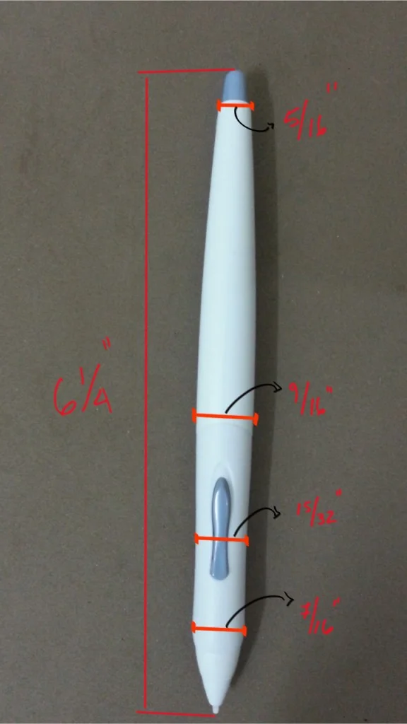
First, the UP-911E as it is a very irregular shaped pen:

And for the others (Tried to keep in 16ths of an inch; 8/16 is 1/2 and 4/16 is 1/4 and so forth):
Pen-------------------------------Length------------Width (Profile)
Motion Computing-------5 12/16----------------7/16
Bamboo Feel Carbon--5 15/16--------------13/32
Surface Pro-------------------5 8/16----------------5/16
Fujitsu Lifebook-------------5 4/16----------------6/16
Lenovo x230t----------------5 2/16----------------6/16
Galaxy Note 2----------------4 7/16----------------4/16

I'm really not sure if the nibs used by the UP-911E are standard or not. I guess the only way to know is to buy a few and try them. But at least I can notice that the nibs used by Fujitsu, x230t, motion computing and UP-911E are all interchangeable and at the same length of 1 1/16" and same standard circumference. So if anybody can confirm that any of these pens use Standard nibs, then we can say that the UP-911E uses Standard Nibs as well, which would be great.

Still reading? Artists, this may be of interest to you:
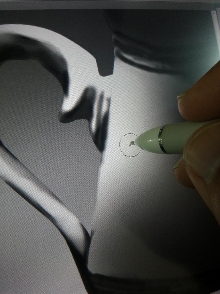
On Photoshop on my Win 7 HP, i7 x230t, the UP-911E is almost as accurate (with very small nib offset) as the most accurate pen I've ever tried - my Bamboo Feel IT Carbon pen.

Here are some screen shots. First, the UP-911E (notice the cursor, not that off from the tip of nib):

Then, the Motion Computing (this one felt pretty bad..):

And finally, the dead-on-center Bamboo Feel IT:

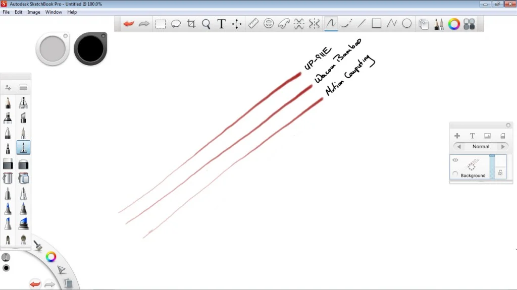
Next, my pressure buildup test done on sketchbook pro. I tried to build pressure consistently with same amount of press with all three pens. The Bamboo Feel seems a bit thicker as it is heavier:

EDIT May 7, 2014: At the request of forum member dream3 in post # 5, I tested the three pens on light stroke mode. I tried several brushes (knife, pencil, air brush) and I had a hard time noticing any difference between the UP-911E and the Bamboo Feel IT pen. I believe that the Bamboo Feel IT is probably infinitesimally more responsive to very VERY light strokes but the weight of the pen may have something to do with it. On the other hand my Fuiji pen and Motion Computing pen require significantly more force to register the same pressure level

Now, here is where the UP-911E scored high marks. This pen is so comfortable to grip and make long strokes with. It is not as heavy as my Carbon pen (28g), or as light as my Fujitsu pen, but it weighs maybe a gram or two more than the motion computing pen, which according to surfaceproartist blog weighs 15g. So this pen weighs IMO around 16g or 17g.

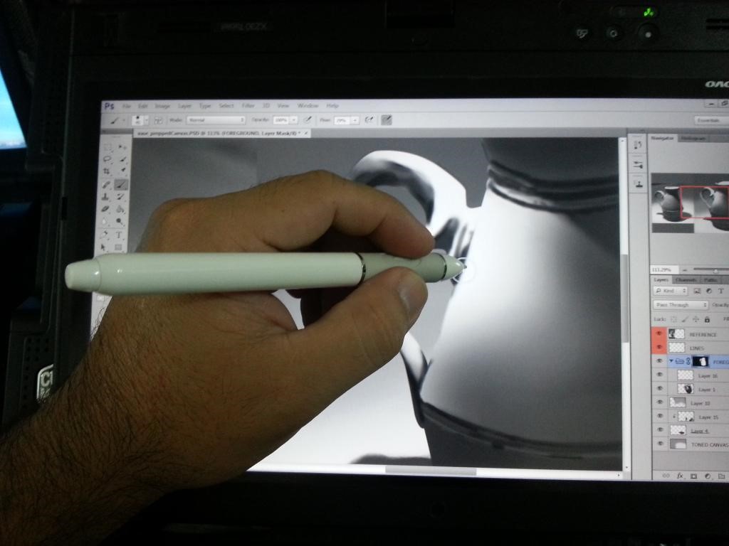
Here are some screen shots of how it looks in your hand. Note that I'm not a leftie, but was forced to awkwardly hold it that way as I needed my right hand to take pictures:

Now for note-taking, I gotta say that my Carbon pen still reigns supreme. I can make short strokes and draw letters better and more comfortable and fluidly with my Bamboo Feel Carbon than any other pen I've tried; even my newest addition UP-911E. Here are the results:

On my Galaxy Note 2, nothing beats the stock 4.5" pen. I remember reading that the digitizer on the Galaxy Note 2 were slightly different than the standard Wacom digitizer.

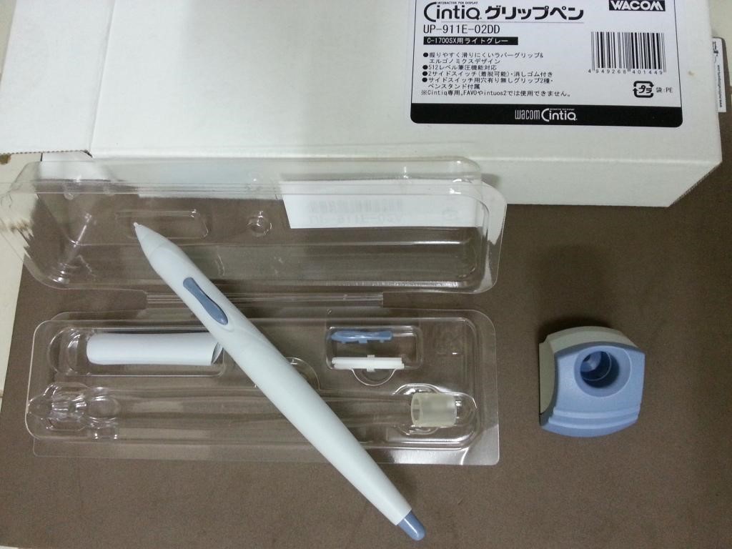
To wrap up, this pen cost US$90 from a Japanese supplier (which reminds me, I need to leave him some feedback) on ebay. It arrived super fast and in a very secured outer package. I didn't take pics of that package but I took pics of the inner package which is the UP-911E box that is labeled Cintiq on the outside:

Contents: Regular hard white nibs, rubber grip with no aperture for side button, Pen Stand, spare side button. That's it, no nib removal ring or additional nibs...

Contents: Regular hard white nibs, rubber grip with no aperture for side button, Pen Stand, spare side button. That's it, no nib removal ring or additional nibs...

If you notice from above it even came with a little stand:

If you were brave enough to read all that and still have questions, just shoot them up (at the original TabletPCReview forum thread located here).

Despite its rumored pen, I haven't been paying much attention to the impending launch of the Surface Mini since it will reportedly be ARM-based and therefore limited to running Windows RT.

I've long lamented the lack of decent touch versions of mainstay Windows tools and unless Microsoft has cajoled Adobe and others to develop something big for the Mini, I don't think the situation will change anytime soon.

But in this morning's WinInfo Daily newsletter, Paul Thurrott floored me with this tidbit:

I can now confirm those reports: Microsoft will indeed launch a bigger, Intel-based Surface Pro device at the event. I'm not 100 percent sure what form it will take—I'd like to see an Ultrabook-like model, but given the makeup of current Surface devices it will almost certainly be a tablet—but it will indeed use a high-end Haswell chip and not a low-end Atom-based chip. 

Thurrott has further speculation on what he calls the "Surface Pro Maxi" in his WinSuperSite column here.

While I'm surprised by the timing (mostly for my bank account), I think this is an excellent move by Microsoft that will undercut the impact of a rumored Apple iPad Pro.

So what specs would I love to see? Simple: 13+ inch screen, 16:10 aspect ratio, thinner, lighter, faster, more RAM, bigger HD, lower price. A man can dream, right?

I'll unfortunately be traveling during the launch event, but I'll do my best to post the official specs as soon as I can. Look forward to reading your reactions!

Posted
AuthorRick Rodriguez
Categoriesnews

Developers would do their users a huge favor by adopting Windows 8.x's UI scaling scheme. But given the wide variety of non-standard interfaces in graphics applications, that may never happen.

Fortunately, creative users can be counted on to find inventive workarounds to those limitations.

Given Autodesk's decision to prematurely retire Softimage, I've been forced to look more closely at 3d applications to replace it. The feeling in the cg community is that venerable 3DS Max is also on the endangered list, so that leaves Maya as the only Autodesk option (fortunately, there are other vendors and other products to consider such as The Foundry's Modo).

The problem with running Maya on the Surface Pro or any screen under 17-inches is that its default UI is extremely cluttered. The top of the standard interface includes six rows of menus, icons, and shelves.

The problem with running Maya on the Surface Pro or any screen under 17-inches is that its default UI is extremely cluttered. The top of the standard interface includes six rows of menus, icons, and shelves.

Fortunately, you can close most UI elements and rely on the program's marking menus which are called up by holding down the spacebar. The downside is that fonts are still very small and difficult to read on a small screen.

Fortunately, you can close most UI elements and rely on the program's marking menus which are called up by holding down the spacebar. The downside is that fonts are still very small and difficult to read on a small screen.

As I was complaining about the issue on Twitter, follower planeteater (@plutoisawesome) came to my aid. He (or she?) pointed me to a cgsociety.org thread explaining how to scale the Maya 2011 interface.

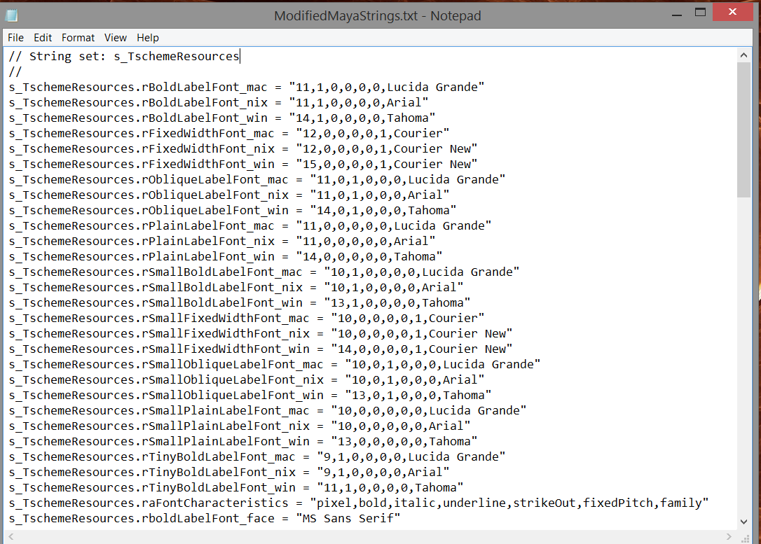
Changing the interface's font sizes is a simple matter of editing the MayaStrings file in a text editor. Look for every item with "*Font_win" in its name and change the first number in the value. By default, most entries were 11 point Tahoma. I changed those to 14 points. There are also 9, 10 and 12 point entries. To keep everything proportional, I scaled each item by 125% and voila! the program is now much easier on the eyes on both the Surface Pro and Thinkpad Yoga.

The person who discovered the hack, Johnny Moore (johnnybob), even created a video (see below).

This video describes how to change the font size for Maya 2011 (32/64) inside the User Interface for Windows PC, but it can be applied to later versions. Tested here with Maya 2015.

Although the effect is subtle and difficult to appreciate in this screen capture, take my word that it is immensely more legible on a small screen. It's possible that the UI will withstand increasing the font sizes even further, but I've found that some requesters in other programs (including Autodesk's 2015 installer) start to look very bad when the UI is scaled to 150%.

With such an easy way to change the program's default font sizes, it's odd that the devs chose not to expose this functionality to users.

If you decide to give this a try (or find other ways to make your software easier to use on the Windows tablet of your choice), please let me know. I'm especially interested to hear from those who choose larger font sizes or different typefaces. I'd love to see what you come up with.

And, if you've come up with a way to hack any other application's interface, please let me know. I'd love to promote your efforts! 


Posted
AuthorRick Rodriguez
CategoriesTips
9 CommentsPost a comment
The Virtual Tablet app is available in both the Windows and Google Play app stores.

The Virtual Tablet app is available in both the Windows and Google Play app stores.

I'm often asked whether a Surface Pro or other Windows penabled device could do double duty as a virtual Wacom Intuos or Bamboo tablet . Although remote control of a desktop pc is possible from any tablet, including iPads, I hadn't found a setup that didn't lag or that properly passed along pen pressure until today.

Virtual Tablet from Sunnysidesoft is the first Windows or Android app I've come across that comes close to duplicating the functionality of a pen tablet over wifi.

In my tests with the Windows app running on the Asus Vivotab Note 8 and the Android version running on the Samsung Galaxy Note Pro 12.2, I was able to draw effortlessly on my desktop copies of Manga Studio and Sketchbook Pro. Lag on those two apps was barely perceptible and pressure range is excellent.

I also tested Virtual Tablet with Photoshop, but pressure information is not communicated. According to the developers' website, "(This is) because Adobe applications use different device driver for supporting pressure sensitivity. We are developing a new driver for Photoshop right now. However, we can’t promise when it will be ready." Dreaded Wintab requirement strikes again! 

The reason Virtual Tablet performs so well may be that unlike other remote control options, it doesn't attempt to reproduce your target screen on your tablet. You'll only see a bounding box representing your target screen. You can pinch zoom in and out of the target area and lock it as well. UPDATE: These are Android-only options. The Windows version only allows full-screen or a default size that leaves a title bar. This is unfortunate because it's easier to reach icons on the sides and bottom of the screen when you reduce the size of the active window slightly.

As you hover around the tablet screen with your pen, your cursor will move on your desktop screen. The pen pointer was displayed as a small pixel on my display. I assume that's a Windows system setting, but I was unable to find the spot to change it. Because the pointer is so small on my 1920x1080 23-inch monitor, it was easy for me to lose sight of it at the top and bottom of the screen. It would be nice if the app offered some way to temporarily change the pointer while in control.

Besides providing even greater functionality for your mobile device, Virtual Tablet makes it possible to control software that would otherwise be incompatible. For example, The Foundry's Mari requires an NVIDIA or AMD graphics card with at least 1GB of RAM. But I was able to paint in the application from the Note Pro. The same should be true for Mudbox and any other app that is problematic on Intel HD graphics hardware. (I can't vouch for pressure sensitivity in Mari because I'm not familiar enough with it to test it properly.) UPDATE: I finally found a meaningful use for my AVTN8. It's a great input device for Mudbox on my desktop while Autodesk continues to grapple with Intel HD graphics compatibility.

To use Virtual Tablet with your desktop, you first need to download the free server application for either Windows or Mac (eraser tip functions are not yet supported in OS X).

Compatibility information from the developers website:

VirtualTablet requires devices with “pressure sensitive stylus pen with hover mode.". As far as we know this functionalities only available with Wacom Digitizer Stylus technology (Samsung Galaxy Note series, few ASUS tablets, and most of Windows Tablets are based on this pen).

Usually capacitive touch pens don’t support pressure sensitivity and hover mode, even though it seems like ‘stylus pen’. This capacitive touch pens are just same as using your finger. Therefore it is not supported by VirtualTablet.

Supported: Galaxy Note series, few ASUS tablets, Windows Tablet(MS Surface, Slate 7, ATIV, ASUS Eee Slate, etc.)

NOT supported: Galaxy Tab, ASUS tablet, Nexus Tablets (Nexus 7, 10), HP TouchPad and other usual tablets & phones.

Virtual Tablet is available as a free trial, but for only $1.99 for the Windows Store version and $1.86 for Android, it's an absolute no-brainer.

Virtual Tablet requires a free server application running on your Windows or Mac desktop.

Virtual Tablet requires a free server application running on your Windows or Mac desktop.

My frustrating "will it run or won't it" investigation into Autodesk's Mudbox has hit another stumbling block.

In the broadest sense of the word, the 2015 version of the software will run and sculpting tools seem to work well.

Unfortunately, one of the most important capabilities of Mudbox is texture painting and there appears to be a crippling bug in the paint brush that makes it useless for this purpose.

Reader and ArtDock collaborator Alex Cheparev first alerted me to the issue which he spotted on his Surface Pro 2 and Wacom Cintiq Companion (see his video below). I've confirmed the issue on both generations of the Suface Pro and the Thinkpad Yoga. 

Using Paintbrush in Mudbox 2015 on Surface Pro 2 appears to be broken. Projection Brush works fine, only the Paintbrush seems broken.

According to Cheparev, he reported the bug to Autodesk who responded that "it's a known bug with the new Intel HD Drivers and they are working with Intel on fixing it in a future release of the drivers. Problem is, they recommended using driver version 9.18.10.3257, but it is nowhere to be found. Intel has removed it from their servers and I can't find it anywhere else...The oldest driver I found on Intel's website also exhibits the same behavior with the paintbrush."

Another bug that Alex didn't illustrate in his video relates to painting in mirror mode. The mirrored side receives 100% of the color applied, but the original side appears to be stuck in Lighten mode.

Although the paint is applied on the right side of the head, it only displays properly on the left side. This issue is repeated regardless of the mirror axis.

Although the paint is applied on the right side of the head, it only displays properly on the left side. This issue is repeated regardless of the mirror axis.

So despite the allure of multi-touch gestures, I'll be putting further testing with Mudbox on hold (at least until the next display driver update from Intel).

Posted
AuthorRick Rodriguez
Categoriesnews, Tips
6 CommentsPost a comment