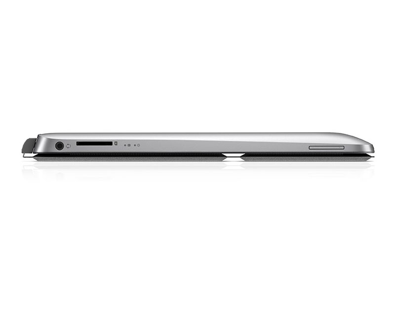
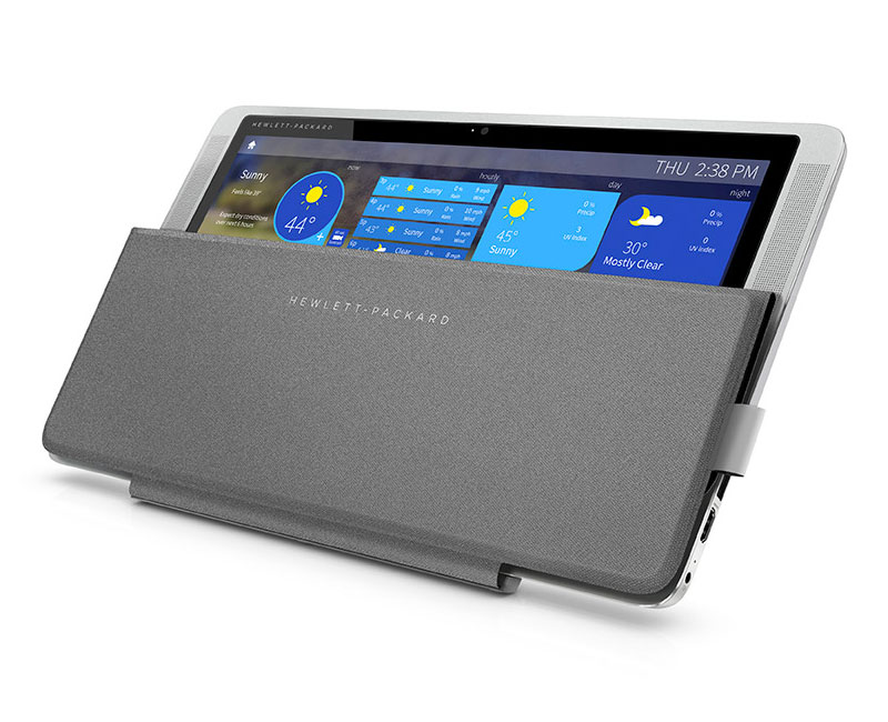
UPDATE: Lenovo has finally placed the Ultrabook Pro Keyboard on its website and the price is downright shocking. Yes, it's got a built-in battery that extends power for up to 12 hours, but for $399 more? No thanks Lenovo. Read it and weep

ORIGINAL POST: Just in time for your holiday shopping consideration, Lenovo has released the Wacom-penabled Thinkpad Helix 2, the first Intel Core M device I've had the chance to test.

The Helix 2 comes in two flavors: a $1049 5Y10 model with 4 GB of RAM and 128 GB SSD and the $1499 5Y70 model with 8 GB and 256 GB storage. Both versions have an 11.6" FHD IPS LED display with a resolution of 1920x1080 and feature Intel HD Graphics 5300.

Although the last thing I need is another Windows tablet, I couldn't resist the temptation and decided to purchase the low end version to see how it compared with the Surface Pro 3 and other devices in the SurfaceProArtist labs.

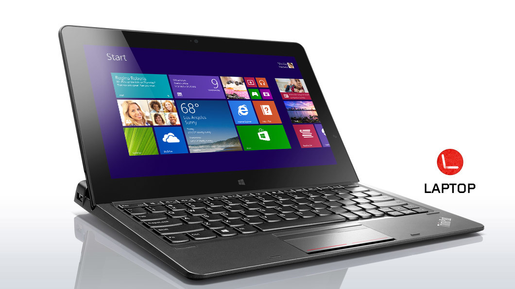
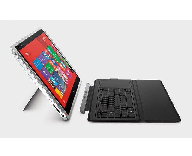
The Helix 2 ships with the Ultrabook Keyboard, a cover that doubles as a stand but lacks a hinge mechanism. The typing experience on the keyboard is far superior to keyboard covers like the Surface Pro's, but the lack of a hinge, backlighting or Bluetooth severely limits the keyboard's functionality. The screen rests at only one angle that may be awkward to use in a cramped environment (see image above). And you have to be careful to dock and undock the screen just right to use the keyboard as a cover. You can't just fold and unfold it as you'd expect from any other keyboard.

An Ultrabook Pro Keyboard will be available early next year. Lenovo doesn't offer a way to purchase the tablet separately, which adds an unnecessary expense to an already pricey purchase.

REVIEW CONTINUES AFTER THE UNBOXING IMAGES BELOW

image.jpg

As unboxings go, the Lenovo Thinkpad Helix 2 unveiling is pretty unmemorable. The tablet ships in a plain cardboard box, with no attention paid to first impressions. Contents are very sparse: the tablet, keyboard, power adapter and cord. I almost threw away the packaging before discovering that the pen was packed loosely in the very bottom of the box.

image.jpg
image.jpg

The keyboard features a USB output (left). Also visible on the tablet is the power connector. 

image.jpg

The top of the tablet has a power switch (right) and an auto-rotation lock.

image.jpg

The right side of the tablet includes (from right to left) a micro HDMI output, covered USB and SD ports, the volume button and headphone jacks. The opening in the keyboard is the pen silo.

image.jpg

Although its screen is only 11.6-inches vs. the Surface Pro 3's 12.5 (above, bottom and below, right), the physical dimensions of the Helix 2 are nearly identical.

image.jpg
image.jpg

The screen size of the Helix 2 is significantly roomier than the Surface Pro 2 (above), and it's also thinner and lighter (below).

image.jpg
image.jpg

I was expecting another Lenovo stylus like the one included with the Thinkpad Yoga (above top), but I was pleased to find that the Helix 2 includes a full-sized pen comparable to the Surface Pro 2 pen (third from top). The barrel is a bit narrower than I prefer, but it's very adequate for most uses. It ships with one Wacom flex nib, such as is found on the Fujitsu T-5000.

The digitizer on my Helix 2 works exceptionally well. I can draw all the way to the edges, I have no problem accessing the corner menus or the close gadgets and the pen-cursor alignment is uniform throughout the screen. This is the first Wacom Windows tablet I've owned that has worked so well out of the box. My Helix 2 shipped with driver version 7.1.3-9 installed and I've decided not to update it until offered the option directly by Lenovo (if that ever happens). The latest driver on the Wacom US site is 7.2.0-10, but if it's not broken, why fix it?

Drawing on the tablet is a wonderful experience. Unlike my Lenovo Thinkpad Yoga, the Helix 2 screen does not have a screen protector, but the pen's Flex nib offers all the grip that I need. Of course, the Helix 2 is compatible with all Wacom Tablet PC pens and I tested mine with the Bamboo Stylus Feel, Fujitsu T-5000 and many others with equally excellent results.

Pressure response is outstanding. (Sorry N-Trig/Microsoft, but there is still a recognizable improvement moving from a 256-level device to 1024 or beyond.)

I've tested the Helix 2 with the desktop applications Clip Studio Paint, Photoshop CC 2014 and Sketchbook Pro 7 and the apps Fresh Paint and Sketchable. The lower-end 5Y10 processor never broke a sweat. A major advantage of the Core M (formerly known as Broadwell) generation of chips is that they allow fanless designs. My Helix 2 has never heated up even while running graphics intensive benchmarks and the silent operation is welcome too.

If you've been waiting for a Wacom-equipped successor to the Surface Pro 2, the Helix 2 comes very close to being that device. It certainly offers more of a true tablet form factor than the SP2. It's significantly thinner and lighter and doesn't throw off heat.

On the other hand, there's something cheap-feeling about the Lenovo. The back is smooth and cool to the touch, but there are a few unsightly stickers and an unidentifiable protuberance by the SD slot that can be uncomfortable to hold. The hardware controls like the volume button are too close to the body and shallow, making them very difficult to distinguish from the USB and SD port covers. There is a sharp edge all around the tablet where the front panel comes in contact with the rest of the body that is less than ideal. The docking holes at the bottom of the display are also uncomfortable to the grip.

The docking mechanism itself is somewhat finicky. You have to align the tablet "just so" for it to send power to the keyboard. It's also very easy for the screen to detach from the keyboard if you attempt to carry the Helix 2 while in the laptop mode.

Lenovo should offer a standalone version of the Helix 2 priced around $800 to compete more directly with the Surface Pro 3 i3 model. Although the 11.6-inch, 16:9 HD display is not as nice as the SP3's 12.5-inch, 3:2 high-res display, it's close enough that Wacom aficionados would want to carefully consider the Helix 2.

But for now, the Helix 2 is simply over-priced. My advice is to wait until the new year when the Ultrabook Pro Keyboard is available and run the price/performance comparison again.

Of course by then, the Surface Pro 4 may be in the offing...

Posted
AuthorRick Rodriguez
8 CommentsPost a comment

PRESS RELEASE

TOKYO and LAS VEGAS, Jan. 6, 2015 /PRNewswire/ -- Wacom Co., Ltd, announced that Toshiba America Information Systems, Inc. and Toshiba Europe GmbH have adopted "Active ES" pen technology, Wacom's unique capacitive pen solution, for their new Windows 8.1 tablets, the Encore 2 Write (exhibited at CES in the Central Hall at the Las Vegas Convention Center, Booth #11028). 

Wacom leads the industry with its EMR® (Electro-Magnetic Resonance) digital pen sensor solution, and reached 100 million units of component production (cumulative) in April 2014. Wacom has now extended its technology portfolio by adding the "Active ES" pen solution to address broadening needs for pens in mobile products.

The Active ES pen solution handles high performance pen and multi-finger touch inputs simultaneously with a single sensor and a single ASIC controller. It realizes a natural and intuitive writing experience with high speed, precision and pressure sensitivity. By supplying both Active ES and EMR pen solutions, Wacom continues to accelerate digital pen use on mobile devices such as tablets and smartphones, and lead the way toward the era of digital stationery.

"Toshiba's Encore 2 Write tablets and TruPen stylus proves that Wacom's Active ES solution delivers a best-in-class writing and drawing experience, with accuracy and speed never seen before on tablets," said Masahiko Yamada, president and CEO of Wacom. "Our Active ES pen supports writing, drawing and editing in intricate details with pressure sensitivity, as well as flexibility in design and configuration for OEM partners."

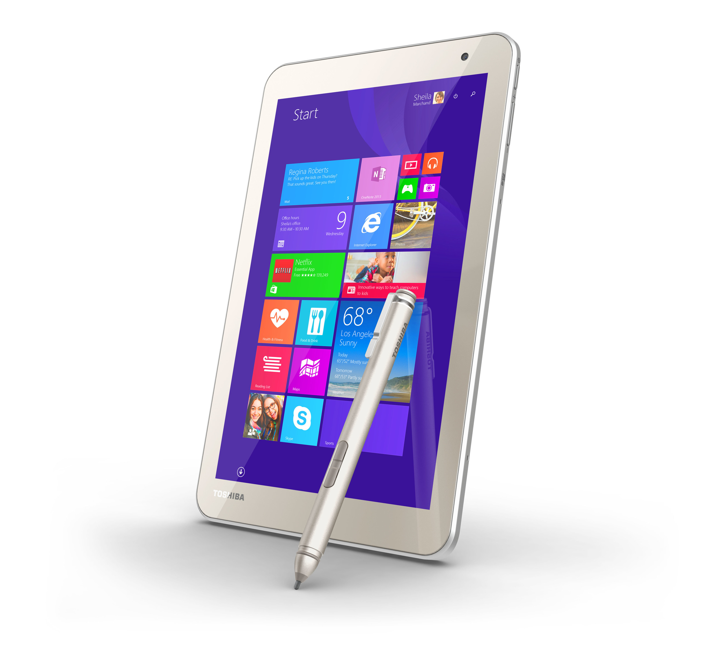
Toshiba's new tablets running Windows 8.1 Update with Bing are ideal travel companions, delivering a powerful Intel® Atom™ performance to help users get the most out of their day.  The "TruPen" stylus brings high precision control to your work -- taking notes in meetings or lectures without sacrificing the writing feel of pen on paper, regardless of speed.

The TruPen is also ergonomically designed, making it comfortable to hold over long periods of time. Thanks to its pressure-sensitive tip, users are always in complete control of every line they write or draw. Furthermore, each model's elegant design features a special slot for attaching the pen to the tablet, so it's always handy for jotting down ideas or developing to-do lists.

By promoting the adoption of feel™ technologies in a variety of mobile devices, Wacom partners with industry leaders in making the world a more creative place.

Posted
AuthorRick Rodriguez
13 CommentsPost a comment

UPDATE: Surface Pro 3's right pen button now calls up the radial menu correctly. See below.

* * * *

ORIGINAL POST

One of the more popular recent additions to Wacom's Feeldriver is the radial menu, a handy set of shortcuts that can be called up with the click of a pen button.

The default RadialMenu offers eight commonly used functions that will apply to most applications. Each wedge is customizable and a profile can be created on an application-specific basis.

The default RadialMenu offers eight commonly used functions that will apply to most applications. Each wedge is customizable and a profile can be created on an application-specific basis.

The radial menu had only been available on Wacom's professional devices until May of this year and its surprise appearance in the enhanced tablet pc driver was another competitive advantage the company had over N-Trig equipped devices like the Surface Pro 3.

We were hoping an SP3 pen menu would be part of Microsoft's recently released Surface Hub, but alas it didn't make the cut and a company spokesman was noncommittal  about it ever appearing. Some within the Surface team have told me they worry that an OS-level radial menu may conflict with context menus and/or software-specific marking menus like those found in Autodesk Maya.

Whether those concerns are valid or not, there's now a powerful utility that brings a highly-customizable radial menu to all devices and throws in a toolbar/ArtDock creator as well.

RadialMenu is the brainchild of independent software/game developer Clint Huegel, who wrote the utility for his Motion Computing LE1700. Fortunately for us, the program appears to work with a wide variety of hardware and software combinations.

"RadialMenu is a small project I started to alleviate aggravations I encountered while using my TabletPC," Huegel writes on his website. "The goal was to emulate the radial menu that Wacom distributes with some of their products but with per application menus. Since that goal was met a Toolbar was added as well." 

The RadialMenu application also includes a toolbar that can be easily customized.

The RadialMenu application also includes a toolbar that can be easily customized.

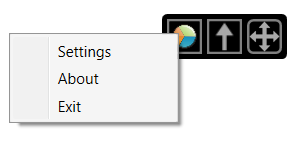
In this view, the toolbar is collapsed with the center (Up arrow) icon. The arrows on the right allow you to move the toolbar around the screen. Tapping on the pie icon switches to the radial menu. Right-clicking on the radial icon brings up the set…

In this view, the toolbar is collapsed with the center (Up arrow) icon. The arrows on the right allow you to move the toolbar around the screen. Tapping on the pie icon switches to the radial menu. Right-clicking on the radial icon brings up the settings options. See below.
The RadialMenu settings. The Menu Size allows you to scale the wedges. Along the bottom, you can create, copy or delete application profiles.

The RadialMenu settings. The Menu Size allows you to scale the wedges. Along the bottom, you can create, copy or delete application profiles.

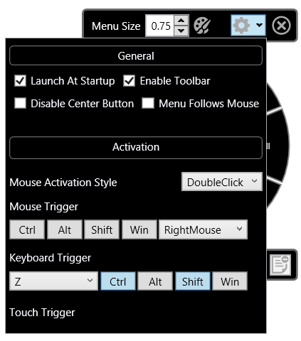
The RadialMenu's options are set in this window. Menu Follows Mouse attaches the menu to the pen cursor, although I had trouble reaching the commands in the right half of the pie with this option set. As a utility in development, RadialMenu still ha…

The RadialMenu's options are set in this window. Menu Follows Mouse attaches the menu to the pen cursor, although I had trouble reaching the commands in the right half of the pie with this option set. As a utility in development, RadialMenu still has some issues to be ironed out on various devices. I haven't been able to trigger the menu with a pen click alone on the Surface Pro 3. I use the keyboard trigger shown here (Ctrl-Shift-Z) and then tap to switch between the toolbar and radial menu.

UPDATE 10/22/15 RadialMenu's developer continues his torrid pace of development and today released version 0.2.3.83 which corrects many of the issues I identify above. Now, setting RadialMenu to load on startup on my Surface Pro 3, I can hold down the right pen button and tap on the desktop to call up the radial menu. Right button + tapping again (away from the center and the command wedges) brings up the standard Windows context menu. Right button + tapping on the center will call up the RadialMenu settings.

Problems persist with Menu Follows Mouse. When the UI is scaled to 100% or 125%, the radial menu icons can be accessed normally, but at 150% or above, I can't reach the lower right icons.

Look for alternate version 0.2.3.83 x64 at http://radialmenu.weebly.com/download.html I wasn't able to run the standard version listed on that page.

To customize the individual RadialMenu wedges, right click the wedge to edit. In addition to several preset options, you can also define a hotkey toggle or create a Macro command (see right).

To customize the individual RadialMenu wedges, right click the wedge to edit. In addition to several preset options, you can also define a hotkey toggle or create a Macro command (see right).

Editing the functions of the toolbar works the same way as the radial menu. Just right click and select your desired function.

Editing the functions of the toolbar works the same way as the radial menu. Just right click and select your desired function.

By default, the toolbar consists of five rows and two columns. The individual buttons can be scaled and the top row of icons can be individually hidden. Auto collapse will shrink the toolbar when you mouse away from it.
By default, the toolbar consists of five rows and two columns. The individual buttons can be scaled and the top row of icons can be individually hidden. Auto collapse will shrink the toolbar when you mouse away from it.
Expanding the number of available items in a toolbar is a simple matter of increasing the available rows and columns.

Expanding the number of available items in a toolbar is a simple matter of increasing the available rows and columns.

If you don't like the pie wedges of the default RadialMenu, the size, shape and color can be edited in a wide variety of ways.

If you don't like the pie wedges of the default RadialMenu, the size, shape and color can be edited in a wide variety of ways.

The developer may have set out to emulate Wacom's radial menu, but it's clear that this utility is significantly more powerful than the original. I've encountered a few bumps as I've tested, but Huegel has been quick to post fixes.

You can download RadialMenu for yourself at radialmenu.weebly.com and either leave comments or questions in that site's forum or participate in the forum threads over at TabletPCReviews.

Although RadialMenu is free to download and install, I plan to contribute a few bucks to reward the developer for his efforts and encourage the utility's further development. I hope you will too.

Posted
AuthorRick Rodriguez
18 CommentsPost a comment

I'm not convinced that the Windows 10 Tech Preview released yesterday will do anything to enhance my life with the various Surface Pros and multiple Windows touch capable devices I own, so I'm taking it uncharacteristically slowly.

Yesterday, I installed the bits on my secondary desktop and I'm just not feeling it. Maybe it will grow on me, but right now it feels like a big step backwards. Instead of deprecating Metro/Modern, I wanted to see the Windows 8 UI refined and enhanced so that it could better replace the traditional desktop mode.

I'm now installing the preview on my original Surface Pro 1 and will offer my thoughts within the next couple of days. I don't intend to install the operating system on any other devices until Microsoft releases Continuum, which will enable users to switch more seamlessly between desktop and tablet modes.

However, I know many of you are tempted to install Windows 10 on your shiny (almost) new Surface Pro 3s and are eager to know what to expect. Fortunately for us, the guys at Windows Phone Central have done it and posted a very nice video review of their first impressions. Enjoy!

First look at Windows 10 Technical Preview running on the Surface Pro 3. Make sure you read more about it, including some things that do not work here: http://www.wpcentral.com/some-thoughts-about-windows-10-preview-surface-pro-3


Posted
AuthorRick Rodriguez