As much as there is to like about the Surface Pro's various keyboard covers, there's no doubt they leave something to be desired as cases. Since they don't latch and leave the back of the tablet exposed, there's something unsettling about relying on them for protection.

The Surface Pro's kickstand and keyboard connector also present unique design challenges to traditional case manufacturers. This may explain why so few tailor-made products have reached the market in the year since the Surface Pro was first introduced.

Indiegogo funded Key Add-On Systems Engineering took this design challenge to heart with its first product, the ProKASE Mobile Dock. Besides providing a basic case that accomodates the Surface Pro and its keyboard cover, the ProKASE offers a removable dock cover with three USB 3.0 ports, and full-sized CF/SD card readers.

Although at $70 it's a little pricey for a case, this additional functionality makes the ProKASE an investment worth considering. To order the ProKASE, visit https://pkase.com/

The ProKASE is available in black, cyan and purple to match your keyboard cover. There were slight imperfections in the stitching of my cover, but the construction quality is consistent with other cases I've purchased for the iPad and Android device…

The ProKASE is available in black, cyan and purple to match your keyboard cover. There were slight imperfections in the stitching of my cover, but the construction quality is consistent with other cases I've purchased for the iPad and Android devices.

The ProKASE consists of three parts: the frame (above) holds the Surface Pro and has appropriate openings for the camera and the tablet's various other buttons, ports and vents. The other two parts are the dock cover (lower left) and the thin cover.…

The ProKASE consists of three parts: the frame (above) holds the Surface Pro and has appropriate openings for the camera and the tablet's various other buttons, ports and vents. The other two parts are the dock cover (lower left) and the thin cover. The black strips sewn into both covers provide stops which duplicate the functionality of the Surface Pro kickstand.

Both covers adhere to the frame with a wide velcro tab. The flap on the frame folds out to provide great stability when the case is opened. The Surface Pro sits much more firmly in one's lap when used in this manner (see gif animation below).

Both covers adhere to the frame with a wide velcro tab. The flap on the frame folds out to provide great stability when the case is opened. The Surface Pro sits much more firmly in one's lap when used in this manner (see gif animation below).

The dock cover sacrifices one of the stopping strips for a padded palm rest. When it's not connected to the Surface Pro, the connector cable on the left side of the dock cover is tucked safely out of the way. Pulling the cable out of its housing can…

The dock cover sacrifices one of the stopping strips for a padded palm rest. When it's not connected to the Surface Pro, the connector cable on the left side of the dock cover is tucked safely out of the way. Pulling the cable out of its housing can take some effort.

The connecting cable hides a USB 3.0 and CF card reader on the left side of the dock cover. The vacant cable storage port is to the right of the card reader.

The connecting cable hides a USB 3.0 and CF card reader on the left side of the dock cover. The vacant cable storage port is to the right of the card reader.

An SD card reader (left) and two USB 3.0 ports sit on the right side of the dock cover.

An SD card reader (left) and two USB 3.0 ports sit on the right side of the dock cover.

The dock cover connector plugs into the Surface Pro's USB port. There are no drivers available from ProKASE and I worry that this may become an issue in the future. My tablet sometimes reports it's unable to identify the USB device when the dock is …

The dock cover connector plugs into the Surface Pro's USB port. There are no drivers available from ProKASE and I worry that this may become an issue in the future. My tablet sometimes reports it's unable to identify the USB device when the dock is plugged in. I've also had intermittent issues with the Marvell wifi driver while the dock is connected.

The closed ProKASE on the left with the thin cover and the open case with dock cover. The support is firm enough that it's possible to draw on the Surface Pro screen at this angle.

The closed ProKASE on the left with the thin cover and the open case with dock cover. The support is firm enough that it's possible to draw on the Surface Pro screen at this angle.

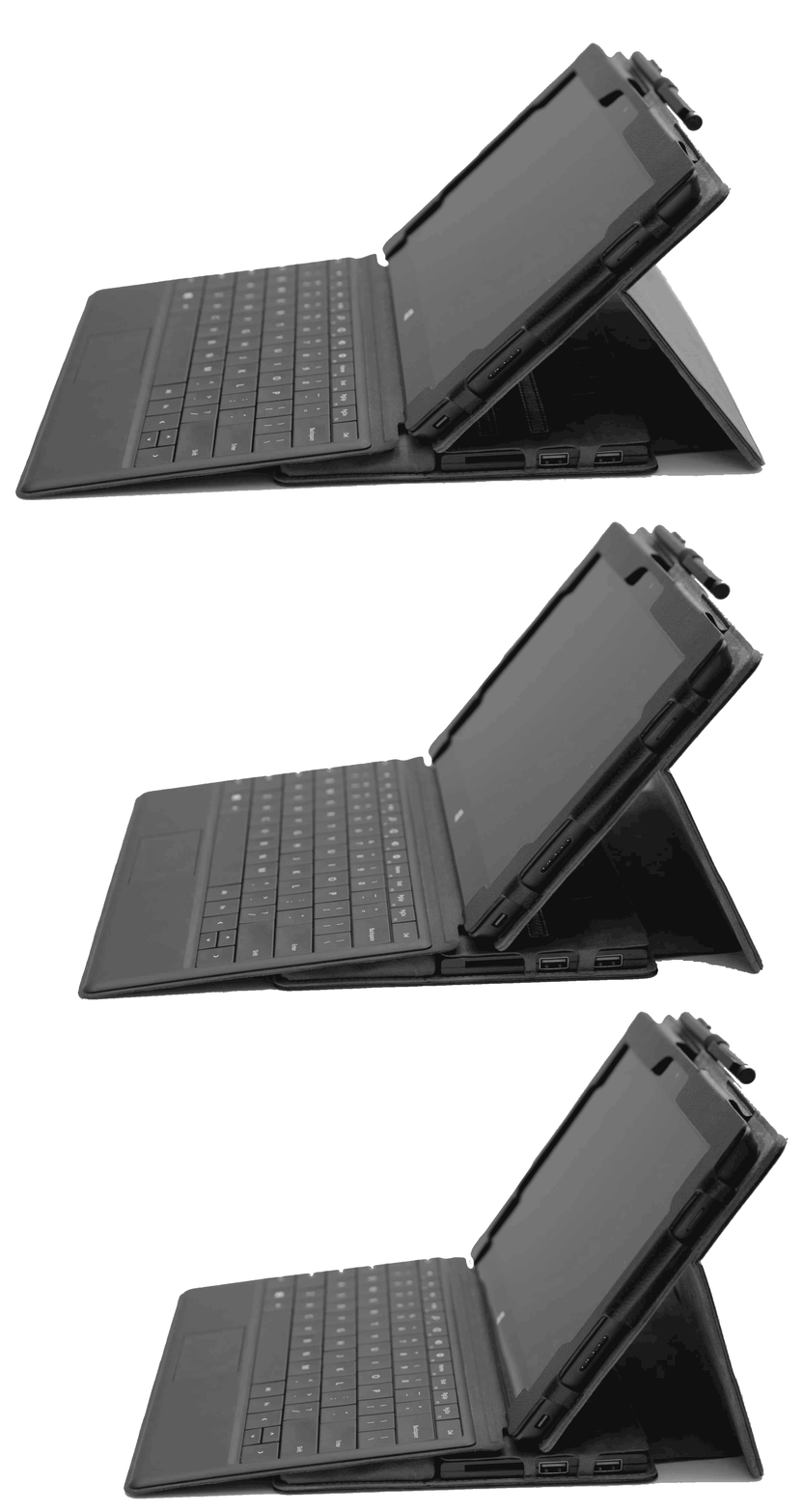
With the keyboard cover attached, the Surface Pro screen can be angled much lower than with the kickstand.

With the keyboard cover attached, the Surface Pro screen can be angled much lower than with the kickstand.

The dock cover (right)  has a visible fold on the underside of the padded palm rest.

The dock cover (right)  has a visible fold on the underside of the padded palm rest.

The ProKASE was designed before the release of the Microsoft Power Cover so it's no surprise that the thicker keyboard doesn't fit very well in the case. The fold in the dock cover refuses to lie flat.

The ProKASE was designed before the release of the Microsoft Power Cover so it's no surprise that the thicker keyboard doesn't fit very well in the case. The fold in the dock cover refuses to lie flat.

Even with the ProKASE strapped closed, the Power Cover and dock cover are an uncomfortable fit. Together the ProKase, Surface Pro and Power Cover dwarf an SP with type cover (right).

Even with the ProKASE strapped closed, the Power Cover and dock cover are an uncomfortable fit. Together the ProKase, Surface Pro and Power Cover dwarf an SP with type cover (right).

The strapped ProKASE with dock cover and type cover is slightly less bulky, especially compared to the Surface Pro with Power Cover (right).

The strapped ProKASE with dock cover and type cover is slightly less bulky, especially compared to the Surface Pro with Power Cover (right).

The spine of the ProKASE (left) is about 1.5 inches thick, about twice the size of the Surface Pro with type cover.

The spine of the ProKASE (left) is about 1.5 inches thick, about twice the size of the Surface Pro with type cover.

With the thin cover and type cover, the ProKASE is almost the same width as the Surface Pro and Power cover.

With the thin cover and type cover, the ProKASE is almost the same width as the Surface Pro and Power cover.

What is bound to be one of the ProKASE's most popular features is the elastic loop at the top of the frame which secures the Surface Pro pen.

What is bound to be one of the ProKASE's most popular features is the elastic loop at the top of the frame which secures the Surface Pro pen.

Although it's designed for the standard pen, the loop expands to hold the much thicker Wacom Bamboo Stylus Feel Carbon.

Although it's designed for the standard pen, the loop expands to hold the much thicker Wacom Bamboo Stylus Feel Carbon.

Posted
AuthorRick Rodriguez
Categoriesreviews
6 CommentsPost a comment

UPDATE: Pressing deadlines are impeding my ability to test gear and software and file regular posts. But Paul Thurrott just wrote about his experiences with the Power Cover and the original Surface Pro here: http://winsupersite.com/mobile-devices/surface-pro-surface-power-cover

* * *

The long-awaited $199 Power Cover from Microsoft arrived at Casa SurfaceProArtist this afternoon and it's charging up as I write this.

It doesn't photograph particularly well, but I offer these pics to illustrate a couple of points worth highlighting.

In the meantime, I've been asking Twitter followers for recommendations on how to test its battery life claims.

I can leave it powered on at High Performance from 100% to 0% on both the Surface Pro 1 and 2 and compare that to running times with standard machines. And I could also run comparisons with full motion video running from 100% charge to zero. But it seems to me that those are somewhat artificial measures. Surely you tax a system differently as you're working on a real world project, accessing the network and saving and loading from your drives. But I've never worked on a project non-stop for 10- or even five-hours, have you? A typical work day is filled with stops and starts, especially while traveling, where eight-hours of work can easily be stretched out over 10-, 12- or even 16-hours. (You international jet-setters know what I'm talking about).

It's a puzzlement. So until I figure this out, enjoy these lousy pics!

Like other type covers, the Surface Power Cover is housed in a box with a highly reflective clear plastic sleeve. The back of the sleeve contains an ominous warning: "Battery has limited recharge cycles and cannot be replaced." I obviously didn't expect to replace the battery but I'm hoping the number of recharge cycles isn't too limited. There's no other mention of this in the documentation, which is a warranty pamphlet.

The Power Cover is nearly identical to the Type Cover. At the top is a label warning not to let the power adapter come in contact with the cover's connector. To charge the Power Cover, you need to charge your Surface Pro as well. Here's where I worry: my SPs are connected to power more often than not; will this adversely impact the Power Cover's lifespan?

The Power Cover (left) is about twice the thickness of the Type Cover. It is noticeably heavier too, but in no way would I describe it as "thick" or "heavy."

Posted
AuthorRick Rodriguez
Categoriesnews
15 CommentsPost a comment

When Autodesk unveiled demo videos for Mudbox 2015 earlier this week, it was unclear whether the software's new multi-touch capabilities would be compatible with the Surface Pro.

The company originally introduced Intel HD graphics 4000 compatibility in the 2014 extension (2014.5) available only to subscribers, but for some reason, gestures refused to work on the Surface Pro.

I reached out to Autodesk support who were unable to confirm that the compatibility issue had been resolved in this latest version. But thanks to a resourceful reader, I was provided a link to the 2015 trial version so that I could test the program myself.

Because a picture is worth a thousand words and video is worth at least ten thousand, see for yourself how well the program runs on the "lowly" first gen Surface Pro with 4 GB of RAM and 128 GB storage.

Mudbox 2015 runs just as well or better on the Surface Pro 2. The only slight hiccup I experienced was when I first installed the program on the Surface Pro seen above. That pc didn't have the Wacom feel driver installed and the pen refused to work although touch did. Once I installed the feel drivers and rebooted, everything worked smoothly.

ZBrush is the king of the hill of sculpting apps, but its crowded UI make it very difficult to use on the Surface Pro. With its relatively uncluttered interface and new interactive capabilities, Mudbox 2015 definitely leaps to the head of the Windows 8 tablet pack.

Autodesk's 2015 offerings are scheduled to be released in mid-April. I'll update this post as soon as trial downloads become publicly available.

Posted
AuthorRick Rodriguez
Categoriesnews
5 CommentsPost a comment

Last fall, I posted some work by traditional illustrator Michelle Kondrick, who had just gotten her Surface Pro. The folks at Microsoft and Intel took note and recently featured her as part of their Empowering Innovators video series.

It's a great showcase for Michelle's work and does a great job showing off the capabilities of our favorite tablet pc, Wacom pen, Manga Studio and Photoshop.

Way to go, Michelle! Visit her blog here: http://michellekondrich.wordpress.com/2014/03/18/empowering-innovators-the-artist/

Posted
AuthorRick Rodriguez
Categoriesnews

I won't waste too much virtual ink on this review because it's very likely you won't be able to get your hands on this device.  But in the event you ever come across someone selling an Axiotron Studio Pen, my advice is simple: buy it! 

Axiotron was the company that first brought the Modbook to market in 2007. Modbooks are Apple MacBooks modified with Wacom touch screens. They're wonderful devices but very expensive.

Axiotron closed up shop shortly after the release of Apple's iPad. One of its founders Andreas Haas revived the concept and now markets the devices as Modbook, Inc. Unfortunately, the new Modbooks use a very basic tablet pc stylus I reviewed here.

The original Axiotron Studio Pen was much closer to the high end pens Wacom produces for its Cintiqs.

Plain Jane wrapping is nothing to write home about, but I include it here to show the model number of the pen I am writing about. Hopefully it will aid in your future online treasure hunts.

The Studio Pen is signficantly longer (6.2 inches) than other tablet pc pens. The Modbook Pro Digitizer Pen is 5.6 inches, the Motion Computing pen is 5.8 inches and the capped Wacom Bamboo Sylus Feel is 5.95 inches.

The Studio Pen is also flared, so it's approximately .10 inch wider than all the other pens I've tested at its thickest point. It has a dual button rocker with a large, comfortable rubber grip that's at least .25 inch longer than the grip on the Motion Computing pen.  And last but not least, the Studio Pen features nice big eraser tip.

The Axiotron Studio Pen (center) is the largest tablet pc stylus I've tested. Its replacement, the white Modbook tablet pc pen is extremely generic and too light and small for my tastes. The closest pen still in production is the Motion Computing stylus (second from bottom), but its grip and single button are much smaller. The Wacom Bamboo Stylus Feel Carbon is pictured at the top and the standard Surface Pro pen is at the bottom.

I found this pen used, so I'm not sure if the nib assortment was standard, but my pen came with a large array of hard, soft and flex nibs and even a replacement button and grip.

The Studio Pen package I bought used included a large assortment of replacment nibs, two extraction rings, a replacement button and a replacement grip. 

The pen is slightly lighter than the Wacom Feel, but its heft feels almost perfect to me. 

I can't find a reason to complain about the Axiotron. I'm just happy that I get to use it on the Surface Pro and my other Windows 8 tablets. Let's hope Wacom or Modbook see fit to offer something similar in the near future.

UPDATE: Reader Pat pointed out in the comments section below that the Axiotron is slightly less accurate than the Wacom Bamboo Stylus. I hadn't noticed this to be the case until I ran a side-by-side test. The slight offset of the cursor to the nib isn't terribly distracting and I quickly forgot about it as I began to draw. The only time where the accuracy becomes an issue is in targeting very fine points in the UI. As I mentioned in my response below, hitting the ultra-narrow scroll bars in Manga Studio is difficult with any pen, but nearly impossible with Axiotron.

To commemorate the premiere of the Mr. Peabody and Sherman movie, a Manga Studio screen grab of the two time travelers alongside the superstars of the Jay Ward universe, Rocky and Bullwinkle.

Screenshot (37).png
Posted
AuthorRick Rodriguez

I'm always on the lookout for talented artists' opinions about the Surface Pro and its pluses and minuses.

After using it for over a year and comparing it to many other tablet pc's and pen displays, I'm happy to say that Microsoft's expensive toy still holds up very well compared to the competition. But reading how other artists are coming along and understanding their concerns is very instructive for me as I look to review future products.

I've also come to appreciate how personal the drawing experience is and recognize that each artist prioritizes a different set of features. Hopefully this selection of reviews will be helpful if you're still sitting on the fence.

Image by Ben Towle, inked on the Surface Pro 2 in Manga Studio.

First up is a review published today by Ben Towle (@ben_towle) a three time Eisner-nominated cartoonist whose current comics project is the webcomic Oyster War.

Find Ben's review here: http://www.benzilla.com/?p=5021


Example panels from Infectious web comic, by Eric Merced

Eric Merced (@eric_merced) is a professional Illustrator who has worked for companies like Zondervan Publishing, Upper Deck, Marvel, Archie’s, IDW and DC Entertainment. He purchased his Surface Pro 2 last month. http://www.ericmerced.com/surfacepro2-review/index.html

A common dilemma facing potential buyers is whether to purchase a relatively expensive Wacom Cintiq device or "settle" for the Surface Pro. Below are two write-ups by artists who came to very different conclusions.

Illustrations by Jonathan Hill, side by side on the Surface Pro 2 and the Wacom Cintiq Companion.

Illustrations by Jonathan Hill, side by side on the Surface Pro 2 and the Wacom Cintiq Companion.

Jonathan Hill teaches comics and illustration classes at the Oregon College of Art and Craft and is a Writer in Residency through Literary Arts' Writers in the Schools program. His first graphic novel, Americus, which he illustrated and was written by MK Reed, was published by First Second Books. Late last year, he explained why he decided on the Surface Pro 2 after testing it alongside the Wacom Cintiq Companion. http://blog.oneofthejohns.com/2013/11/07/surface-pro-2-vs-cintiq-companion/

Last Minute Shopping by Scott R. Kurtz

Scott Kurtz is an Eisner and Harvey award-winning cartoonist who helped pioneer webcomics with his daily feature, PvP which debuted in May of 1998. Since then Scott has co-authored a book on making webcomics, co-created and produced several animated web-series and launched a second ongoing webcomic, Table Titans. His most recent blog post details why he chose a Wacom Cintiq 13HD over the Surface Pro: http://www.pvponline.com/

Whether you agree or disagree with their conclusions, you'll definitely find food for thought.

Posted
AuthorRick Rodriguez

UPDATE: I decided the comments section doesn't do your images justice, especially since none of the links are live. Keep posting there and I'll update this article with your images.

Untitled piece by Tiffany Ross.See more of her work at Cyantian.net.

Untitled piece by Tiffany Ross.See more of her work at Cyantian.net.

The Grey, the Bag and the Smaugly by Nick Heazell (@Fire_PowR) produced in Adobe Illustrator. See more of Nick's t-shirt designs here.

The Grey, the Bag and the Smaugly by Nick Heazell (@Fire_PowR) produced in Adobe Illustrator. See more of Nick's t-shirt designs here.

Infectious panel by Eric Merced. Eric's a recent Mac convert. See more of his weekly strip here: http://infectious.ericmerced.com/comic/infectious/

Infectious panel by Eric Merced. Eric's a recent Mac convert. See more of his weekly strip here: http://infectious.ericmerced.com/comic/infectious/

Icarus by Melody Ng, created on a Sony VAIO Flip 15 with Clip Studio Paint. More of her artwork can be found here: http://marshyoftheblobs.tumblr.com/tagged/marsh-art

Daddy's Girl by Rubin Pingk. For more of Rubin's amazing work, check out http://rubinpingk.com/blog/

Cafe speed painting test by Thierry Doizon. Read his review of the Surface Pro 2 here: http://barontieri.blogspot.ca/2014/01/testing.html

Self portrait by Austin Balaich. Follow him at austinbalaich.tumblr.com.

Imagination fills the void... by  Thomas Voillaume, created on Thinkpad Yoga. Visit Thomas' blog here: http://blog.apachcreation.com/

Illustration by Owen Freeman of Kate Winslet and Josh Brolin in a new movie directed by Jason Reitman for The New Yorker magazine. See more of Owen's work at his blog

Ark by Ian McQue. See more of his amazing concept paintings here: http://mcqueconcept.blogspot.com/

Illustration by Joseph Yeap done on his Surface Pro 1 in Clip Studio Paint

"Here We Go" by Anwar Madrigal

Joel Swain's first illustration with his new Surface Pro 1.

ORIGINAL POST

For an artists' site, we don't feature enough artwork. Help remedy that by attaching a link to some of your most recent amazing work in the comments section below.

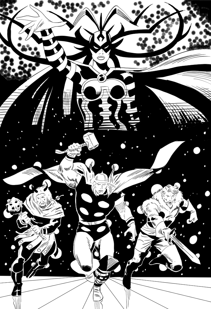
Here's a pic I inked in Clip Studio Paint on the Lenovo Thinkpad Yoga while testing that tablet. It's a classic by John Buscema, one of my favorite Silver Age Marvel artists.

Thor.png
Posted
AuthorRick Rodriguez
CategoriesTips
46 CommentsPost a comment