UPDATE: If you'd like to try the latest beta of Toolbar Creator 2.2, the developer has just released it publicly. http://forum.tabletpcreview.com/threads/toolbar-creator-v-2-1.63014/page-12#post-415712
Keyboard shortcuts are an absolute must for artists who are in the "zone." But sadly, docked keyboards and tablet pcs don't play well together in comfortable drawing positions. I strongly recommend that everyone who draws on a Windows tablet invests in a compact bluetooth keyboard, but even they can be poor substitutes for easy-to-reach Expresskeys or on-screen buttons.
The latter was possible on the Surface Pro 1 and 2 thanks to ArtDock: artist-customizable sets of on-screen shortcuts powered by a clever utility called AutoHotkey. Microsoft's switch to N-Trig with the Surface Pro 3 meant that handy utility was no longer compatible. And for a while, it looked like no one in the art community could figure out how to make Autohotkey scripts work with anything other than Wacom devices.
But in recent weeks, I've been experimenting with a handful of AHK-based solutions that show a lot of promise for users of any touch-capable tablet pc.
First up is Toolbar Creator by lblb, a teacher and researcher in organic chemistry at a liberal arts college who prefers to remain otherwise anonymous.
Rather than post his own ArtDock or toolbar, lblb set out to harness the power of Autohotkey and make it accessible to anyone. The screenshots below are from version 2.2 of the software, which is currently in beta.
While the number of options may seem overwhelming, Toolbar Creator is very logically designed and should be easy for any digital artist to understand, regardless of technical knowledge.
Despite claiming to be busy with his day job, the author is very active on the TabletPCReview forums where the software is maintained and he promptly responds to questions and suggestions from users.
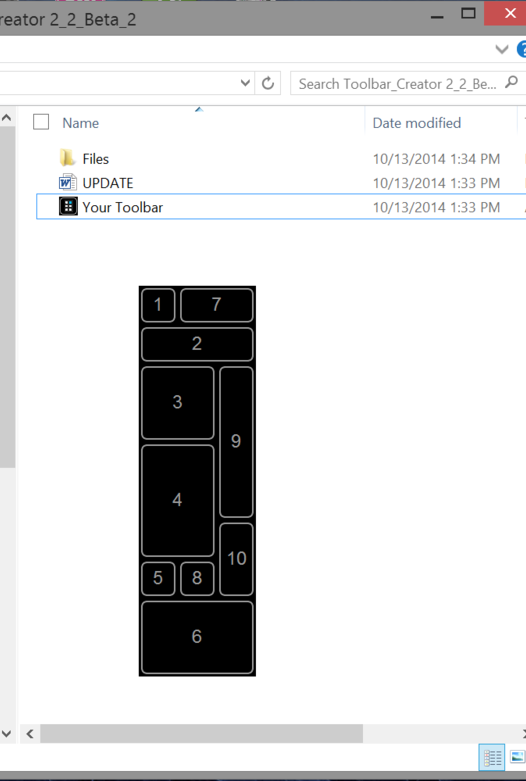
When you first run the utility, you get a blank toolbar with number buttons. This is the first of two sample toolbar layouts. You can drag this toolbar around by pressing and holding the 1 button in the upper left corner. The only other functional item is the 2 button, which loads up the program's main menu.
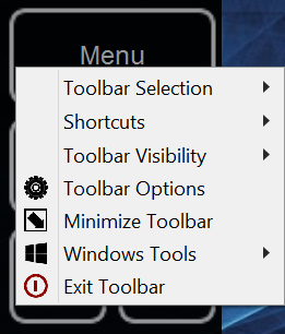
The main menu provides a taste of the wide range of system control that toolbars can provide. To begin creating your own toolbar or to customize the sample, tap on Toolbar Options.
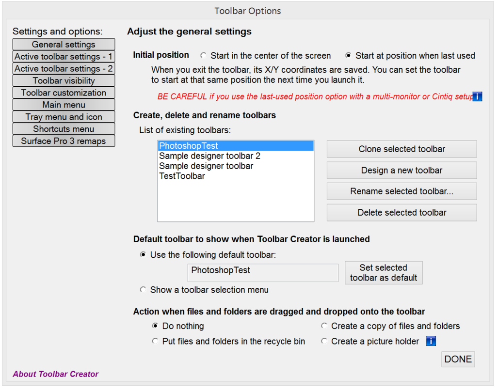
In the General settings window, you can create, clone, delete and rename toolbars. In this example, I'm creating a new toolbar called PhotoshopTest, which I've designated as my default.
Tapping "Design a new toolbar" in the previous windows brings up the Toolbar design window. Here you drag and drop the buttons that will make up your toolbar. You can populate up to 20 columns by 20 rows. I recommend you start slowly (perhaps with only two columns by two rows) until you're familiar with the workflow. If you drop a button into the wrong slot, right clicking it will delete it. A lot of forethought is required for this step because once a grid is defined it can't be edited except by editing a large text file. lblb is working on a more flexible design for a future update. Clicking Save will allow you to name your new toolbar.
This is the layout I created and called Photoshop Test. It consists of four columns by nine rows. One of the advantages of Toolbar Creator is that you can label your buttons directly, so dressing them with bitmaps can come later (if at all). Since I come from the Softimage mindset, I prefer a simple text button to a hard-to-decipher icon, but that's entirely up to you.
In the Active toolbar settings - 1 screen, you set the transparency of the toolbar (useful for Option 8 mentioned above) and the button height and width. The default size is 50 but to make the buttons impossible for fat fingers to miss, I've resized them to 100x100. Selecting the program ID (in this case Photoshop) ensures that button presses are always sent to the correct program, even when that program is not in focus.
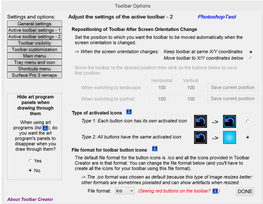
Another very helpful feature of Toolbar Creator is seen on the Active toolbar settings - 2 window. Here you can determine the file format of your button images. The program defaults to .ico files which are great for scaling. But if you'd rather work in .jpg, .bmp or .png formats, those are supported as well. While designing your toolbar, I recommend selecting Type 2 activated icons, which don't require an additional set images. The solid bright blue is also easier to see as you're testing your work.
The Toolbar Visibility window offers 13 options for your toolbar's on-screen appearance. In the couple of versions of ArtDock we previously published, the toolbar would disappear when the pen approached it. Option 2 is the closest to that setting, but I find that the toolbar will pop back into place too quickly after the pen stroke is registered. In Option 8, the toolbar is nearly transparent until the pen approaches it. To draw beneath the toolbar, I will either shrink it or move it out of the way with my free hand. One advantage that Toolbars have over ArtDocks is that the pen tip can be used as easily as the finger to tap buttons.
In the toolbar customization window, the toolbar you just designed shows up in the lower left. Selecting any button on the toolbar (highlighted in blue) brings up its properties on the right side of the window. In this example, I set the upper left button to run the predefined Rollup Toolbar function, which collapses the large toolbar to a single button.
The Main menu window allows you to select the commands available when a button is assigned the Predefined action Show Menu (see below). Our colleague Alex Cheparev, who designed the icons in the SurfaceProArtist ArtDock, has also contributed some icons to Toolbar Creator. Alex is at work on his own set of toolbars which we hope to share with you soon.
Adding or subtracting items from the Menu list is a matter of moving items from one column of the Main menu window to the other.
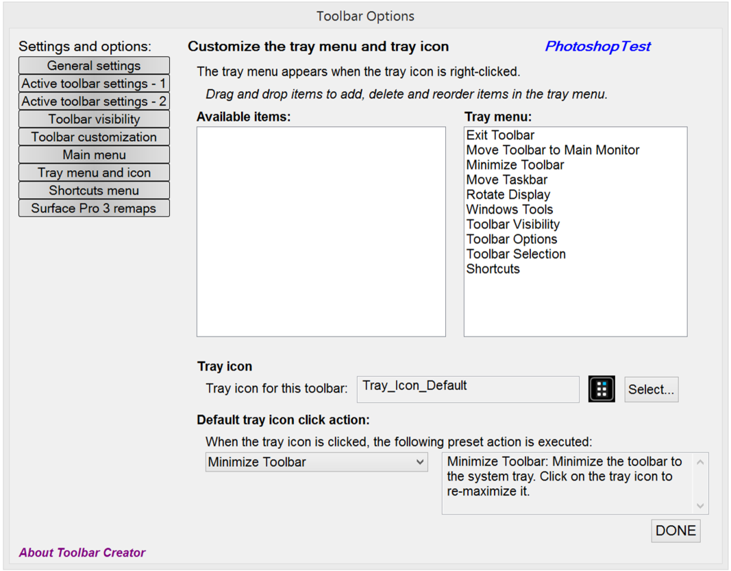
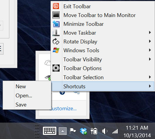
When loaded, Toolbar Creator generates a system tray item. Those menus can be edited in the Tray menu and icon window.
The shortcuts available in the tray menu can be edited in the Shortcuts menu window seen below.
Shortcuts menu
Toolbar Creator even allows you to remap the Surface Pro 3's top pen button or redefine its double click action. The Surface Pro 3 remaps window also allows you to assign new actions to the Windows and Volume hardware buttons.
lblb may want to remain somewhat anonymous, but his Herculean effort here deserves at least a little bit of Internet fame. Check out Toolbar Creator for yourself over at TabletPCReviews and stop back here to show us what you're able to create with his toolkit.
As soon as Alex Cheparev comes up with his Mudbox and ZBrush toolbars, we will post them here.
Next up, we'll be looking at a new utility that brings the Wacom radial menu to N-Trig pens. Stay tuned!
