Brad Colbow is an independent web and UX designer based in Cleveland, Ohio. Below is a very entertaining follow up to his Surface Pro 3 video review (I've also embedded the original below it).

According to his website, Colbow is "best known for my illustration and comic work with The Brads that can be seen on my other website and in .Net magazine. Occasionally I'll take on an illustration project but I prefer to take on new web projects where I can use my UX skills or team up and collaborate with a development team."


It's been several months since my original review of the Surface Pro 3 as a drawing tablet so I figured it was time to do a follow up. Since I use it every day in my work I have a lot more perspective on it than I did when I first got it.

I've been looking to replace my Wacom Cintiq tablet with something more portable. This is my review of the Surface Pro 3 as a drawing tablet. The Surface Pro 3 I'm using has the i5 processor and 8gb of ram with the 256gb hard drive.

Posted
AuthorRick Rodriguez
Categoriesopinion
14 CommentsPost a comment

On this Thanksgiving Day 2014, I'm thankful to all my readers who have helped make this blog such a pleasure to operate.

But despite the steady stream of both regular and new readers, our display advertisements cover only a tiny fraction of the hardware and software costs for this site. Most of the stuff I test and review on these pages is bought with my own cash and I can't justify continuing to spend at the level I have over the last year.

Several of you have donated directly but an even easier way to help is to click on one of our many Amazon links and ads located throughout the blog. You don't have to buy the specific item in the link, but any purchases you make during that session will be credited to us and we'll receive a tiny finder's fee.

Thanks again for visiting and come back soon for a new set of news, reviews, previews, tips and tricks.

Posted
AuthorRick Rodriguez
Categoriesopinion
8 CommentsPost a comment

Some eye candy to start your week: our friend and ArtDock collaborator Alex Cheparev has just posted a video demonstrating the performance of the 3d applications Autodesk Maya 2015, Autodesk Mudbox 2015 and Pixologic Zbrush 4r6 on a top of the line Surface Pro 3 with i7 processor, 8GB ram, 256gb ssd, and Intel HD 5000 video card.

Enjoy!

Posted
AuthorRick Rodriguez
Categoriesreviews
8 CommentsPost a comment

Mischief 2.0 price reduced to $25; feature-limited free version also released

'Lightning' by Mischief artist Szynka2496

'Lightning' by Mischief artist Szynka2496

'Archer' by drawingFORCE author and instructor Michael Mattesi

'Archer' by drawingFORCE author and instructor Michael Mattesi

High-end graphics software developer The Foundry yesterday surprised industry observers with the announcement of the acquisition of the tiny hobbyist software startup Made With Mischief. The latter's Mischief paint and sketch software was introduced last year.

Along with the acquisition, the companies announced the immediate release of Version 2.0 of the software with new UI, additional brushes and --most significantly for Surface Pro and Windows tablet users-- multitouch gesture support with palm rejection. The retail price of Mischief 2.0 was also cut dramatically to $25 and a free feature-limited version is available to download. The software runs on Windows and OS X and is also available through the Mac App Store.

I tested the paid version on the Surface Pro 2 and 3. In previous incarnations, Mischief required a Wintab driver for pen pressure. But on the SP3, I actually had to remove the N-Trig Wintab driver in order for the paid software to work properly. With the driver installed, many of my pen strokes exhibited an odd glitch: a small spike that would appear randomly, usually at the beginning of a stroke. Uninstalling the driver took care of the issue.

This screenshot taken from the Surface Pro 2 displays the stroke glitches I've encountered.

This screenshot taken from the Surface Pro 2 displays the stroke glitches I've encountered.

I'd ordinarily chalk the problem up to N-Trig, but my Surface Pro 2 has the same issue (see above). I haven't tried removing the Wacom pen driver because it's more critical to the calibration and pen settings on the SP2.

Several Twitter followers have corroborated the issue, while others have claimed they're not seeing the problem. It could of course be a conflict with other software or one of the many utilities I have installed to test over time. Made with Mischief is looking into the problem.

Performance is also somewhat erratic on the SP3. Multitouch gestures sometimes stop working or are difficult to trigger. It's also easy to lose sight of your work if you zoom in or out too far. If this happens to you, select Edit/View All Strokes to frame up your work.

Besides these early performance issues, Mischief 2.0 is simply a lot of fun to use. I can't wait until the developers introduce flipbook capability so that you can animate the pans, tilts and zooms. There is a sample file available for separate download called Sleepy Story that is absolutely breathtaking.

Although Mischief has a very limited core feature set at the moment, it features a revolutionary technology that enables an almost infinite canvas. "Our infinite zoom is 50 trillion:1!" crowed the @GetMischief Twitter feed."It's like sitting on the moon and zooming down to the wing of a bug (on Earth)!"

The Foundry's blog announcement went into further detail on the technology powering Mischief's zooming capability:

Mischief is powered by a revolutionary patented shape representation, known as Adaptively Sampled Distance Fields (ADFs), co-invented by (company founder Sarah) Frisken. ADFs have several advantages for creative applications: they provide high-quality stroke rendering; they are amenable to hardware-based rendering so drawing is extremely responsive; they are very compact, resulting in small file sizes; they can be scaled without introducing pixelation artifacts; and they can accurately represent much richer and more complex shapes than traditional vector-based stroke representations. For Frisken, the acquisition of Made With Mischief by The Foundry enables her to retain her core vision of providing high-quality software tools for a wide range of artists and to preserve an accessible price point, while bringing future versions of the platform to an even broader audience.
“The Foundry has a proven record of taking exciting, innovative concepts and commercializing them for a broader market,” said Sarah Frisken. “By becoming a part of The Foundry, we now have the ability to grow our team, to be more responsive to our users, and to further our vision... With our talent and technology, we will create new and exciting products that in turn create new possibilities and experiences for our customers.”  

The entire announcement video is available to view here.

Although Mischief is an exciting application, its user base is tiny: about 4,000, according to one source I read yesterday. The Foundry specializes in high end applications like Nuke, which begins at £2,534 per seat. Its Mari paint software is a mere £1,221 plus an annual license. Why would they want to sell a $25 program to hobbyists?

FXGuide yesterday published a deep look at the ADF technology that The Foundry is acquiring alongside Made with Mischief and it's definitely worth a look. "The software that is the backbone of Mischief right now is absolutely able to do 3D," Frisken told the site. "All that is exposed right now is 2D but the underlying engine could do 3D. We have imagined sketching in 3D or sketching on a 2D canvas at any orientation or rotation to the camera.”

The article also features a demonstration video of a test ADF sculpting application written by Tomas Pettersson, of Sculptris for The Foundry's Luxology Modo team. If you're into 3d sculpting, it's definitely worth a look.

To purchase Mischief 2.0 or download the free version, go to MadewithMischief.com Registered owners of version 1.x can upgrade to 2.0 for free.


Posted
AuthorRick Rodriguez
Categoriesnews
5 CommentsPost a comment

UPDATE: Surface Pro 3's right pen button now calls up the radial menu correctly. See below.

* * * *

ORIGINAL POST

One of the more popular recent additions to Wacom's Feeldriver is the radial menu, a handy set of shortcuts that can be called up with the click of a pen button.

The default RadialMenu offers eight commonly used functions that will apply to most applications. Each wedge is customizable and a profile can be created on an application-specific basis.

The default RadialMenu offers eight commonly used functions that will apply to most applications. Each wedge is customizable and a profile can be created on an application-specific basis.

The radial menu had only been available on Wacom's professional devices until May of this year and its surprise appearance in the enhanced tablet pc driver was another competitive advantage the company had over N-Trig equipped devices like the Surface Pro 3.

We were hoping an SP3 pen menu would be part of Microsoft's recently released Surface Hub, but alas it didn't make the cut and a company spokesman was noncommittal  about it ever appearing. Some within the Surface team have told me they worry that an OS-level radial menu may conflict with context menus and/or software-specific marking menus like those found in Autodesk Maya.

Whether those concerns are valid or not, there's now a powerful utility that brings a highly-customizable radial menu to all devices and throws in a toolbar/ArtDock creator as well.

RadialMenu is the brainchild of independent software/game developer Clint Huegel, who wrote the utility for his Motion Computing LE1700. Fortunately for us, the program appears to work with a wide variety of hardware and software combinations.

"RadialMenu is a small project I started to alleviate aggravations I encountered while using my TabletPC," Huegel writes on his website. "The goal was to emulate the radial menu that Wacom distributes with some of their products but with per application menus. Since that goal was met a Toolbar was added as well." 

The RadialMenu application also includes a toolbar that can be easily customized.

The RadialMenu application also includes a toolbar that can be easily customized.

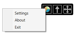
In this view, the toolbar is collapsed with the center (Up arrow) icon. The arrows on the right allow you to move the toolbar around the screen. Tapping on the pie icon switches to the radial menu. Right-clicking on the radial icon brings up the set…

In this view, the toolbar is collapsed with the center (Up arrow) icon. The arrows on the right allow you to move the toolbar around the screen. Tapping on the pie icon switches to the radial menu. Right-clicking on the radial icon brings up the settings options. See below.

The RadialMenu settings. The Menu Size allows you to scale the wedges. Along the bottom, you can create, copy or delete application profiles.

The RadialMenu settings. The Menu Size allows you to scale the wedges. Along the bottom, you can create, copy or delete application profiles.

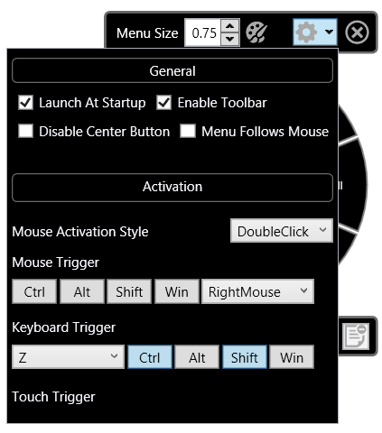
The RadialMenu's options are set in this window. Menu Follows Mouse attaches the menu to the pen cursor, although I had trouble reaching the commands in the right half of the pie with this option set. As a utility in development, RadialMenu still ha…

The RadialMenu's options are set in this window. Menu Follows Mouse attaches the menu to the pen cursor, although I had trouble reaching the commands in the right half of the pie with this option set. As a utility in development, RadialMenu still has some issues to be ironed out on various devices. I haven't been able to trigger the menu with a pen click alone on the Surface Pro 3. I use the keyboard trigger shown here (Ctrl-Shift-Z) and then tap to switch between the toolbar and radial menu.

UPDATE 10/22/15 RadialMenu's developer continues his torrid pace of development and today released version 0.2.3.83 which corrects many of the issues I identify above. Now, setting RadialMenu to load on startup on my Surface Pro 3, I can hold down the right pen button and tap on the desktop to call up the radial menu. Right button + tapping again (away from the center and the command wedges) brings up the standard Windows context menu. Right button + tapping on the center will call up the RadialMenu settings.

Problems persist with Menu Follows Mouse. When the UI is scaled to 100% or 125%, the radial menu icons can be accessed normally, but at 150% or above, I can't reach the lower right icons.

Look for alternate version 0.2.3.83 x64 at http://radialmenu.weebly.com/download.html I wasn't able to run the standard version listed on that page.

To customize the individual RadialMenu wedges, right click the wedge to edit. In addition to several preset options, you can also define a hotkey toggle or create a Macro command (see right).

To customize the individual RadialMenu wedges, right click the wedge to edit. In addition to several preset options, you can also define a hotkey toggle or create a Macro command (see right).

Editing the functions of the toolbar works the same way as the radial menu. Just right click and select your desired function.

Editing the functions of the toolbar works the same way as the radial menu. Just right click and select your desired function.

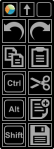
By default, the toolbar consists of five rows and two columns. The individual buttons can be scaled and the top row of icons can be individually hidden. Auto collapse will shrink the toolbar when you mouse away from it.

By default, the toolbar consists of five rows and two columns. The individual buttons can be scaled and the top row of icons can be individually hidden. Auto collapse will shrink the toolbar when you mouse away from it.

Expanding the number of available items in a toolbar is a simple matter of increasing the available rows and columns.

Expanding the number of available items in a toolbar is a simple matter of increasing the available rows and columns.

If you don't like the pie wedges of the default RadialMenu, the size, shape and color can be edited in a wide variety of ways.

If you don't like the pie wedges of the default RadialMenu, the size, shape and color can be edited in a wide variety of ways.

The developer may have set out to emulate Wacom's radial menu, but it's clear that this utility is significantly more powerful than the original. I've encountered a few bumps as I've tested, but Huegel has been quick to post fixes.

You can download RadialMenu for yourself at radialmenu.weebly.com and either leave comments or questions in that site's forum or participate in the forum threads over at TabletPCReviews.

Although RadialMenu is free to download and install, I plan to contribute a few bucks to reward the developer for his efforts and encourage the utility's further development. I hope you will too.

Posted
AuthorRick Rodriguez
18 CommentsPost a comment

UPDATE: If you'd like to try the latest beta of Toolbar Creator 2.2, the developer has just released it publicly. http://forum.tabletpcreview.com/threads/toolbar-creator-v-2-1.63014/page-12#post-415712

Keyboard shortcuts are an absolute must for artists who are in the "zone." But sadly, docked keyboards and tablet pcs don't play well together in comfortable drawing positions. I strongly recommend that everyone who draws on a Windows tablet invests in a compact bluetooth keyboard, but even they can be poor substitutes for easy-to-reach Expresskeys or on-screen buttons.

The latter was possible on the Surface Pro 1 and 2 thanks to ArtDock: artist-customizable sets of on-screen shortcuts powered by a clever utility called AutoHotkey. Microsoft's switch to N-Trig with the Surface Pro 3 meant that handy utility was no longer compatible. And for a while, it looked like no one in the art community could figure out how to make Autohotkey scripts work with anything other than Wacom devices.

But in recent weeks, I've been experimenting with a handful of AHK-based solutions that show a lot of promise for users of any touch-capable tablet pc.

First up is Toolbar Creator by lblb, a teacher and researcher in organic chemistry at a liberal arts college who prefers to remain otherwise anonymous.

Rather than post his own ArtDock or toolbar, lblb set out to harness the power of Autohotkey and make it accessible to anyone. The screenshots below are from version 2.2 of the software, which is currently in beta.

While the number of options may seem overwhelming, Toolbar Creator is very logically designed and should be easy for any digital artist to understand, regardless of technical knowledge.

Despite claiming to be busy with his day job, the author is very active on the TabletPCReview forums where the software is maintained and he promptly responds to questions and suggestions from users.

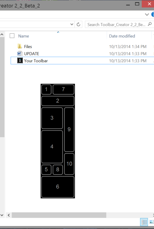
When you first run the utility, you get a blank toolbar with number buttons. This is the first of two sample toolbar layouts. You can drag this toolbar around by pressing and holding the 1 button in the upper left corner. The only other functional i…

When you first run the utility, you get a blank toolbar with number buttons. This is the first of two sample toolbar layouts. You can drag this toolbar around by pressing and holding the 1 button in the upper left corner. The only other functional item is the 2 button, which loads up the program's main menu.

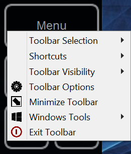
The main menu provides a taste of the wide range of system control that toolbars can provide. To begin creating your own toolbar or to customize the sample, tap on Toolbar Options.

The main menu provides a taste of the wide range of system control that toolbars can provide. To begin creating your own toolbar or to customize the sample, tap on Toolbar Options.

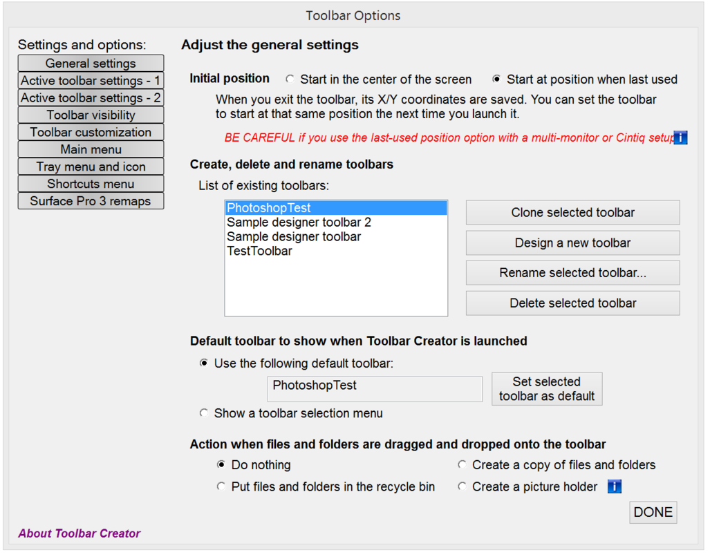
In the General settings window, you can create, clone, delete and rename toolbars. In this example, I'm creating a new toolbar called PhotoshopTest, which I've designated as my default.

In the General settings window, you can create, clone, delete and rename toolbars. In this example, I'm creating a new toolbar called PhotoshopTest, which I've designated as my default.

Tapping "Design a new toolbar" in the previous windows brings up the Toolbar design window. Here you drag and drop the buttons that will make up your toolbar. You can populate up to 20 columns by 20 rows. I recommend you start slowly (perhaps with o…

Tapping "Design a new toolbar" in the previous windows brings up the Toolbar design window. Here you drag and drop the buttons that will make up your toolbar. You can populate up to 20 columns by 20 rows. I recommend you start slowly (perhaps with only two columns by two rows) until you're familiar with the workflow. If you drop a button into the wrong slot, right clicking it will delete it. A lot of forethought is required for this step because once a grid is defined it can't be edited except by editing a large text file. lblb is working on a more flexible design for a future update. Clicking Save will allow you to name your new toolbar.

This is the layout I created and called Photoshop Test. It consists of four columns by nine rows. One of the advantages of Toolbar Creator is that you can label your buttons directly, so dressing them with bitmaps can come later (if at all). Since I…

This is the layout I created and called Photoshop Test. It consists of four columns by nine rows. One of the advantages of Toolbar Creator is that you can label your buttons directly, so dressing them with bitmaps can come later (if at all). Since I come from the Softimage mindset, I prefer a simple text button to a hard-to-decipher icon, but that's entirely up to you.

In the Active toolbar settings - 1 screen, you set the transparency of the toolbar (useful for Option 8 mentioned above) and the button height and width. The default size is 50 but to make the buttons impossible for fat fingers to miss, I've resized…

In the Active toolbar settings - 1 screen, you set the transparency of the toolbar (useful for Option 8 mentioned above) and the button height and width. The default size is 50 but to make the buttons impossible for fat fingers to miss, I've resized them to 100x100. Selecting the program ID (in this case Photoshop) ensures that button presses are always sent to the correct program, even when that program is not in focus.

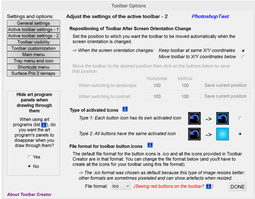
Another very helpful feature of Toolbar Creator is seen on the Active toolbar settings - 2 window. Here you can determine the file format of your button images. The program defaults to .ico files which are great for scaling. But if you'd rather work…

Another very helpful feature of Toolbar Creator is seen on the Active toolbar settings - 2 window. Here you can determine the file format of your button images. The program defaults to .ico files which are great for scaling. But if you'd rather work in .jpg, .bmp or .png formats, those are supported as well. While designing your toolbar, I recommend selecting Type 2 activated icons, which don't require an additional set images. The solid bright blue is also easier to see as you're testing your work.  

The Toolbar Visibility window offers 13 options for your toolbar's on-screen appearance. In the couple of versions of ArtDock we previously published, the toolbar would disappear when the pen approached it. Option 2 is the closest to that setting, b…

The Toolbar Visibility window offers 13 options for your toolbar's on-screen appearance. In the couple of versions of ArtDock we previously published, the toolbar would disappear when the pen approached it. Option 2 is the closest to that setting, but I find that the toolbar will pop back into place too quickly after the pen stroke is registered. In Option 8, the toolbar is nearly transparent until the pen approaches it. To draw beneath the toolbar, I will either shrink it or move it out of the way with my free hand. One advantage that Toolbars have over ArtDocks is that the pen tip can be used as easily as the finger to tap buttons.

In the toolbar customization window, the toolbar you just designed shows up in the lower left. Selecting any button on the toolbar (highlighted in blue) brings up its properties on the right side of the window. In this example, I set the upper left …

In the toolbar customization window, the toolbar you just designed shows up in the lower left. Selecting any button on the toolbar (highlighted in blue) brings up its properties on the right side of the window. In this example, I set the upper left button to run the predefined Rollup Toolbar function, which collapses the large toolbar to a single button.

The Main menu window allows you to select the commands available when a button is assigned the Predefined action Show Menu (see below). Our colleague Alex Cheparev, who designed the icons in the SurfaceProArtist ArtDock, has also contributed some ic…

The Main menu window allows you to select the commands available when a button is assigned the Predefined action Show Menu (see below). Our colleague Alex Cheparev, who designed the icons in the SurfaceProArtist ArtDock, has also contributed some icons to Toolbar Creator. Alex is at work on his own set of toolbars which we hope to share with you soon.

Adding or subtracting items from the Menu list is a matter of moving items from one column of the Main menu window to the other.

Adding or subtracting items from the Menu list is a matter of moving items from one column of the Main menu window to the other.

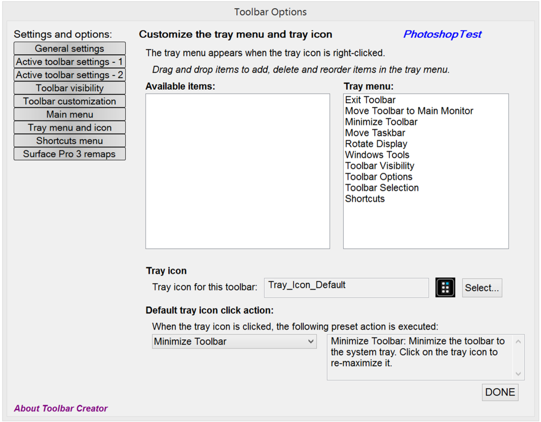
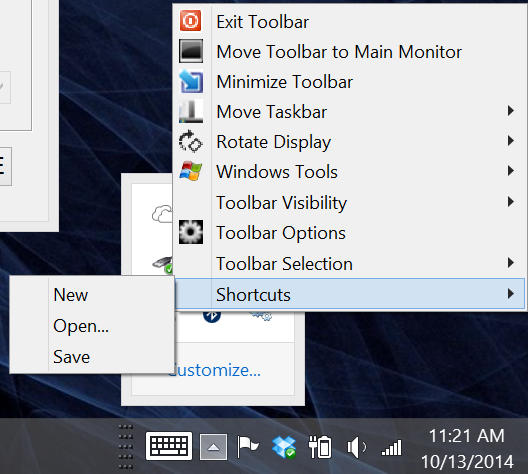
When loaded, Toolbar Creator generates a system tray item. Those menus can be edited in the Tray menu and icon window.

When loaded, Toolbar Creator generates a system tray item. Those menus can be edited in the Tray menu and icon window.

The shortcuts available in the tray menu can be edited in the Shortcuts menu window seen below.

The shortcuts available in the tray menu can be edited in the Shortcuts menu window seen below.

Shortcuts menu

Shortcuts menu

Toolbar Creator even allows you to remap the Surface Pro 3's top pen button or redefine its double click action. The Surface Pro 3 remaps window also allows you to assign new actions to the Windows and Volume hardware buttons.

Toolbar Creator even allows you to remap the Surface Pro 3's top pen button or redefine its double click action. The Surface Pro 3 remaps window also allows you to assign new actions to the Windows and Volume hardware buttons.

lblb may want to remain somewhat anonymous, but his Herculean effort here deserves at least a little bit of Internet fame. Check out Toolbar Creator for yourself over at TabletPCReviews and stop back here to show us what you're able to create with his toolkit.

As soon as Alex Cheparev comes up with his Mudbox and ZBrush toolbars, we will post them here.

Next up, we'll be looking at a new utility that brings the Wacom radial menu to N-Trig pens. Stay tuned!

Posted
AuthorRick Rodriguez
CategoriesTips
15 CommentsPost a comment

Is Surface Hub more than a pretty face?

The long-awaited Surface Pro 3 pen pressure control panel app just went live in the Windows Store under the vague name Surface Hub.

I've only had a couple of minutes so far, but here are my first impressions. UPDATE: After 24 hours with the Hub, I've added a bit more information below.

The app is very pretty, clearly the product of the Microsoft marketing team. 

The app is very pretty, clearly the product of the Microsoft marketing team. 

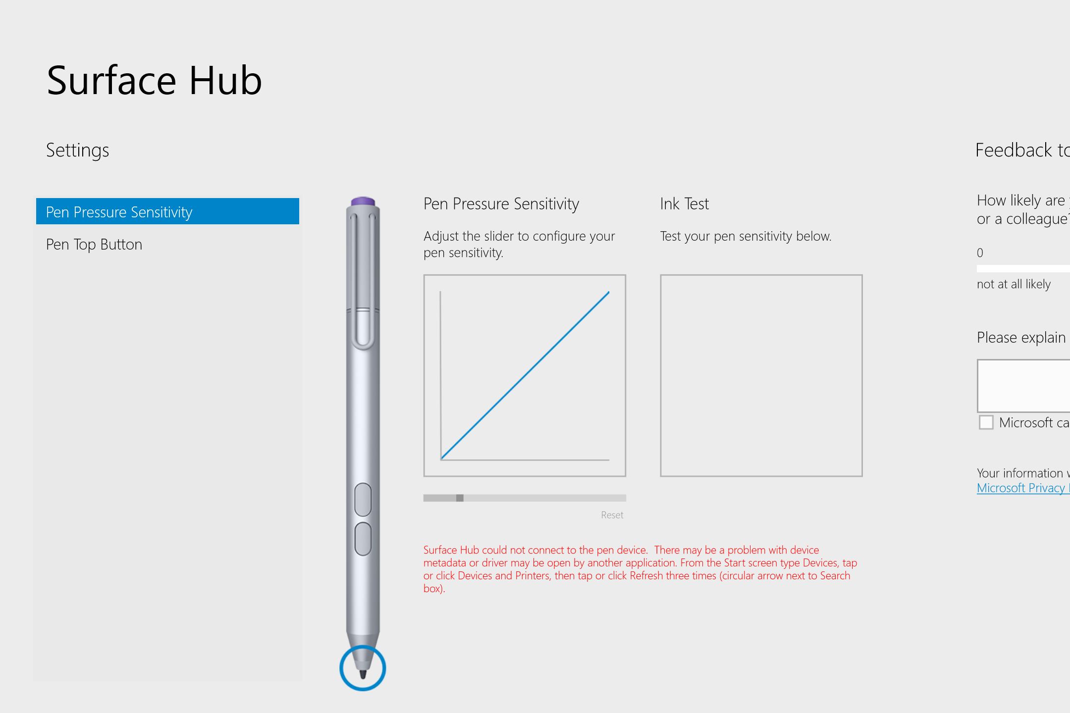
When I first loaded the app, it couldn't find my pen although the pen was clearly working. The instructions in red are somewhat difficult to understand, so after a couple of failed attempts, I just restarted the Surface Pro 3 and the pen was recogni…

When I first loaded the app, it couldn't find my pen although the pen was clearly working. The instructions in red are somewhat difficult to understand, so after a couple of failed attempts, I just restarted the Surface Pro 3 and the pen was recognized.

Besides editing pen pressure, the app allows you to determine which version of OneNote (desktop or Modern) opens when the pen top button is pressed.

Besides editing pen pressure, the app allows you to determine which version of OneNote (desktop or Modern) opens when the pen top button is pressed.

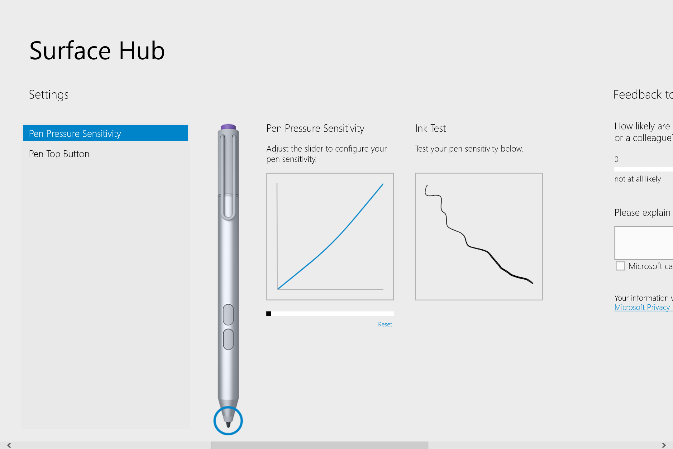
Moving the pen pressure slider all the way to the right yields a uniform line. This will be helpful to users who complain that applications require too much pressure to register their strokes.

Moving the pen pressure slider all the way to the right yields a uniform line. This will be helpful to users who complain that applications require too much pressure to register their strokes.

I'm very disappointed by the lowest pressure sensitivity setting. The resulting curve is not nearly shallow enough. It would be great to have a multiple stroke pressure curve as seen in Manga Studio or Clip Studio Paint. Initial activation force (ti…

I'm very disappointed by the lowest pressure sensitivity setting. The resulting curve is not nearly shallow enough. It would be great to have a multiple stroke pressure curve as seen in Manga Studio or Clip Studio Paint. Initial activation force (tip sensitivity) is also not addressed.

A final screen allows users to give some feedback. Please stop by and let us know what message you're delivering to the Microsoft Surface team.

A final screen allows users to give some feedback. Please stop by and let us know what message you're delivering to the Microsoft Surface team.

UPDATE 10/12/14: The Pen Pressure Sensitivity slider offers seven settings: -1, 0, +1, +2, +3, +4 and +5. Selecting -1 as I illustrated above makes the pen somewhat unresponsive in many applications that already have spotty pen response, such as Google Chrome. Increasing sensitivity was very helpful in getting blacker blacks in Sketchbook Pro. Although it's not ideal, you may need to change the Hub pressure setting depending on the art application you're using. I've settled on +1 for the moment and I've changed my Manga Studio/Clip Studio Paint pressure curve (see below). 

Clip Studio Paint EX 1.3.8 pressure curve and resulting line variations with Frenden's Inker Brush. The Surface Hub setting is +1

Clip Studio Paint EX 1.3.8 pressure curve and resulting line variations with Frenden's Inker Brush. The Surface Hub setting is +1

Several of you have commented or tweeted that you're having difficulty getting the app to recognize your pen. Make sure you have the System Hardware Update - 10/6/14 installed. This is the firmware that enables the app to work. After installing the app, you may need to restart your Surface Pro 3. Anyone still having issues should leave a comment here and we will try to get Microsoft's attention.

ORIGINAL CONCLUSION

Overall, Surface Hub is a decent first effort, but I believe it needs a few more iterations before it will address all the concerns of the Surface Pro 3's creative community.

Posted
AuthorRick Rodriguez
CategoriesTips, news
17 CommentsPost a comment